## Bar Chart: Pearson Correlation Coefficient vs. Averaging Period
### Overview
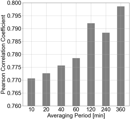
The image is a bar chart showing the relationship between the averaging period (in minutes) and the Pearson correlation coefficient. The chart displays how the correlation coefficient changes as the averaging period increases. The bars are all gray.
### Components/Axes
* **X-axis:** Averaging Period [min]. The values are 10, 20, 40, 60, 120, 240, and 360.
* **Y-axis:** Pearson Correlation Coefficient. The scale ranges from 0.760 to 0.800, with increments of 0.005.
* **Gridlines:** There are light gray gridlines running horizontally across the chart.
### Detailed Analysis
The chart shows the Pearson correlation coefficient for different averaging periods.
* **10 min:** The Pearson correlation coefficient is approximately 0.771.
* **20 min:** The Pearson correlation coefficient is approximately 0.773.
* **40 min:** The Pearson correlation coefficient is approximately 0.776.
* **60 min:** The Pearson correlation coefficient is approximately 0.780.
* **120 min:** The Pearson correlation coefficient is approximately 0.792.
* **240 min:** The Pearson correlation coefficient is approximately 0.788.
* **360 min:** The Pearson correlation coefficient is approximately 0.798.
### Key Observations
The Pearson correlation coefficient generally increases with the averaging period, but there is a slight dip at 240 minutes before rising again at 360 minutes.
### Interpretation
The chart suggests that a longer averaging period generally leads to a higher Pearson correlation coefficient, indicating a stronger linear relationship between the variables being correlated. However, the slight decrease at 240 minutes suggests that there might be an optimal averaging period beyond which the correlation does not consistently improve. The data indicates that the correlation is strongest at the 360 minute averaging period.