\n
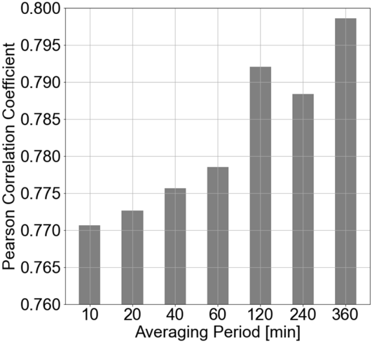
## Bar Chart: Pearson Correlation Coefficient vs. Averaging Period
### Overview
The image presents a bar chart illustrating the relationship between the Pearson Correlation Coefficient and the Averaging Period. The chart displays how the correlation coefficient changes as the averaging period increases.
### Components/Axes
* **X-axis:** Averaging Period [min]. Marked with values: 10, 20, 40, 60, 120, 240, 360.
* **Y-axis:** Pearson Correlation Coefficient. Scale ranges from approximately 0.760 to 0.800.
* **Data Series:** A single data series represented by gray bars.
* **Gridlines:** Horizontal gridlines are present to aid in reading the Y-axis values.
### Detailed Analysis
The chart shows an increasing trend in the Pearson Correlation Coefficient as the Averaging Period increases. Let's examine the approximate values for each averaging period:
* **10 min:** Pearson Correlation Coefficient ≈ 0.771
* **20 min:** Pearson Correlation Coefficient ≈ 0.774
* **40 min:** Pearson Correlation Coefficient ≈ 0.776
* **60 min:** Pearson Correlation Coefficient ≈ 0.779
* **120 min:** Pearson Correlation Coefficient ≈ 0.791
* **240 min:** Pearson Correlation Coefficient ≈ 0.787
* **360 min:** Pearson Correlation Coefficient ≈ 0.798
The trend is generally upward, but there is a slight dip between 120 and 240 minutes.
### Key Observations
* The Pearson Correlation Coefficient consistently increases with the Averaging Period, suggesting a stronger correlation as the averaging period gets longer.
* The most significant increase in correlation occurs between 60 and 120 minutes.
* The dip at 240 minutes is a minor anomaly, but it's worth noting.
* The highest correlation coefficient is observed at 360 minutes, reaching approximately 0.798.
### Interpretation
The data suggests that using a longer averaging period leads to a stronger correlation between the variables being measured. This could be due to the smoothing effect of averaging, which reduces noise and highlights underlying trends. The slight dip at 240 minutes might indicate a temporary fluctuation or a point where the averaging period is no longer optimal for capturing the relationship. The overall trend implies that for this particular dataset, a 360-minute averaging period provides the most reliable correlation coefficient. This information could be valuable in signal processing, time series analysis, or any field where identifying correlations over time is important. The choice of averaging period is a trade-off between reducing noise and potentially losing responsiveness to rapid changes in the data.