## Heatmap: Number of Feedback Repairs vs Number of Initial Programs
### Overview
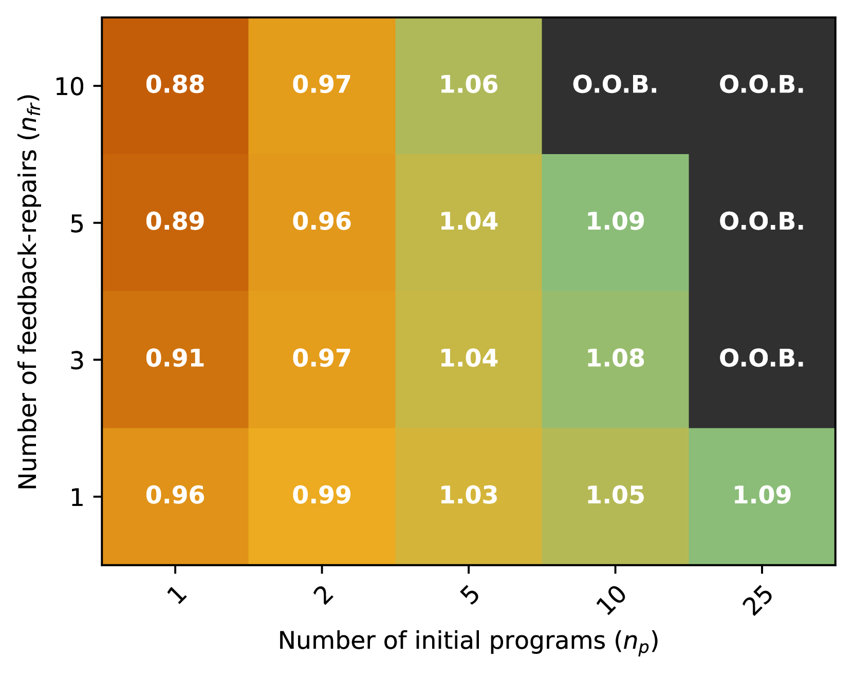
The heatmap illustrates the relationship between the number of initial programs and the number of feedback repairs. The color gradient represents the frequency of feedback repairs, with darker shades indicating higher frequencies.
### Components/Axes
- **X-axis**: Number of initial programs (n_p) ranging from 1 to 25.
- **Y-axis**: Number of feedback repairs (n_f) ranging from 1 to 10.
- **Legend**: The legend indicates the color coding for feedback repair frequencies, with darker shades representing higher frequencies.
### Detailed Analysis or ### Content Details
The heatmap shows a clear trend where the number of feedback repairs increases with the number of initial programs. The highest frequency of feedback repairs is observed when there are 25 initial programs, with a frequency of 1.09. The lowest frequency is observed when there is only 1 initial program, with a frequency of 0.88.
### Key Observations
- The heatmap shows a positive correlation between the number of initial programs and the number of feedback repairs.
- The highest frequency of feedback repairs is observed when there are 25 initial programs.
- The lowest frequency of feedback repairs is observed when there is only 1 initial program.
### Interpretation
The data suggests that as the number of initial programs increases, the number of feedback repairs also increases. This could be due to the fact that more initial programs may lead to more complex systems, which require more feedback to ensure they are functioning correctly. The positive correlation between the number of initial programs and the number of feedback repairs could be a useful metric for evaluating the effectiveness of a system or program.