TECHNICAL ASSET FINGERPRINT
eac73736bd8a27e3bca954ff
Click to view fullscreen
Press ESC or click to close
FOUND IN PAPERS
EXPERT: gemini-3.1-pro-preview VERSION 1
RUNTIME: gemini/gemini-3.1-pro-preview
INTEL_VERIFIED
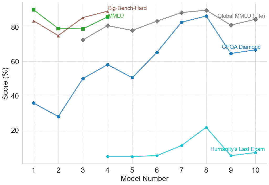
## Line Chart: AI Model Performance Across Various Benchmarks
### Overview
This image is a line chart displaying the performance scores (in percentages) of ten sequential or distinct entities, labeled as "Model Number" 1 through 10, across five different evaluation benchmarks. The chart illustrates how performance varies across different tests, with some tests showing high saturation (scores near 90%) and others proving exceptionally difficult (scores below 25%).
### Components/Axes
**Main Chart Area:**
The chart uses a standard Cartesian coordinate system with faint, dashed, light-gray gridlines corresponding to the major axis ticks.
**X-Axis (Horizontal):**
* **Label:** "Model Number" (Centered at the bottom).
* **Scale:** Discrete integer values from 1 to 10.
* **Markers:** 1, 2, 3, 4, 5, 6, 7, 8, 9, 10.
**Y-Axis (Vertical):**
* **Label:** "Score (%)" (Rotated 90 degrees counter-clockwise, centered on the left).
* **Scale:** Continuous percentage scale, visually ranging from 0 to 100.
* **Markers:** 20, 40, 60, 80.
**Legend / Data Series Labels:**
There is no separate legend box. Instead, labels are placed directly within the chart area adjacent to their respective data lines.
* **Big-Bench-Hard:** Brown text, located top-center near Model 4. Corresponds to the brown line with triangle markers.
* **MMLU:** Green text, located top-center near Model 4, just below the Big-Bench-Hard label. Corresponds to the green line with square markers.
* **Global MMLU (Lite):** Gray text, located top-right near Models 9 and 10. Corresponds to the gray line with diamond markers.
* **GPQA Diamond:** Dark blue text, located mid-right near Models 9 and 10. Corresponds to the dark blue line with circular markers.
* **Humanity's Last Exam:** Light blue/cyan text, located bottom-right near Models 8 and 9. Corresponds to the light blue/cyan line with small circular/pentagonal markers.
### Detailed Analysis
*Note: All numerical values extracted below are visual approximations based on the y-axis scale, with an estimated uncertainty of ±2%.*
**1. Big-Bench-Hard (Brown line, Triangle markers)**
* **Visual Trend:** This series only contains data for Models 1 through 4. The line starts high, dips noticeably at Model 2, recovers at Model 3, and reaches its peak at Model 4.
* **Data Points:**
* Model 1: ~83%
* Model 2: ~75%
* Model 3: ~85%
* Model 4: ~89%
**2. MMLU (Green line, Square markers)**
* **Visual Trend:** Similar to Big-Bench-Hard, this series only covers Models 1 through 4. It starts at the highest point on the entire chart for Model 1, drops sharply at Model 2, remains perfectly flat at Model 3, and rises again at Model 4.
* **Data Points:**
* Model 1: ~90%
* Model 2: ~79%
* Model 3: ~79%
* Model 4: ~86%
**3. Global MMLU (Lite) (Gray line, Diamond markers)**
* **Visual Trend:** This series begins at Model 3 and continues to Model 10. It shows a general upward trajectory with minor fluctuations. It rises from Model 3 to 4, dips slightly at 5, climbs steadily to a peak at Model 8, drops at Model 9, and recovers slightly at Model 10.
* **Data Points:**
* Model 3: ~72%
* Model 4: ~81%
* Model 5: ~78%
* Model 6: ~83%
* Model 7: ~88%
* Model 8: ~90% (Peak)
* Model 9: ~81%
* Model 10: ~84%
**4. GPQA Diamond (Dark Blue line, Circle markers)**
* **Visual Trend:** This series spans all 10 models. It exhibits high volatility but a strong overall upward trend from Model 2 to Model 8. It starts relatively low, dips at Model 2, surges at Model 3, climbs to a peak at Model 8 (nearly matching Global MMLU Lite), then suffers a massive drop at Model 9 before stabilizing slightly at Model 10.
* **Data Points:**
* Model 1: ~36%
* Model 2: ~28%
* Model 3: ~50%
* Model 4: ~58%
* Model 5: ~50%
* Model 6: ~65%
* Model 7: ~82%
* Model 8: ~86% (Peak)
* Model 9: ~64%
* Model 10: ~66%
**5. Humanity's Last Exam (Light Blue/Cyan line, Small circle markers)**
* **Visual Trend:** This series begins at Model 4 and continues to Model 10. It represents the lowest scores on the chart by a wide margin. The trend is completely flat and near zero from Models 4 to 6, shows a slight rise at Model 7, peaks at Model 8, drops back to baseline at Model 9, and rises marginally at Model 10.
* **Data Points:**
* Model 4: ~5%
* Model 5: ~5%
* Model 6: ~5%
* Model 7: ~11%
* Model 8: ~21% (Peak)
* Model 9: ~5%
* Model 10: ~7%
### Key Observations
* **Incomplete Data Series:** Not all benchmarks were tested on all models. "Big-Bench-Hard" and "MMLU" stop after Model 4. "Global MMLU (Lite)" starts at Model 3, and "Humanity's Last Exam" starts at Model 4. Only "GPQA Diamond" spans the entire x-axis.
* **The "Model 8" Peak:** For the three benchmarks that span the latter half of the chart (Global MMLU Lite, GPQA Diamond, Humanity's Last Exam), Model 8 represents the absolute peak performance.
* **The "Model 9" Drop:** Conversely, Model 9 shows a significant performance regression across all three active benchmarks compared to Model 8.
* **Benchmark Difficulty Stratification:** The chart clearly shows three tiers of difficulty:
1. *Easier/Saturated:* MMLU, Big-Bench-Hard, and Global MMLU (Lite) generally score between 70% and 90%.
2. *Moderate/High Variance:* GPQA Diamond shows the most growth, moving from ~28% to ~86%.
3. *Extreme Difficulty:* "Humanity's Last Exam" rarely breaks above 10%, maxing out at ~21%.
### Interpretation
This chart likely tracks the historical progression or a specific comparative lineup of Large Language Models (LLMs) against standardized AI benchmarks. The "Model Number" likely represents either chronological releases (e.g., GPT-1 through a modern model) or a specific tier list of competing models from different organizations.
The data demonstrates the concept of "benchmark saturation." Older benchmarks like MMLU and Big-Bench-Hard were likely abandoned after Model 4 because the models were already scoring near 90%, leaving little room to measure meaningful improvement.
To replace them, harder benchmarks were introduced. GPQA Diamond shows a beautiful capability curve, where early models failed, but later models (specifically Model 8) mastered it.
The most striking element is "Humanity's Last Exam." Its placement at the very bottom of the chart, hovering near a 0-5% baseline for most models, indicates it is a next-generation benchmark designed specifically to be resistant to current AI capabilities. Even Model 8, which excels at everything else, barely achieves 20% on this test.
Finally, the sharp drop at Model 9 suggests that the x-axis is not strictly chronological by capability. Model 9 and 10 might represent smaller, more efficient models (like "mini" or "haiku" variants of flagship models), or models from a different, slightly less capable lineage compared to the state-of-the-art Model 8.
DECODING INTELLIGENCE...