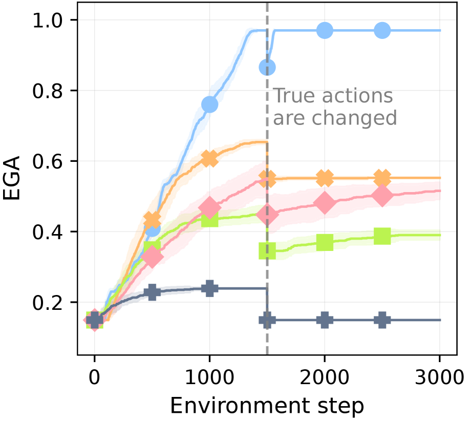
## Line Chart: EGA vs Environment Step
### Overview
The image is a line chart displaying the Effective Goal Achievement (EGA) on the y-axis against the Environment Step on the x-axis. There are five distinct data series represented by different colored lines with markers. A vertical dashed line indicates a point where "True actions are changed". The chart shows how EGA changes over time for each series, with a clear shift in behavior after the vertical line.
### Components/Axes
* **X-axis:** Environment step, ranging from 0 to 3000. Markers are present at 0, 1000, 2000, and 3000.
* **Y-axis:** EGA (Effective Goal Achievement), ranging from 0.0 to 1.0. Markers are present at 0.2, 0.4, 0.6, 0.8, and 1.0.
* **Data Series:** Five distinct lines, each with a unique color and marker.
* Light Blue line with circle markers
* Orange line with cross markers
* Pink line with diamond markers
* Lime Green line with square markers
* Dark Grey line with plus markers
* **Vertical Dashed Line:** Located at approximately x = 1600, labeled "True actions are changed".
### Detailed Analysis
**Light Blue Line (Circle Markers):**
* Trend: Initially slopes sharply upward, reaching near 1.0 EGA before the vertical dashed line. After the line, it plateaus at approximately 0.98 EGA.
* Data Points:
* (0, ~0.15)
* (750, ~0.75)
* (1500, ~0.98)
* (2000, ~0.98)
* (3000, ~0.98)
**Orange Line (Cross Markers):**
* Trend: Slopes upward, but less steeply than the light blue line. After the vertical dashed line, it plateaus at approximately 0.55 EGA.
* Data Points:
* (0, ~0.15)
* (1000, ~0.60)
* (1500, ~0.65)
* (2000, ~0.55)
* (3000, ~0.55)
**Pink Line (Diamond Markers):**
* Trend: Slopes upward, similar to the orange line, but plateaus at a lower EGA. After the vertical dashed line, it plateaus at approximately 0.52 EGA.
* Data Points:
* (0, ~0.15)
* (1000, ~0.40)
* (1500, ~0.50)
* (2000, ~0.52)
* (3000, ~0.52)
**Lime Green Line (Square Markers):**
* Trend: Slopes upward, plateaus at a lower EGA than the pink line. After the vertical dashed line, it plateaus at approximately 0.38 EGA.
* Data Points:
* (0, ~0.15)
* (1000, ~0.40)
* (1500, ~0.45)
* (2000, ~0.38)
* (3000, ~0.38)
**Dark Grey Line (Plus Markers):**
* Trend: Slopes upward slightly, then plateaus at a low EGA. After the vertical dashed line, it plateaus at approximately 0.15 EGA.
* Data Points:
* (0, ~0.15)
* (1000, ~0.23)
* (1500, ~0.25)
* (2000, ~0.15)
* (3000, ~0.15)
### Key Observations
* All lines start at approximately the same EGA value (~0.15).
* The light blue line achieves the highest EGA, while the dark grey line achieves the lowest.
* The vertical dashed line at Environment step ~1600 marks a point where the behavior of all lines changes, generally plateauing after this point.
* There are shaded regions around each line, indicating uncertainty or variance in the data.
### Interpretation
The chart illustrates the performance of different strategies or algorithms (represented by the colored lines) in achieving a goal (EGA) as the environment changes (Environment step). The vertical line signifies a change in the environment or task ("True actions are changed"). The data suggests that the light blue strategy is the most effective, consistently achieving a high EGA. The other strategies show varying degrees of success, with the dark grey strategy being the least effective. The change in environment at step ~1600 appears to stabilize the EGA for all strategies, preventing further significant improvement. The shaded regions indicate the variability in performance for each strategy, suggesting that some strategies are more consistent than others.