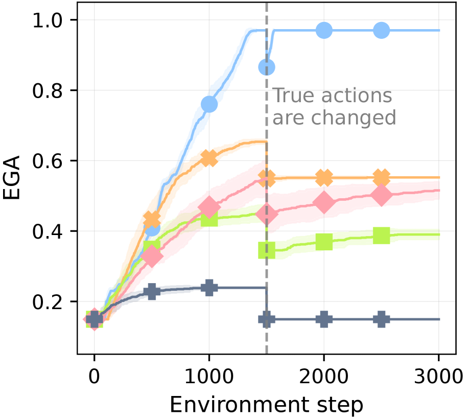
## Line Chart: EGA vs. Environment Step
### Overview
This image presents a line chart illustrating the relationship between EGA (presumably a performance metric) and the Environment Step. The chart displays multiple lines, each representing a different experimental condition or algorithm. A vertical dashed line indicates a point where "True actions are changed," suggesting an intervention or shift in the experimental setup.
### Components/Axes
* **X-axis:** "Environment step" ranging from 0 to approximately 3000, with tick marks at 0, 1000, 2000, and 3000.
* **Y-axis:** "EGA" ranging from 0 to 1.1, with tick marks at 0, 0.2, 0.4, 0.6, 0.8, and 1.0.
* **Lines:** Six distinct lines, each with a unique color and marker:
* Blue line with circle markers
* Orange line with diamond markers
* Pink line with triangle markers
* Green line with square markers
* Purple line with inverted triangle markers
* Gray line with plus markers
* **Annotation:** "True actions are changed" with a vertical dashed gray line at approximately Environment Step 1800.
### Detailed Analysis
Let's analyze each line's trend and approximate data points:
* **Blue Line:** This line shows a rapid increase in EGA from approximately 0.15 at Environment Step 0 to nearly 1.0 by Environment Step 1000, then plateaus around 0.95-1.0 for the remainder of the chart.
* (0, 0.15), (500, 0.6), (1000, 0.95), (1500, 0.98), (2000, 0.97), (3000, 0.96)
* **Orange Line:** This line exhibits a slower, more gradual increase in EGA, starting at approximately 0.2 at Environment Step 0 and reaching around 0.6 by Environment Step 3000.
* (0, 0.2), (500, 0.35), (1000, 0.45), (1500, 0.52), (2000, 0.56), (3000, 0.6)
* **Pink Line:** This line starts at approximately 0.25 at Environment Step 0 and increases to around 0.5 by Environment Step 3000.
* (0, 0.25), (500, 0.38), (1000, 0.42), (1500, 0.46), (2000, 0.49), (3000, 0.5)
* **Green Line:** This line shows a relatively stable EGA value, starting at approximately 0.2 at Environment Step 0 and remaining around 0.4 for most of the chart, with a slight increase to around 0.45 by Environment Step 3000.
* (0, 0.2), (500, 0.3), (1000, 0.35), (1500, 0.4), (2000, 0.42), (3000, 0.45)
* **Purple Line:** This line starts at approximately 0.15 at Environment Step 0 and remains relatively flat, fluctuating around 0.2 for the duration of the chart.
* (0, 0.15), (500, 0.18), (1000, 0.19), (1500, 0.18), (2000, 0.17), (3000, 0.16)
* **Gray Line:** This line starts at approximately 0.18 at Environment Step 0 and remains relatively flat, fluctuating around 0.15-0.2 for the duration of the chart.
* (0, 0.18), (500, 0.17), (1000, 0.16), (1500, 0.16), (2000, 0.16), (3000, 0.15)
### Key Observations
* The blue line demonstrates significantly faster learning and higher performance (EGA) compared to all other lines.
* The purple and gray lines show minimal improvement in EGA over time, indicating limited learning or adaptation.
* The "True actions are changed" annotation coincides with a slight dip in the blue line's EGA, but it quickly recovers.
* The orange, pink, and green lines show moderate improvement in EGA, but at a much slower rate than the blue line.
### Interpretation
The chart likely represents the performance of different algorithms or experimental conditions in a reinforcement learning or control task. The EGA metric appears to measure the effectiveness of the algorithm in achieving its goal. The rapid increase in EGA for the blue line suggests that this algorithm learns quickly and efficiently. The change in "True actions" at Environment Step 1800 might represent a shift in the environment's dynamics or a change in the reward function, which temporarily disrupts the performance of the blue line but doesn't prevent it from continuing to learn. The consistently low EGA values for the purple and gray lines suggest that these algorithms are either ineffective or poorly suited for the task. The differences in learning rates and final EGA values between the lines highlight the importance of algorithm selection and experimental design in achieving optimal performance. The chart suggests a clear hierarchy of performance, with the blue algorithm significantly outperforming the others. Further investigation would be needed to understand the specific reasons for these differences and the impact of the "True actions" change.