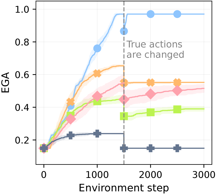
## Line Graph: Evolution of Expected Goal Achievement (EGA) Over Environment Steps
### Overview
The graph depicts the progression of Expected Goal Achievement (EGA) across four distinct data series over 3,000 environment steps. A vertical dashed line at 1,500 steps marks a critical transition point labeled "True actions are changed." All series show varying trajectories, with uncertainty bands (shaded regions) indicating variability in measurements.
### Components/Axes
- **X-axis**: "Environment step" (0 to 3,000), with ticks at 0, 1,000, 2,000, and 3,000.
- **Y-axis**: "EGA" (0.0 to 1.0), with ticks at 0.2, 0.4, 0.6, 0.8, and 1.0.
- **Legend**: Located on the right, with four entries:
- Blue circles (solid line)
- Orange crosses (dashed line)
- Pink diamonds (dotted line)
- Green squares (dash-dot line)
- **Dashed Line**: Vertical line at ~1,500 steps with annotation "True actions are changed."
### Detailed Analysis
1. **Blue Circles (Solid Line)**:
- Starts at ~0.2 EGA at step 0.
- Sharp upward trajectory to 1.0 EGA by step 1,500.
- Remains at 1.0 EGA for all subsequent steps.
- Uncertainty band narrows significantly after step 1,500.
2. **Orange Crosses (Dashed Line)**:
- Begins at ~0.4 EGA at step 0.
- Peaks at ~0.6 EGA by step 1,000.
- Drops to ~0.5 EGA by step 1,500, then stabilizes.
- Uncertainty band widens slightly after step 1,500.
3. **Pink Diamonds (Dotted Line)**:
- Starts at ~0.3 EGA at step 0.
- Rises to ~0.5 EGA by step 1,000.
- Declines to ~0.4 EGA by step 1,500, then plateaus.
- Uncertainty band remains consistent.
4. **Green Squares (Dash-Dot Line)**:
- Begins at ~0.1 EGA at step 0.
- Increases to ~0.4 EGA by step 1,000.
- Drops to ~0.3 EGA by step 1,500, then stabilizes.
- Uncertainty band widens slightly after step 1,500.
### Key Observations
- **Blue Line Anomaly**: The blue series exhibits a discontinuous jump at step 1,500, aligning with the "True actions are changed" annotation. This suggests a structural shift in the system's behavior.
- **Post-Transition Divergence**: All series experience performance declines after step 1,500, though the blue line recovers fully.
- **Uncertainty Patterns**: Variability (shaded regions) increases for orange, pink, and green lines after step 1,500, indicating reduced confidence in measurements post-transition.
### Interpretation
The graph demonstrates that the blue data series (likely representing an optimal or adaptive strategy) achieves near-perfect EGA after the transition point, while other strategies degrade. This implies that the system's true actions (e.g., policy changes, environmental shifts) critically impact performance, with only certain approaches maintaining robustness. The shaded uncertainty bands highlight measurement noise or model variability, which becomes more pronounced for non-adaptive strategies after the transition. The blue line's abrupt recovery suggests it may incorporate real-time adjustments or exploit new system dynamics introduced at step 1,500.