## Bar Chart: Test Accuracy (%) vs Dropout Rate
### Overview
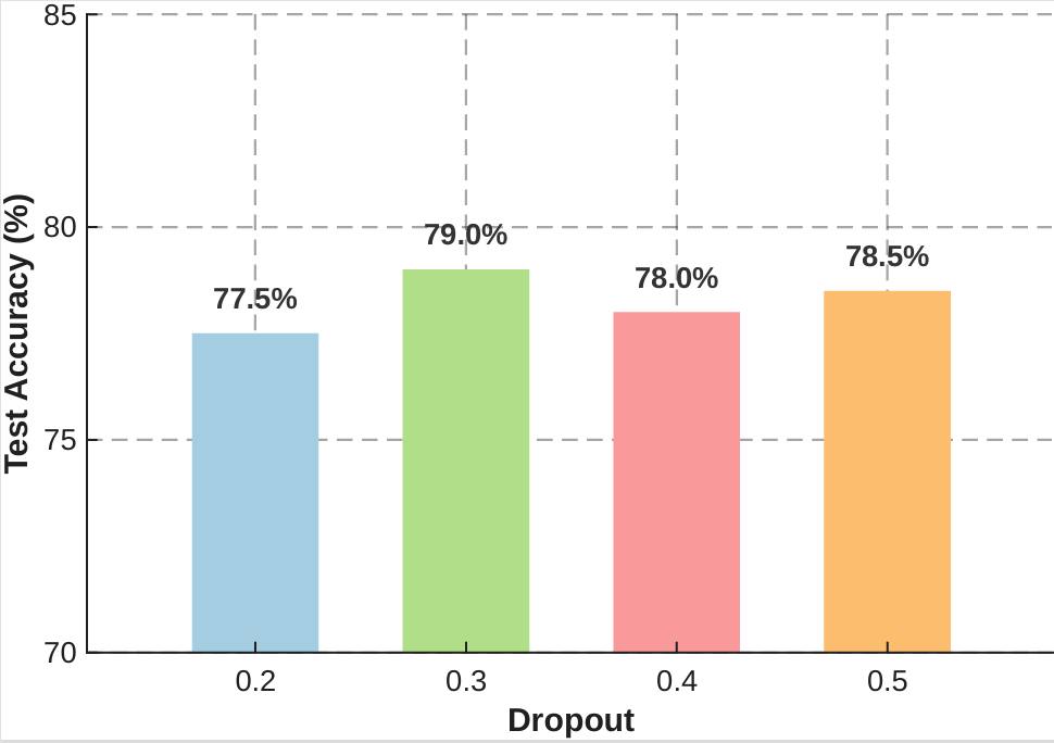
The chart visualizes the relationship between dropout rates (0.2 to 0.5) and corresponding test accuracy percentages (77.5% to 79.0%). Four vertical bars represent distinct dropout rates, with colors mapped to specific values via a legend. The y-axis ranges from 70% to 85%, with gridlines at 75%, 80%, and 85%.
### Components/Axes
- **X-Axis (Dropout)**: Categorical scale with values 0.2, 0.3, 0.4, 0.5 (left to right).
- **Y-Axis (Test Accuracy %)**: Linear scale from 70% to 85%, with gridlines at 75%, 80%, and 85%.
- **Legend**: Located on the right, associating colors with dropout rates:
- Blue: 0.2
- Green: 0.3
- Red: 0.4
- Orange: 0.5
- **Bars**: Positioned in ascending dropout rate order, with heights proportional to test accuracy.
### Detailed Analysis
1. **Dropout 0.2 (Blue)**: 77.5% accuracy (shortest bar).
2. **Dropout 0.3 (Green)**: 79.0% accuracy (tallest bar).
3. **Dropout 0.4 (Red)**: 78.0% accuracy (second-shortest bar).
4. **Dropout 0.5 (Orange)**: 78.5% accuracy (second-tallest bar).
### Key Observations
- **Peak Accuracy**: Dropout rate 0.3 achieves the highest test accuracy (79.0%).
- **Non-Linear Relationship**: Accuracy increases from 0.2 to 0.3, then decreases at 0.4, followed by a slight recovery at 0.5.
- **Color Consistency**: All bars match the legend’s color assignments without discrepancies.
- **Narrow Range**: All accuracies fall within 77.5%–79.0%, indicating minimal variation across dropout rates.
### Interpretation
The data suggests an optimal dropout rate of **0.3** for maximizing test accuracy. The non-linear trend implies that excessive regularization (e.g., dropout >0.3) may initially reduce performance but could stabilize with further adjustments (e.g., dropout 0.5). The minimal spread in accuracy highlights robustness across tested dropout rates, though 0.3 remains the clear outlier. This pattern aligns with regularization theory, where moderate dropout balances model complexity and generalization.