\n
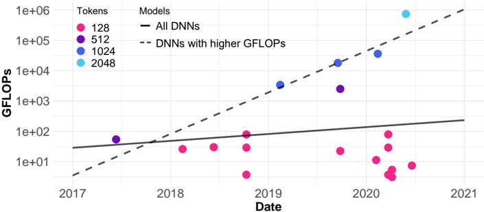
## Scatter Plot with Trend Lines: DNN Computational Cost (GFLOPs) Over Time by Token Count
### Overview
The image is a scatter plot with two overlaid trend lines, illustrating the relationship between the computational cost (measured in GFLOPs) of Deep Neural Network (DNN) models and their release date, categorized by the number of tokens they process. The chart uses a logarithmic scale for the vertical axis.
### Components/Axes
* **Title:** "Tokens" and "Models" are listed as column headers for the legend.
* **Y-Axis:**
* **Label:** "GFLOPs" (Giga Floating Point Operations per Second, a measure of computational cost).
* **Scale:** Logarithmic (base 10).
* **Markers:** 1e+01 (10), 1e+02 (100), 1e+03 (1,000), 1e+04 (10,000), 1e+05 (100,000), 1e+06 (1,000,000).
* **X-Axis:**
* **Label:** "Date".
* **Scale:** Linear, representing years.
* **Markers:** 2017, 2018, 2019, 2020, 2021.
* **Legend (Top-Left Corner):**
* **Tokens (Color-Coded Dots):**
* Pink Dot: 128
* Purple Dot: 512
* Blue Dot: 1024
* Cyan Dot: 2048
* **Models (Line Styles):**
* Solid Black Line: "All DNNs"
* Dashed Black Line: "DNNs with higher GFLOPs"
### Detailed Analysis
**Data Series & Trends:**
1. **"All DNNs" Trend (Solid Line):** This line shows a gradual, linear increase on the log scale from approximately 30 GFLOPs in early 2017 to roughly 200 GFLOPs by the end of 2020. This represents a moderate exponential growth trend for the general population of models.
2. **"DNNs with higher GFLOPs" Trend (Dashed Line):** This line exhibits a much steeper slope. It starts below the solid line in 2017 (around 5 GFLOPs) but crosses above it around mid-2018. By the end of 2020, it projects to over 1,000,000 (1e+06) GFLOPs, indicating a dramatically faster rate of growth in computational cost for high-performance models.
3. **Data Points by Token Count:**
* **128 Tokens (Pink):** These points are predominantly clustered below the "All DNNs" trend line. They range from approximately 5 GFLOPs to 100 GFLOPs, with the majority falling between 10 and 50 GFLOPs. Their distribution shows no strong upward trend over time, suggesting that models processing 128 tokens have maintained relatively stable, lower computational costs.
* **512 Tokens (Purple):** A small number of points are visible. One point in 2017 is near 50 GFLOPs. Two points in late 2019/early 2020 are significantly higher, around 3,000 GFLOPs and 30,000 GFLOPs, placing them between the two trend lines.
* **1024 Tokens (Blue):** Three data points are visible, all positioned near or above the steep "higher GFLOPs" trend line. They are located at approximately 4,000 GFLOPs (mid-2019), 20,000 GFLOPs (late 2019), and 40,000 GFLOPs (early 2020). This series shows a clear upward trajectory.
* **2048 Tokens (Cyan):** A single, prominent data point is located at the top-right of the chart, corresponding to late 2020 or early 2021. Its value is near the top of the scale, approximately 800,000 to 900,000 GFLOPs. This is the highest computational cost shown and aligns with the steep "higher GFLOPs" trend.
**Spatial Grounding:** The legend is positioned in the top-left quadrant of the plot area. The "All DNNs" solid line originates from the left y-axis. The "higher GFLOPs" dashed line originates from a lower point on the left y-axis. The cyan 2048-token point is the topmost and rightmost data marker.
### Key Observations
1. **Bifurcation of Trends:** The chart clearly separates two growth trajectories: a moderate one for the average model and an explosive one for high-compute models.
2. **Token Count as a Cost Driver:** There is a strong positive correlation between the number of tokens a model processes and its GFLOPs. The 128-token models are consistently the least computationally expensive, while the 1024 and 2048-token models are orders of magnitude more expensive.
3. **Temporal Acceleration:** The most computationally expensive models (high token count) appear later in the timeline (2019-2021), indicating a recent acceleration in pushing the boundaries of model scale.
4. **Outlier:** The single 2048-token data point is a significant outlier in terms of absolute GFLOPs, representing a potential frontier model.
### Interpretation
This chart visualizes the "scaling laws" phenomenon in deep learning, where increasing model size (proxied here by token count and computational cost) leads to more powerful systems. The data suggests that the field has pursued two parallel paths: developing more efficient models for common tasks (the "All DNNs" line) and aggressively scaling up models for state-of-the-art performance (the "higher GFLOPs" line). The steep dashed line implies that the computational cost for cutting-edge models is growing at a super-exponential rate. The clustering of 128-token models at lower GFLOPs indicates a mature, optimized category, likely for deployment on resource-constrained devices. In contrast, the high-token models represent the research frontier, where computational resources are invested to achieve breakthrough capabilities, with costs escalating rapidly over a short period. The chart implies that future advancements in model capability may come at a disproportionately higher computational cost.