## Diagram: Periodic Function with Highlighted Interval
### Overview
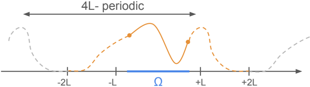
The image is a technical diagram illustrating a periodic function or signal with a defined period of 4L. It features a central waveform plotted against a horizontal axis, with annotations indicating periodicity and a specific interval of interest (Ω). The diagram uses color and line style to distinguish between the primary period and its repetitions.
### Components/Axes
* **Horizontal Axis:** A straight line with an arrowhead pointing to the right, indicating the independent variable (e.g., time or space).
* **Axis Markers/Ticks:** The axis is marked at five equidistant points. From left to right, the labels are: `-2L`, `-L`, `Ω` (the Greek letter Omega, rendered in blue), `+L`, and `+2L`.
* **Periodicity Indicator:** A double-headed arrow spans the top of the diagram from the `-2L` marker to the `+2L` marker. Above this arrow is the text label: **"4L-periodic"**.
* **Primary Waveform (Solid Orange Line):** A continuous, smooth curve plotted primarily between `-L` and `+L`. It has a complex shape with two local maxima (peaks) and one local minimum (trough).
* **Extended Waveform (Dashed Lines):** The waveform continues beyond the `-L` to `+L` range as dashed lines.
* To the left of `-L`, the dashed line is **orange**.
* To the right of `+L`, the dashed line is **gray**.
* Further extensions beyond `-2L` and `+2L` are shown as **gray dashed lines**, indicating the repeating nature of the function.
* **Highlighted Interval (Ω):** A solid blue bar is drawn directly on the axis, centered on the `Ω` marker. It spans a sub-interval within the `[-L, +L]` range.
* **Data Points:** Two distinct orange dots are placed on the solid orange waveform.
* One dot is located on the ascending slope just after the `-L` marker.
* The second dot is located on the descending slope just before the `+L` marker.
### Detailed Analysis
* **Spatial Layout:** The diagram is centered around the `Ω` marker. The primary period of interest, as defined by the solid orange line and the "4L-periodic" arrow, is the interval `[-2L, +2L]`. The core function is displayed in the sub-interval `[-L, +L]`.
* **Waveform Description:** The solid orange curve between `-L` and `+L` is not a simple sine wave. It rises from near zero at `-L` to a first peak, dips to a trough, rises to a second, slightly higher peak, and then descends back toward zero at `+L`. The two orange dots mark specific points on this curve, possibly sampling points, points of interest, or boundaries for a calculation.
* **Color & Style Coding:**
* **Solid Orange:** The primary, defined segment of the function.
* **Dashed Orange:** The immediate continuation of the function pattern to the left.
* **Dashed Gray:** The continuation of the periodic pattern further to the left and right, indicating repetition beyond the immediate view.
* **Solid Blue (Ω bar):** Highlights a specific, possibly critical, sub-domain within the main period.
### Key Observations
1. The function is explicitly defined as having a period of **4L**.
2. The diagram emphasizes the interval from `-L` to `+L` by rendering it as a solid line, while the outer intervals (`-2L` to `-L` and `+L` to `+2L`) are dashed.
3. The blue `Ω` interval is a subset of the `[-L, +L]` range, suggesting it is a region where a specific condition applies, a measurement is taken, or a transformation is applied.
4. The two orange dots are symmetrically placed relative to the central trough but are not at the peaks. Their exact significance is not labeled but is clearly intentional.
### Interpretation
This diagram is a conceptual representation used in fields like signal processing, physics, or mathematics to illustrate operations on periodic functions. The key takeaways are:
* **Periodicity:** The function repeats every 4L units. The dashed lines visually enforce this concept.
* **Domain Segmentation:** The overall period `[-2L, +2L]` is segmented. The core behavior is shown in `[-L, +L]` (solid line), with the outer segments `[-2L, -L]` and `[+L, +2L]` shown as repetitions (dashed lines).
* **Region of Interest (ROI):** The blue bar labeled **Ω** denotes a specific, smaller interval within the core domain. This is likely the focus of an analysis, such as where a signal is sampled, a boundary condition is applied, or an integral is computed. The orange dots may represent the boundaries of this Ω interval projected onto the function curve itself.
* **Purpose:** The diagram serves to visually define the setup for a problem. It answers: "What is the function's period? Where is the main segment we care about? And within that, what is the specific sub-interval (Ω) relevant to our current calculation or discussion?" It provides a spatial and conceptual map for subsequent mathematical operations or physical interpretations.