## Scatter Plot: Distribution of Association Types
### Overview
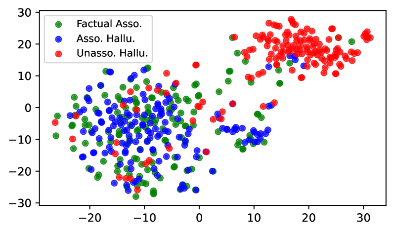
The image is a scatter plot visualizing the distribution of three categories: Factual Association (green), Associated Hallucination (blue), and Unassociated Hallucination (red). The plot spans X and Y axes from -30 to 30, with data points densely clustered in specific regions.
### Components/Axes
- **X-axis**: Labeled "X" with ticks at -30, -20, -10, 0, 10, 20, 30.
- **Y-axis**: Labeled "Y" with ticks at -30, -20, -10, 0, 10, 20, 30.
- **Legend**: Located in the top-left corner, mapping:
- Green: Factual Association
- Blue: Associated Hallucination
- Red: Unassociated Hallucination
### Detailed Analysis
1. **Factual Association (Green)**:
- **Positioning**: Predominantly clustered in the left half of the plot (X ≈ -25 to -5, Y ≈ -20 to 10).
- **Distribution**: Dense grouping near the origin, with some outliers extending toward the bottom-left (X ≈ -30, Y ≈ -30).
2. **Associated Hallucination (Blue)**:
- **Positioning**: Spread across the central region (X ≈ -15 to 15, Y ≈ -25 to 15).
- **Distribution**: Overlaps with green and red points in the central area, with a secondary cluster near the top-center (X ≈ 5–10, Y ≈ 5–10).
3. **Unassociated Hallucination (Red)**:
- **Positioning**: Concentrated in the top-right quadrant (X ≈ 5–30, Y ≈ 5–30).
- **Distribution**: High density near the upper-right corner (X ≈ 20–30, Y ≈ 20–30), with fewer points extending toward the center-right (X ≈ 10–20, Y ≈ 5–15).
### Key Observations
- **Trend Verification**:
- Factual Associations (green) show a clear leftward bias, with minimal presence in the right half of the plot.
- Unassociated Hallucinations (red) exhibit a strong rightward and upward trend, dominating the top-right quadrant.
- Associated Hallucinations (blue) are more dispersed, with no dominant directional trend but significant overlap with other categories in the central region.
- **Outliers/Anomalies**:
- A small cluster of red points (Unassociated Hallucinations) appears near the bottom-left (X ≈ -10, Y ≈ -10), deviating from the primary top-right trend.
- Blue points (Associated Hallucinations) occasionally extend into the top-right quadrant, overlapping with red points.
### Interpretation
The plot suggests a clear distinction between Factual Associations (left-leaning) and Unassociated Hallucinations (right-leaning), with Associated Hallucinations occupying an intermediate, overlapping space. The red points’ dominance in the top-right quadrant may indicate a correlation between higher X/Y values and unassociated hallucinations. The blue points’ central clustering implies variability in associated hallucinations, potentially reflecting mixed or transitional states. The outlier red points in the bottom-left could represent edge cases or measurement noise. This distribution might reflect a classification system where factual data is distinct from hallucinated content, with associated hallucinations acting as a transitional category.