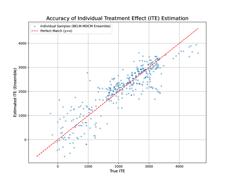
## Scatter Plot: Accuracy of Individual Treatment Effect (ITE) Estimation
### Overview
This image presents a scatter plot visualizing the accuracy of Individual Treatment Effect (ITE) estimation. The plot compares the "True ITE" against the "Estimated ITE (Ensemble)" for a collection of individual samples. A diagonal red dashed line representing a "Perfect Match" (y=x) is overlaid on the scatter plot for reference.
### Components/Axes
* **Title:** Accuracy of Individual Treatment Effect (ITE) Estimation
* **X-axis Label:** True ITE
* Scale: 0 to 4000, with gridlines at increments of 1000.
* **Y-axis Label:** Estimated ITE (Ensemble)
* Scale: 0 to 4000, with gridlines at increments of 1000.
* **Legend:** Located at the top-right corner.
* "Individual Samples (BELM-MDCM Ensemble)" - Represented by blue circles.
* "Perfect Match (y=x)" - Represented by a red dashed line.
### Detailed Analysis
The scatter plot displays approximately 300-400 individual data points (blue circles). The points are distributed around the red dashed line, but with considerable scatter.
* **Trend of Individual Samples:** The blue points generally follow an upward trend, indicating a positive correlation between the True ITE and the Estimated ITE. However, the relationship is not perfectly linear.
* **Data Point Distribution:**
* **Low True ITE (0-1000):** The estimated ITE values are widely dispersed, with many points falling below the "Perfect Match" line. There's a noticeable cluster of points with low True ITE and low Estimated ITE.
* **Mid-Range True ITE (1000-3000):** The points are more tightly clustered around the "Perfect Match" line, but still exhibit significant scatter.
* **High True ITE (3000-4000):** The estimated ITE values tend to be slightly above the "Perfect Match" line, but with a wider spread.
* **Approximate Data Points (sampled for illustration):**
* (0, 0) - Point lies on the Perfect Match line.
* (500, 500) - Point lies on the Perfect Match line.
* (1000, 1500) - Estimated ITE is higher than True ITE.
* (2000, 2200) - Estimated ITE is slightly higher than True ITE.
* (3000, 3500) - Estimated ITE is significantly higher than True ITE.
* (4000, 4200) - Estimated ITE is slightly higher than True ITE.
* (500, 200) - Estimated ITE is lower than True ITE.
* (1500, 800) - Estimated ITE is lower than True ITE.
* (2500, 1800) - Estimated ITE is lower than True ITE.
### Key Observations
* The estimation accuracy is higher for mid-range True ITE values compared to low and high values.
* There is a tendency for the Estimated ITE to be overestimated for higher True ITE values.
* The scatter around the "Perfect Match" line indicates that the ITE estimation is not perfect, and there is inherent uncertainty in the estimation process.
* The points are not uniformly distributed, suggesting potential biases or limitations in the estimation method.
### Interpretation
The scatter plot demonstrates the accuracy of the BELM-MDCM Ensemble method for estimating Individual Treatment Effects. The plot reveals that while there is a general positive correlation between the true and estimated ITEs, the estimation is not without error. The deviation from the "Perfect Match" line quantifies the estimation error. The observed pattern suggests that the method performs better for moderate ITE values, but struggles with extreme values (both low and high). This could be due to several factors, such as the complexity of modeling heterogeneous treatment effects, limitations in the data, or the specific assumptions of the BELM-MDCM Ensemble method. The spread of the points indicates the inherent variability in ITE estimation, even with a sophisticated ensemble method. Further investigation is needed to understand the sources of error and improve the accuracy of ITE estimation, particularly for extreme ITE values.