## Power Curve Comparison Charts: Manufacturer vs. Synthetic Models
### Overview
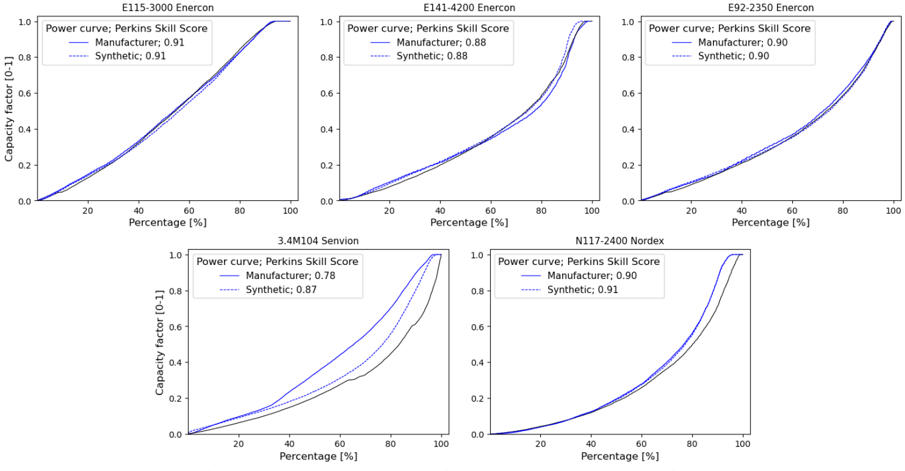
The image displays a composite of five separate line charts arranged in two rows. Each chart compares a "Manufacturer" power curve against a "Synthetic" power curve for a specific wind turbine model. The comparison is quantified using the Perkins Skill Score. All charts share identical axes and visual styling.
### Components/Axes
* **Chart Titles (Top of each subplot):**
* Top Row (Left to Right): `E115-3000 Enercon`, `E141-4200 Enercon`, `E92-2350 Enercon`
* Bottom Row (Left to Right): `3.4M104 Senvion`, `N117-2400 Nordex`
* **X-Axis (All charts):** Labeled `Percentage [%]`. Scale runs from 0 to 100 with major tick marks at 0, 20, 40, 60, 80, 100.
* **Y-Axis (All charts):** Labeled `Capacity Factor (0-1)`. Scale runs from 0.0 to 1.0 with major tick marks at 0.0, 0.2, 0.4, 0.6, 0.8, 1.0.
* **Legend (Top-left corner of each chart):**
* Title: `Power curve; Perkins Skill Score`
* Series 1: `Manufacturer: [Score]` (Represented by a solid blue line)
* Series 2: `Synthetic: [Score]` (Represented by a dashed blue line)
### Detailed Analysis
**1. E115-3000 Enercon (Top-Left)**
* **Perkins Skill Scores:** Manufacturer: 0.91, Synthetic: 0.91.
* **Trend & Data:** Both lines are nearly indistinguishable, showing a smooth, concave-up curve. They start at (0%, 0.0), rise gradually to approximately (60%, 0.4), then accelerate, reaching (100%, 1.0). The perfect overlap indicates an excellent match between the manufacturer and synthetic models.
**2. E141-4200 Enercon (Top-Center)**
* **Perkins Skill Scores:** Manufacturer: 0.88, Synthetic: 0.88.
* **Trend & Data:** Similar concave-up shape. Lines begin at (0%, 0.0). They track very closely until about 70% capacity factor, after which the synthetic (dashed) line appears slightly above the manufacturer (solid) line before they converge again near 100%. The scores indicate a very good match.
**3. E92-2350 Enercon (Top-Right)**
* **Perkins Skill Scores:** Manufacturer: 0.90, Synthetic: 0.90.
* **Trend & Data:** The curves are almost perfectly overlaid, showing a smooth, accelerating upward trend from (0%, 0.0) to (100%, 1.0). This represents another near-perfect model match.
**4. 3.4M104 Senvion (Bottom-Left)**
* **Perkins Skill Scores:** Manufacturer: 0.78, Synthetic: 0.87.
* **Trend & Data:** This chart shows the most significant divergence. Both lines start at (0%, 0.0). The synthetic (dashed) line rises more steeply than the manufacturer (solid) line in the middle range (approx. 20%-80%). For example, at 60% on the x-axis, the synthetic curve is at ~0.5 capacity factor, while the manufacturer curve is at ~0.35. They converge near 100%. The lower Manufacturer score (0.78) reflects this poorer fit.
**5. N117-2400 Nordex (Bottom-Right)**
* **Perkins Skill Scores:** Manufacturer: 0.90, Synthetic: 0.91.
* **Trend & Data:** The lines are extremely close, following a smooth, accelerating curve from origin to (100%, 1.0). The synthetic line may be infinitesimally above the manufacturer line in the 60-90% range, but the visual difference is minimal, consistent with the nearly identical high scores.
### Key Observations
1. **High Fidelity in Enercon & Nordex Models:** Four out of five models (all except Senvion) show Perkins Skill Scores of 0.88 or higher, with three at 0.90 or above. The visual overlap of the solid and dashed lines in these charts is excellent.
2. **Significant Anomaly with Senvion Model:** The `3.4M104 Senvion` chart is a clear outlier. It has the lowest Manufacturer score (0.78) and the largest visual gap between the two curves, particularly in the mid-range of the x-axis. The synthetic model consistently predicts a higher capacity factor than the manufacturer's curve for the same percentage value in this region.
3. **Consistent Chart Structure:** All five charts use the same axis scales, labels, legend placement (top-left), and color scheme (solid vs. dashed blue lines), allowing for direct visual comparison across turbine models.
4. **Characteristic Curve Shape:** All power curves exhibit a concave-up, non-linear relationship. Capacity factor increases slowly at low percentages, then rises more rapidly as the percentage increases, typical of wind turbine power curves relative to wind speed or power output percentiles.
### Interpretation
This set of charts serves as a validation exercise for a synthetic model designed to replicate manufacturer-provided wind turbine power curves. The Perkins Skill Score acts as a metric of agreement.
* **Model Performance:** The synthetic model demonstrates high accuracy for the Enercon (E115, E141, E92) and Nordex (N117) turbines, suggesting it successfully captures the underlying physics or data patterns for these models. The near-perfect scores (0.90-0.91) for three turbines indicate the synthetic model is essentially indistinguishable from the manufacturer's specification for practical purposes.
* **Investigative Focus on Senvion:** The poor performance for the Senvion turbine (score 0.78) is the most critical finding. This discrepancy could stem from several sources: unique characteristics of the Senvion turbine not captured by the synthetic model's assumptions, potential errors or different methodologies in the source manufacturer data, or limitations in the synthetic model's training data for this specific turbine class. This result flags the Senvion model as requiring further investigation and potential model refinement.
* **Practical Implication:** For wind farm simulation or energy yield assessment, using the synthetic model would be highly reliable for the Enercon and Nordex turbines but would introduce a notable positive bias (overestimation of capacity factor) for the Senvion turbine, especially at mid-range operating conditions. This bias would need to be accounted for or corrected in any practical application.