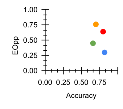
## Scatter Plot: Accuracy vs. EOpp
### Overview
The image depicts a scatter plot comparing two metrics: **Accuracy** (x-axis) and **EOpp** (y-axis). Four distinct data points are plotted, each represented by a unique color (orange, red, green, blue). The plot suggests a trade-off relationship between the two metrics, with no clear linear correlation.
### Components/Axes
- **X-axis (Accuracy)**: Ranges from 0.00 to 0.80 in increments of 0.25.
- **Y-axis (EOpp)**: Ranges from 0.00 to 1.00 in increments of 0.25.
- **Legend**: Located on the right side of the plot, associating colors with labels:
- Orange
- Red
- Green
- Blue
### Detailed Analysis
1. **Orange Data Point**:
- Positioned at approximately **(0.75, 0.75)**.
- Highest values for both Accuracy and EOpp.
2. **Red Data Point**:
- Positioned at approximately **(0.70, 0.65)**.
- Slightly lower than Orange in both metrics.
3. **Green Data Point**:
- Positioned at approximately **(0.50, 0.45)**.
- Mid-range values for both metrics.
4. **Blue Data Point**:
- Positioned at approximately **(0.40, 0.30)**.
- Lowest Accuracy but higher EOpp than Green.
### Key Observations
- **Trade-off Pattern**: Higher Accuracy generally correlates with higher EOpp, but exceptions exist (e.g., Blue).
- **Outlier**: The Blue point deviates from the trend, achieving lower Accuracy but relatively higher EOpp compared to Green.
- **Clustering**: Orange and Red cluster in the upper-right quadrant, suggesting optimal performance.
### Interpretation
The plot highlights a potential **trade-off between Accuracy and EOpp**, where improving one metric may come at the expense of the other. The Orange point represents the "best performer" in both metrics, while the Blue point raises questions about its methodology or context—its lower Accuracy paired with moderate EOpp could indicate a specialized approach or data imbalance. The absence of a clear linear relationship suggests that optimizing both metrics simultaneously may require balancing competing objectives.