\n
## Diagram: Resource Allocation/Trade-off
### Overview
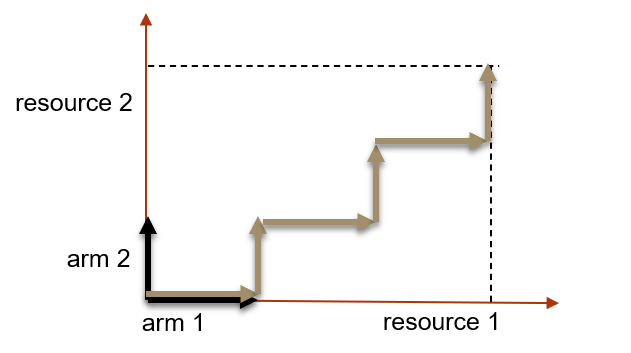
The image depicts a diagram illustrating a trade-off or allocation between two resources, labeled "resource 1" and "resource 2", and two corresponding "arms" or factors, labeled "arm 1" and "arm 2". The diagram shows a path of increasing resource 1 at the expense of resource 2, and vice versa, represented by a zig-zagging line.
### Components/Axes
* **Axes:**
* Horizontal axis: "resource 1" (positive direction to the right)
* Vertical axis: "resource 2" (positive direction upwards)
* Secondary axes: "arm 1" and "arm 2" are also labeled as axes, but they seem to represent factors influencing the resource allocation.
* **Line:** A zig-zagging line, colored in shades of brown, represents the trade-off path. It starts with an increase in "resource 1" and then fluctuates between increases and decreases in both resources.
* **Dashed Lines:** A vertical dashed line extends from the end of the zig-zagging line to the top edge of the diagram, suggesting a potential maximum value or limit for "resource 2".
* **Initial Segment:** A short, dark brown line segment at the bottom-left corner, representing an initial allocation.
### Detailed Analysis
The diagram does not contain specific numerical values. However, we can describe the path of the line:
1. **Initial Phase:** The line starts with a horizontal segment (dark brown) along the "resource 1" axis, indicating an initial allocation to "resource 1".
2. **Zig-Zag Pattern:** The line then enters a zig-zag pattern.
* It increases in "resource 2" while decreasing in "resource 1".
* It then decreases in "resource 2" while increasing in "resource 1".
* This pattern repeats several times.
3. **Final Phase:** The line ends with a vertical segment (light brown) extending upwards, indicating a final allocation with a higher value for "resource 2".
The zig-zag pattern suggests a dynamic allocation process where resources are traded off against each other. The dashed line indicates a potential upper bound for "resource 2".
### Key Observations
* The diagram illustrates a trade-off relationship between "resource 1" and "resource 2".
* The zig-zag pattern suggests that the allocation is not static but changes over time or with different conditions.
* The initial allocation favors "resource 1".
* The final allocation favors "resource 2".
### Interpretation
This diagram likely represents a resource allocation problem where there is a constraint or trade-off between two resources. The zig-zagging line could represent a series of decisions or iterations where resources are reallocated based on changing needs or priorities. The diagram suggests that it is possible to increase one resource at the expense of the other, but there may be limits to how much of each resource can be obtained. The dashed line could represent a maximum capacity or a target value for "resource 2".
The "arms" (arm 1 and arm 2) likely represent factors influencing the allocation. For example, "arm 1" could represent the cost of "resource 1", and "arm 2" could represent the benefit of "resource 2". The diagram could be used to visualize the optimal allocation strategy given these factors.
Without further context, it is difficult to determine the specific meaning of the resources and arms. However, the diagram provides a general framework for understanding resource allocation trade-offs.