\n
## Line Chart with Inset Histogram and Digit Grid
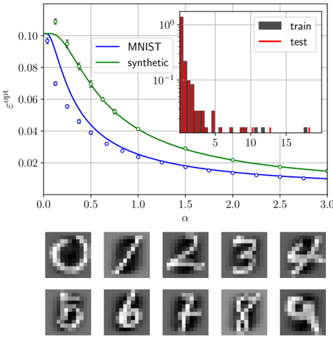
### Overview
The image is a composite technical figure containing three distinct elements: a primary line chart with an inset histogram, and a separate grid of ten grayscale digit images. The line chart compares the optimization error (ε_opt) as a function of a parameter α for two datasets: "MNIST" and "synthetic". The inset histogram shows the distribution of a metric (likely loss or error) for "train" and "test" sets on a logarithmic scale. The bottom section displays a 2x5 grid of synthetic or reconstructed handwritten digit images, labeled 0 through 9.
### Components/Axes
**Main Line Chart:**
* **X-axis:** Label is "α". Scale is linear, ranging from 0.0 to 3.0, with major tick marks at 0.0, 0.5, 1.0, 1.5, 2.0, 2.5, 3.0.
* **Y-axis:** Label is "ε_opt". Scale is logarithmic, ranging from approximately 0.01 to 0.10. Major tick marks are at 0.02, 0.04, 0.06, 0.08, 0.10.
* **Legend:** Located in the top-right quadrant of the main chart area.
* Blue line with circle markers: "MNIST"
* Green line with circle markers: "synthetic"
**Inset Histogram (Top-Right of Main Chart):**
* **X-axis:** Unlabeled. Scale is linear, with visible tick marks at 5, 10, 15. The range appears to be from 0 to approximately 20.
* **Y-axis:** Unlabeled. Scale is logarithmic, with major tick marks at 10⁻¹ (0.1) and 10⁰ (1.0).
* **Legend:** Located in the top-right corner of the inset.
* Gray bars: "train"
* Red bars: "test"
**Digit Grid (Bottom of Image):**
* A 2-row by 5-column grid of square, grayscale images.
* Each cell contains a single handwritten digit, labeled below the grid in sequence: 0, 1, 2, 3, 4 (top row); 5, 6, 7, 8, 9 (bottom row).
### Detailed Analysis
**Main Line Chart Trends & Data Points:**
* **Trend Verification:** Both the blue (MNIST) and green (synthetic) lines show a clear, monotonic decreasing trend as α increases from 0 to 3. The blue line (MNIST) starts at a higher ε_opt value but exhibits a steeper initial decline, crossing below the green line around α ≈ 0.3. The green line (synthetic) decreases more gradually.
* **Approximate Data Points (ε_opt vs. α):**
* **MNIST (Blue):**
* α=0.0: ε_opt ≈ 0.10
* α=0.5: ε_opt ≈ 0.04
* α=1.0: ε_opt ≈ 0.025
* α=2.0: ε_opt ≈ 0.015
* α=3.0: ε_opt ≈ 0.012
* **Synthetic (Green):**
* α=0.0: ε_opt ≈ 0.10
* α=0.5: ε_opt ≈ 0.07
* α=1.0: ε_opt ≈ 0.045
* α=2.0: ε_opt ≈ 0.025
* α=3.0: ε_opt ≈ 0.018
**Inset Histogram Analysis:**
* The histogram displays a right-skewed distribution for both "train" (gray) and "test" (red) data.
* The highest frequency (peak) for both distributions occurs in the first bin, near x=0.
* The "test" distribution (red) appears to have a slightly higher concentration in the very low-value bins (x < 5) compared to the "train" distribution (gray).
* Both distributions have long tails extending to the right, with sparse occurrences up to x ≈ 20. The y-axis being logarithmic emphasizes that the vast majority of data points have low values.
**Digit Grid Content:**
* The images are low-resolution (likely 28x28 pixels, consistent with MNIST format), grayscale, and depict stylized handwritten digits.
* The digits appear to be synthetic reconstructions or generations, as they have a slightly blurred or smoothed quality compared to crisp, original MNIST samples. They are not perfectly formed but are clearly recognizable as their respective numerals.
### Key Observations
1. **Crossover Point:** The performance (lower ε_opt is better) of the "MNIST" model surpasses the "synthetic" model at a relatively low α value (≈0.3). For all α > 0.3, the MNIST model achieves a lower optimization error.
2. **Diminishing Returns:** The rate of decrease in ε_opt slows significantly for both models as α increases beyond 1.5, suggesting diminishing returns from increasing the parameter α further.
3. **Histogram Skew:** The log-scale histogram reveals that the underlying metric for both training and testing is heavily concentrated near zero, with a long tail of less frequent, higher-value outliers.
4. **Visual Quality:** The generated digits are coherent and legible, indicating the synthetic data or model has learned the fundamental structure of handwritten numerals.
### Interpretation
This figure likely comes from a study on generative models or domain adaptation, comparing the behavior of a model trained on real data (MNIST) versus one trained on or evaluated with synthetic data.
* **The Line Chart** suggests that the parameter α controls a trade-off, possibly related to regularization strength, noise level, or a interpolation coefficient. The fact that ε_opt decreases for both indicates that increasing α generally improves the optimization landscape or final fit. The steeper decline for MNIST implies that real data benefits more from this parameter adjustment, or that the synthetic data is inherently noisier or less responsive.
* **The Inset Histogram** provides context on the distribution of a key metric (e.g., per-sample loss, reconstruction error). The heavy skew towards zero indicates that for the majority of samples, the model performs very well. The long tail represents problematic or outlier samples. The similarity between train and test distributions suggests the model is not overfitting severely.
* **The Digit Grid** serves as a qualitative validation. It demonstrates that the process being analyzed (whether it's generation, reconstruction, or adaptation) produces visually plausible results across all digit classes. The slight blurriness is a common artifact of generative models like VAEs or certain GANs.
**Overall Narrative:** The data demonstrates that while synthetic data can be used to train a model that performs reasonably well (as seen in the histogram and digit grid), a model leveraging real data (MNIST) achieves superior optimization performance (lower ε_opt) across most of the tested parameter range (α > 0.3). The figure combines quantitative metrics (chart, histogram) with qualitative results (digits) to give a comprehensive view of model performance.