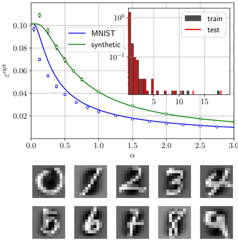
## Line Chart: ε_opt vs α for MNIST and Synthetic Data
### Overview
The image presents a line chart comparing the optimal error rate (ε_opt) of two datasets (MNIST and synthetic) across varying values of α (0 to 3.0). A secondary histogram on the right visualizes the distribution of ε_opt values, while the bottom section displays blurred digit images (0-9).
### Components/Axes
- **X-axis (α)**: Ranges from 0.0 to 3.0 in increments of 0.5.
- **Y-axis (ε_opt)**: Logarithmic scale from 0.02 to 0.10.
- **Legend**: Located in the top-right corner, with:
- **Blue line**: MNIST dataset
- **Green line**: Synthetic dataset
- **Inset Histogram**: Right-aligned, with:
- **X-axis**: ε_opt values (10⁻¹ to 10⁰)
- **Y-axis**: Counts (0 to 10⁰)
- **Digit Images**: Two rows of 10 blurred digit samples (0-9) at the bottom.
### Detailed Analysis
1. **MNIST Line (Blue)**:
- Starts at ε_opt ≈ 0.08 at α=0.
- Decreases monotonically to ε_opt ≈ 0.02 at α=3.0.
- Data points marked with blue circles (○).
2. **Synthetic Line (Green)**:
- Starts at ε_opt ≈ 0.07 at α=0.
- Decreases more steeply than MNIST, reaching ε_opt ≈ 0.015 at α=3.0.
- Data points marked with green diamonds (♦).
3. **Histogram**:
- Majority of ε_opt values cluster between 0.02 and 0.05 (count ≈ 0.1).
- Fewer values exceed 0.10 (count ≈ 0.01).
4. **Digit Images**:
- Arranged in two rows (top: 0-4, bottom: 5-9).
- Blurred grayscale digits with visible noise artifacts.
### Key Observations
- **Performance Gap**: Synthetic data consistently outperforms MNIST across all α values (ε_opt ~20-30% lower).
- **Distribution Skew**: Histogram shows a long tail toward higher ε_opt values, suggesting rare but significant errors.
- **Digit Clarity**: Blurred digits imply potential preprocessing steps (e.g., denoising) or visualization of latent space samples.
### Interpretation
The chart demonstrates that synthetic data achieves lower optimal error rates than MNIST for all tested α values, indicating superior model generalizability or data quality. The histogram reveals that most ε_opt values are concentrated in the 0.02–0.05 range, with extreme errors being rare. The digit images likely represent either training samples or reconstructed outputs, with blurring suggesting regularization or dimensionality reduction effects. The α parameter may control model complexity or regularization strength, as increasing α correlates with reduced ε_opt for both datasets.