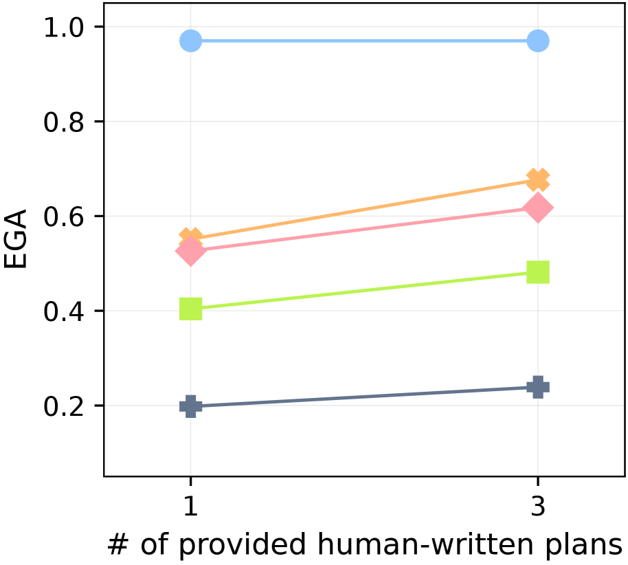
## Line Chart: EGA vs. Number of Provided Human-Written Plans
### Overview
The image is a line chart comparing the EGA (Expected Goal Achievement) score against the number of provided human-written plans (1 or 3). There are four distinct data series represented by different colored lines, each showing the trend of EGA as the number of plans increases from 1 to 3.
### Components/Axes
* **X-axis:** "# of provided human-written plans" with two data points: 1 and 3.
* **Y-axis:** "EGA" (Expected Goal Achievement), ranging from 0.2 to 1.0 in increments of 0.2.
* **Data Series:** Four distinct lines, each with a unique color and marker shape:
* Light Blue: Circle marker
* Light Green: Square marker
* Light Pink: Diamond marker
* Dark Gray: Plus marker
* Light Orange: X marker
### Detailed Analysis
* **Light Blue (Circle):** This line remains almost constant at EGA ~0.98, regardless of the number of provided plans.
* (1 plan, EGA ~0.98)
* (3 plans, EGA ~0.98)
* **Light Green (Square):** This line shows an upward trend, starting at EGA ~0.4 and increasing to EGA ~0.48.
* (1 plan, EGA ~0.4)
* (3 plans, EGA ~0.48)
* **Light Pink (Diamond):** This line also shows an upward trend, starting at EGA ~0.52 and increasing to EGA ~0.62.
* (1 plan, EGA ~0.52)
* (3 plans, EGA ~0.62)
* **Dark Gray (Plus):** This line shows a slight upward trend, starting at EGA ~0.2 and increasing to EGA ~0.24.
* (1 plan, EGA ~0.2)
* (3 plans, EGA ~0.24)
* **Light Orange (X):** This line shows an upward trend, starting at EGA ~0.56 and increasing to EGA ~0.68.
* (1 plan, EGA ~0.56)
* (3 plans, EGA ~0.68)
### Key Observations
* The light blue data series (circle marker) consistently achieves a high EGA score, irrespective of the number of provided plans.
* All other data series (light green, light pink, dark gray, light orange) show an increase in EGA score when the number of provided plans increases from 1 to 3.
* The dark gray data series (plus marker) consistently has the lowest EGA scores.
### Interpretation
The chart suggests that providing more human-written plans (increasing from 1 to 3) generally improves the Expected Goal Achievement (EGA) score for most of the data series represented. However, one data series (light blue) maintains a high EGA score regardless of the number of plans provided, indicating that its performance is not significantly affected by this variable. The dark gray data series consistently underperforms compared to the others, suggesting it may represent a less effective strategy or system. The other series show moderate improvements with more plans, indicating that the additional information is beneficial but not transformative.