# Technical Data Extraction: Network Traffic Frequency Analysis
## 1. Image Overview
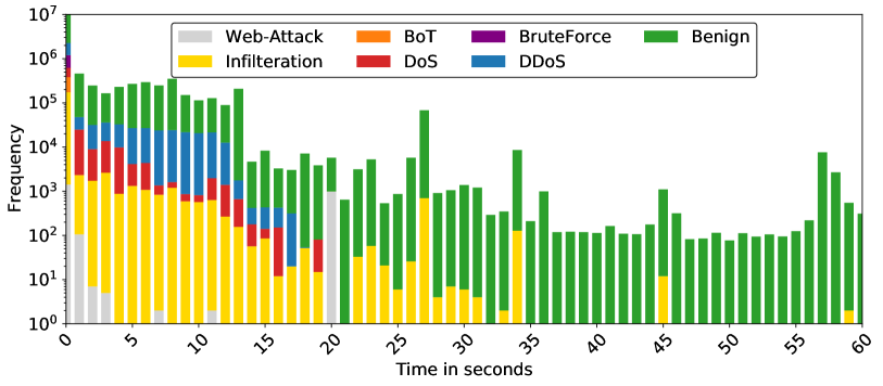
This image is a stacked bar chart representing the frequency of different types of network traffic (Benign and various attack types) over a duration of 60 seconds. The Y-axis uses a logarithmic scale to accommodate a wide range of frequency values, from $10^0$ to $10^7$.
## 2. Component Isolation
### A. Header / Legend
* **Location:** Top-center, enclosed in a rounded rectangle.
* **Content:** Seven categories with corresponding color codes.
* **Web-Attack:** Light Grey
* **Infiltration:** Yellow
* **BoT:** Orange (Note: Visually minimal presence in the bars)
* **DoS:** Red
* **BruteForce:** Purple
* **DDoS:** Blue
* **Benign:** Green
### B. Main Chart Area (Axes)
* **Y-Axis (Vertical):**
* **Label:** "Frequency"
* **Scale:** Logarithmic, ranging from $10^0$ (1) to $10^7$ (10,000,000).
* **Markers:** $10^0, 10^1, 10^2, 10^3, 10^4, 10^5, 10^6, 10^7$.
* **X-Axis (Horizontal):**
* **Label:** "Time in seconds"
* **Range:** 0 to 60 seconds.
* **Markers:** Increments of 5 (0, 5, 10, 15, 20, 25, 30, 35, 40, 45, 50, 55, 60). Labels are rotated approximately 45 degrees.
## 3. Data Series Analysis and Trends
### Benign (Green)
* **Trend:** Present across the entire 60-second window. It is the dominant category in terms of total volume, consistently reaching heights between $10^2$ and $10^5$.
* **Key Observations:** Peaks significantly at $t=0$ (reaching $10^7$) and shows a notable spike around $t=27$ and $t=57$.
### DDoS (Blue)
* **Trend:** Concentrated in the first 20 seconds.
* **Key Observations:** Starts strong at $t=0$ (approx. $10^6$), maintains a steady presence around $10^4$ until $t=13$, then tapers off and disappears after $t=18$.
### DoS (Red)
* **Trend:** Primarily active in the first 15 seconds, with a small resurgence around $t=18-19$.
* **Key Observations:** Highest frequency at $t=0$ (approx. $10^5$). It fluctuates between $10^3$ and $10^4$ in the first 10 seconds.
### Infiltration (Yellow)
* **Trend:** Persistent from $t=0$ to $t=32$, with sporadic appearances later (e.g., $t=34, 45, 59$).
* **Key Observations:** Maintains a relatively high frequency (between $10^2$ and $10^3$) for the first 12 seconds before gradually declining.
### Web-Attack (Light Grey)
* **Trend:** Highly localized.
* **Key Observations:** Visible at $t=0$ to $t=3$, and a significant isolated spike at $t=20$.
### BruteForce (Purple)
* **Trend:** Extremely short-lived.
* **Key Observations:** Only clearly visible at $t=0$ with a frequency of approximately $10^6$.
### BoT (Orange)
* **Trend:** Negligible visual footprint.
* **Key Observations:** While listed in the legend, orange segments are not distinctly visible at this scale, suggesting very low frequency relative to other categories.
## 4. Summary of Temporal Distribution
| Time Segment | Dominant Traffic Types | Activity Description |
| :--- | :--- | :--- |
| **0 - 15s** | All types (Benign, DDoS, DoS, Infiltration, BruteForce, Web-Attack) | High-intensity period. Most attack vectors are active simultaneously. Total frequency is highest here. |
| **15 - 30s** | Benign, Infiltration, DDoS (early), Web-Attack (spike at 20s) | Transition period. Attack variety decreases; Benign traffic remains steady. |
| **30 - 60s** | Benign | Low-intensity period. Traffic is almost exclusively Benign, with very minor, isolated Infiltration events. |
## 5. Technical Notes
* **Logarithmic Distortion:** Because the Y-axis is logarithmic, the visual "height" of the top segments (like Benign) represents a much larger absolute number of events than the segments at the bottom of the stack.
* **Data Density:** The chart uses 60 discrete bars, representing 1-second intervals.