## Bar Chart: Frequency of Thinking Tokens
### Overview
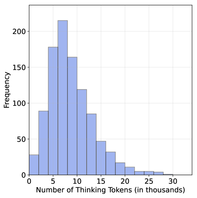
The image is a bar chart visualizing the distribution of "Thinking Tokens" across different ranges. The x-axis represents the number of thinking tokens (in thousands), and the y-axis represents frequency. The chart shows a right-skewed distribution with a sharp decline in frequency as the number of tokens increases.
### Components/Axes
- **X-axis**: "Number of Thinking Tokens (in thousands)" with intervals at 0, 5, 10, 15, 20, 25, and 30.
- **Y-axis**: "Frequency" with values ranging from 0 to 200 in increments of 50.
- **Legend**: Located in the top-right corner, indicating the color blue corresponds to the data series.
- **Bars**: All bars are blue, with heights proportional to frequency.
### Detailed Analysis
- **0–5k tokens**: Frequency ≈ 30.
- **5–10k tokens**: Frequency peaks at ≈ 220 (tallest bar).
- **10–15k tokens**: Frequency ≈ 165.
- **15–20k tokens**: Frequency ≈ 85.
- **20–25k tokens**: Frequency ≈ 30.
- **25–30k tokens**: Frequency ≈ 5.
- **30k+ tokens**: Frequency ≈ 0.
### Key Observations
1. The distribution is heavily concentrated in the **5–10k token range**, with the highest frequency (~220).
2. A sharp decline occurs after 10k tokens, with frequencies dropping below 100 for all higher ranges.
3. No tokens are recorded beyond 30k, suggesting a possible upper limit or data truncation.
### Interpretation
The data suggests that **most thinking tokens are concentrated in lower ranges**, with a significant drop-off after 10k tokens. This could indicate:
- A natural or system-imposed limit on token usage.
- An optimal threshold where higher token counts are either unnecessary or impractical.
- A potential anomaly in data collection for higher ranges (e.g., underrepresentation).
The right-skewed distribution implies that while low-to-moderate token usage is common, extreme values (e.g., >10k) are rare. This pattern might reflect real-world constraints or user behavior in the context of the dataset.