## Bar Charts: Token Frequency Distribution for Questions and Answers
### Overview
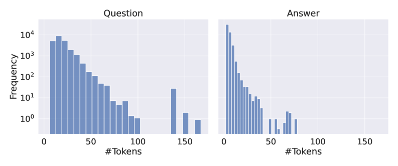
The image contains two side-by-side bar charts comparing the frequency distribution of token counts for "Questions" and "Answers." Both charts use a logarithmic scale (10⁰ to 10⁴) on the y-axis (Frequency) and a linear scale (0 to 150) on the x-axis (#Tokens). The data suggests differences in how questions and answers are structured in terms of token length.
### Components/Axes
- **X-axis (Horizontal)**:
- Label: `#Tokens`
- Range: 0 to 150 (linear scale)
- Tick marks: Every 50 units (0, 50, 100, 150)
- **Y-axis (Vertical)**:
- Label: `Frequency`
- Scale: Logarithmic (10⁰ to 10⁴)
- Tick marks: 10⁰, 10¹, 10², 10³, 10⁴
- **Charts**:
- **Left Chart**: Titled "Question"
- **Right Chart**: Titled "Answer"
- No explicit legend, but the chart titles act as labels for the data series.
### Detailed Analysis
#### Question Chart
- **Trend**:
- Frequency decreases sharply as token count increases.
- Peaks at ~10⁴ for 10 tokens, then declines to ~10¹ at 150 tokens.
- **Key Data Points**:
- 0–10 tokens: Frequencies range from ~10³ to ~10⁴.
- 50 tokens: ~10².
- 100 tokens: ~10¹.
- 150 tokens: ~10¹ (outlier, significantly lower than adjacent bins).
#### Answer Chart
- **Trend**:
- Sharp peak at 0 tokens (~10⁴), followed by a steep decline.
- Frequencies drop to ~10¹ at 50 tokens, with sporadic bars at higher token counts (e.g., 100, 150).
- **Key Data Points**:
- 0 tokens: ~10⁴ (dominant peak).
- 10 tokens: ~10³.
- 50 tokens: ~10¹.
- 100 tokens: ~10¹.
- 150 tokens: ~10¹ (outlier, similar to Question chart).
### Key Observations
1. **Question Distribution**:
- Questions are more evenly distributed across token counts, with a gradual decline.
- A notable outlier at 150 tokens suggests some unusually long questions.
2. **Answer Distribution**:
- Answers are heavily concentrated at 0 tokens, indicating many short or empty answers.
- A few answers extend to 150 tokens, but these are rare (frequency ~10¹).
3. **Log Scale Impact**:
- The logarithmic y-axis emphasizes the disparity in frequency between low and high token counts.
- Without this scale, the Answer chart’s peak at 0 tokens would appear disproportionately large.
### Interpretation
- **Structural Differences**:
- Questions tend to be more variable in length, while answers are predominantly short, with a few exceptions.
- The Answer chart’s peak at 0 tokens may reflect placeholder or incomplete responses.
- **Implications**:
- The data could indicate a need for better answer quality control or question design to reduce variability.
- The outlier at 150 tokens in both charts suggests potential anomalies (e.g., malformed data, edge cases).
- **Peircean Insight**:
- The log scale reveals hidden patterns (e.g., the Answer chart’s dominance at 0 tokens) that a linear scale might obscure.
- The similarity in outlier frequencies at 150 tokens hints at a shared underlying process (e.g., data generation or user behavior).