## Scatter Plot: Execution Time vs. Number of Spins
### Overview
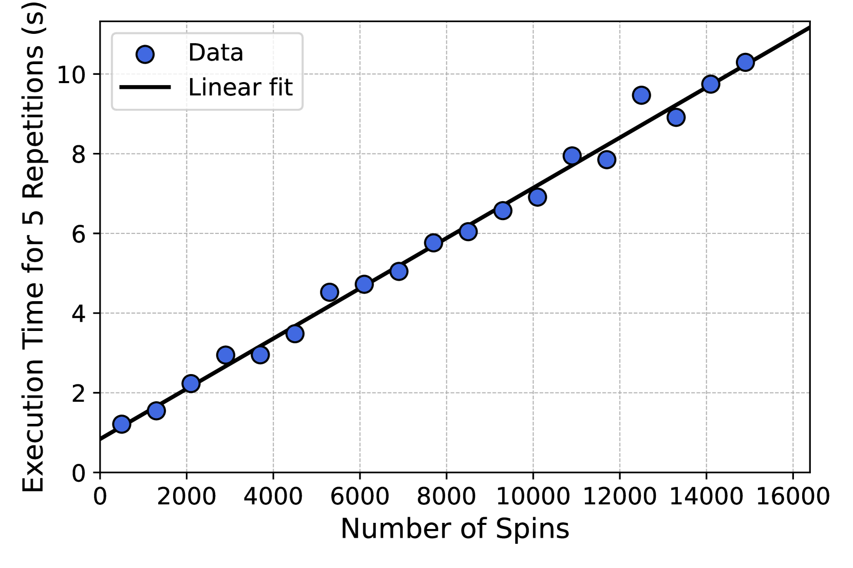
The image is a scatter plot showing the relationship between the number of spins and the execution time for 5 repetitions. A linear fit line is overlaid on the data points, indicating a positive correlation between the two variables.
### Components/Axes
- **X-axis (Horizontal)**: "Number of Spins" with values ranging from 0 to 16,000 in increments of 2,000.
- **Y-axis (Vertical)**: "Execution Time for 5 Repetitions (s)" with values ranging from 0 to 10 in increments of 2.
- **Legend**: Located in the top-left corner.
- **Data**: Blue circles (labeled "Data").
- **Linear fit**: Black line (labeled "Linear fit").
### Detailed Analysis
- **Data Points**: Blue circles are plotted across the graph, showing a general upward trend.
- **Linear Fit**: A black line passes through the data points, starting near (0, 0) and ending near (16,000, 10). The slope of the line suggests a direct proportionality between spins and execution time.
- **Spread of Data**: Some data points deviate slightly from the linear fit, with a few above and below the line.
### Key Observations
1. **Positive Correlation**: As the number of spins increases, the execution time for 5 repetitions also increases.
2. **Linear Relationship**: The linear fit line indicates a strong linear trend, though minor deviations exist.
3. **Outliers**: A few data points (e.g., near 12,000 spins) show slightly higher execution times than the linear fit predicts.
### Interpretation
The data demonstrates that execution time scales linearly with the number of spins, suggesting a predictable relationship between the two variables. The linear fit line provides a clear model for estimating execution time based on spin count. However, the slight deviations from the line indicate potential variability in the system, such as experimental noise or unaccounted factors. This trend is critical for optimizing performance in systems where spin count and execution time are interdependent.