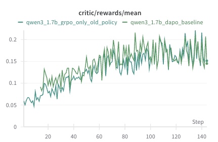
## Line Chart: Critic Rewards Mean Over Training Steps
### Overview
The image displays a line chart tracking the mean critic rewards for two different model training configurations over the course of approximately 140 training steps. The chart compares the performance of a "GRPO only old policy" method against a "DAPO baseline" method for a model identified as "qwen3_1.7b".
### Components/Axes
* **Chart Title:** `critic/rewards/mean` (centered at the top).
* **X-Axis:**
* **Label:** `Step` (positioned at the bottom-right).
* **Scale:** Linear scale from 0 to 140, with major tick marks labeled at intervals of 20 (0, 20, 40, 60, 80, 100, 120, 140).
* **Y-Axis:**
* **Scale:** Linear scale from 0 to 0.2, with major tick marks labeled at intervals of 0.05 (0, 0.05, 0.1, 0.15, 0.2).
* **Legend:** Positioned in the top-left corner of the plot area.
* **Entry 1:** A blue line labeled `qwen3_1.7b_grpo_only_old_policy`.
* **Entry 2:** A green line labeled `qwen3_1.7b_dapo_baseline`.
* **Plot Area:** Contains two fluctuating line series plotted against a white background with light gray horizontal grid lines aligned with the y-axis ticks.
### Detailed Analysis
**Data Series 1: `qwen3_1.7b_grpo_only_old_policy` (Blue Line)**
* **Trend:** Shows a clear upward trend with significant high-frequency volatility (noise). The line starts near 0.05 at step 0 and exhibits a general increase, with the amplitude of fluctuations growing over time.
* **Key Data Points (Approximate):**
* Start (Step ~0): ~0.05
* Step ~20: Peaks around 0.13
* Step ~60: Fluctuates between ~0.12 and ~0.18
* Step ~100: Reaches a local peak near 0.22
* End (Step ~140): Fluctuates between ~0.15 and ~0.22, with the final point near 0.15.
* **Visual Character:** This series is the more volatile of the two, frequently crossing above and below the green line, but spending more time above it after approximately step 60.
**Data Series 2: `qwen3_1.7b_dapo_baseline` (Green Line)**
* **Trend:** Also shows a clear upward trend but with noticeably lower volatility compared to the blue line. It starts at a similar point and increases more steadily.
* **Key Data Points (Approximate):**
* Start (Step ~0): ~0.05
* Step ~20: Around 0.08
* Step ~60: Fluctuates between ~0.10 and ~0.15
* Step ~100: Fluctuates between ~0.13 and ~0.17
* End (Step ~140): Fluctuates between ~0.14 and ~0.18, with the final point near 0.14.
* **Visual Character:** This series acts as a smoother baseline. It is generally enveloped by the blue line's fluctuations, suggesting the GRPO method achieves higher peak rewards but with less stability.
### Key Observations
1. **Positive Correlation with Training:** Both methods show a positive correlation between training steps and mean critic reward, indicating learning is occurring.
2. **Volatility Divergence:** The primary difference is not in the overall trend but in the variance. The `grpo_only_old_policy` (blue) exhibits much larger swings, suggesting its reward signal is noisier or its policy updates are more aggressive.
3. **Crossover Points:** The lines cross multiple times, particularly in the first 60 steps. After step ~80, the blue line's peaks consistently exceed the green line's peaks, though its troughs can fall below.
4. **No Clear Plateau:** Neither line shows a definitive plateau by step 140, suggesting training might benefit from continuation to observe convergence.
### Interpretation
This chart is a training diagnostic plot from a reinforcement learning or alignment process for a large language model (LLM). The "critic/rewards/mean" metric likely measures the average score assigned by a critic model to the outputs generated by the policy model being trained.
* **What the data suggests:** The `qwen3_1.7b_grpo_only_old_policy` configuration appears to be more effective at achieving higher maximum reward scores over time compared to the `qwen3_1.7b_dapo_baseline`. However, this comes at the cost of stability, as evidenced by the high variance. The DAPO baseline provides a more consistent, if slightly lower, reward signal.
* **How elements relate:** The x-axis (Step) represents training progression. The upward trend in both lines indicates that both training methods are successfully improving the model's ability to generate outputs that the critic rewards. The divergence in volatility highlights a trade-off between performance (peak reward) and stability (consistency of reward).
* **Notable anomalies:** The dramatic increase in the amplitude of the blue line's fluctuations after step 80 is notable. It could indicate a change in the training dynamics, such as the policy entering a more exploratory phase or the critic's scoring becoming more sensitive.
* **Underlying significance:** For a machine learning engineer, this plot would inform a decision. If the goal is to maximize peak performance and some instability is acceptable, the GRPO method is promising. If stable, predictable improvement is critical, the DAPO baseline might be preferred. The lack of a plateau suggests the optimal training duration is longer than 140 steps for both methods.