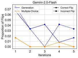
## Line Chart: Gemini-2.0-Flip Proportions Over Iterations
### Overview
The image is a line chart titled "Gemini-2.0-Flash" that plots the "Proportion of Flips" against "Iterations" for two different methods: "Generation" and "Multiple-Choice". The chart tracks these proportions over five discrete iterations. A legend indicates that data points are marked as either "Correct Flip" (circle) or "Incorrect Flip" (square).
### Components/Axes
* **Title:** "Gemini-2.0-Flash" (centered at the top).
* **Y-Axis (Vertical):**
* **Label:** "Proportion of Flips".
* **Scale:** Linear scale from 0.00 to 0.07, with major tick marks at 0.00, 0.01, 0.02, 0.03, 0.04, 0.05, 0.06, and 0.07.
* **X-Axis (Horizontal):**
* **Label:** "Iterations".
* **Scale:** Discrete integer scale from 1 to 5.
* **Legend (Top-Left Corner):**
* **Blue Line:** Labeled "Generation".
* **Orange Line:** Labeled "Multiple-Choice".
* **Marker Key:**
* Circle (●): "Correct Flip".
* Square (■): "Incorrect Flip".
* **Data Series:**
1. **Generation (Blue Line):** A solid blue line connecting data points marked with circles.
2. **Multiple-Choice (Orange Line):** A solid orange line connecting data points marked with circles.
### Detailed Analysis
**Trend Verification & Data Points (Approximate Values):**
* **Generation (Blue Line):**
* **Trend:** The line shows a general downward trend with significant fluctuations. It starts high, drops sharply, recovers partially, drops again, and then rises slightly.
* **Data Points (Iteration, Proportion):**
* Iteration 1: ~0.065 (Circle - Correct Flip)
* Iteration 2: ~0.035 (Circle - Correct Flip)
* Iteration 3: ~0.040 (Circle - Correct Flip)
* Iteration 4: ~0.010 (Circle - Correct Flip)
* Iteration 5: ~0.018 (Circle - Correct Flip)
* **Multiple-Choice (Orange Line):**
* **Trend:** The line shows a sharp initial drop followed by a stable, very low proportion near zero for the remaining iterations.
* **Data Points (Iteration, Proportion):**
* Iteration 1: ~0.018 (Circle - Correct Flip)
* Iteration 2: ~0.002 (Circle - Correct Flip)
* Iteration 3: ~0.001 (Circle - Correct Flip)
* Iteration 4: ~0.002 (Circle - Correct Flip)
* Iteration 5: ~0.001 (Circle - Correct Flip)
**Component Isolation & Marker Analysis:**
* **Header Region:** Contains only the chart title.
* **Main Chart Region:** Contains the two plotted lines, axes, and gridlines.
* **Legend Region:** Located in the top-left corner of the plot area. It defines the line colors and the meaning of the marker shapes.
* **Marker Consistency Check:** All visible data points on **both** the blue and orange lines are marked with **circles**. According to the legend, circles denote "Correct Flip". **No square markers ("Incorrect Flip") are present on the chart.** This indicates that for the data shown, all recorded flips were classified as correct.
### Key Observations
1. **Magnitude Difference:** The "Generation" method consistently exhibits a higher proportion of flips than the "Multiple-Choice" method across all iterations, with the largest gap at Iteration 1.
2. **Convergence at Low Values:** By Iterations 4 and 5, the proportion for "Generation" drops to a level (0.010-0.018) that is much closer to the consistently low "Multiple-Choice" values (~0.001-0.002).
3. **Absence of Incorrect Flips:** The most notable observation is the complete absence of data points marked as "Incorrect Flip" (squares). The legend includes this category, but it is not utilized in the plotted data.
4. **Volatility:** The "Generation" line is more volatile, showing larger swings between iterations compared to the relatively flat "Multiple-Choice" line after the first iteration.
### Interpretation
This chart appears to compare the stability or error-correction behavior of two different model response methods ("Generation" vs. "Multiple-Choice") over sequential iterations, likely in a testing or refinement loop. A "flip" probably refers to a change in the model's output or answer between iterations.
* **What the data suggests:** The "Multiple-Choice" method is highly stable from the outset, with a very low and decreasing rate of change (flips). The "Generation" method starts with a high rate of change, suggesting initial instability or active revision, but this rate decreases substantially over time, indicating convergence or stabilization.
* **Relationship between elements:** The higher initial flip rate for "Generation" may reflect its open-ended nature, allowing for more variation before settling. The low, flat line for "Multiple-Choice" suggests its constrained format leads to quicker consensus or less need for revision.
* **Notable Anomaly:** The legend's inclusion of an "Incorrect Flip" category that has no corresponding data points is a significant anomaly. This could mean: a) No incorrect flips occurred in this experiment, b) The data for incorrect flips was omitted from this specific visualization, or c) The legend is a generic template not fully customized for this chart. This absence prevents analysis of flip *quality* and limits the interpretation to flip *frequency* only. The chart effectively shows only the rate of "Correct Flips" for both methods.