## Chart Type: Line Plots and Scatter Plot
### Overview
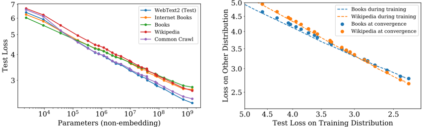
The image contains two plots. The left plot is a line plot showing the test loss as a function of the number of parameters for different datasets. The right plot is a scatter plot showing the loss on other distributions versus the test loss on the training distribution for books and Wikipedia datasets during training and at convergence.
### Components/Axes
**Left Plot:**
* **X-axis:** Parameters (non-embedding). Logarithmic scale from 10^4 to 10^9.
* **Y-axis:** Test Loss. Linear scale from 3 to 7.
* **Legend (top-right):**
* Blue: WebText2 (Test)
* Orange: Internet Books
* Green: Books
* Red: Wikipedia
* Purple: Common Crawl
**Right Plot:**
* **X-axis:** Test Loss on Training Distribution. Linear scale from 2.5 to 5.0.
* **Y-axis:** Loss on Other Distribution. Linear scale from 2.5 to 5.0.
* **Legend (top-right):**
* Dashed Blue: Books during training
* Dashed Orange: Wikipedia during training
* Solid Blue: Books at convergence
* Solid Orange: Wikipedia at convergence
### Detailed Analysis
**Left Plot: Test Loss vs. Parameters**
* **WebText2 (Test) (Blue):** The line slopes downward. Starts at approximately 6.2 at 10^4 parameters and decreases to approximately 3.2 at 10^9 parameters.
* **Internet Books (Orange):** The line slopes downward. Starts at approximately 6.3 at 10^4 parameters and decreases to approximately 3.5 at 10^9 parameters.
* **Books (Green):** The line slopes downward. Starts at approximately 6.1 at 10^4 parameters and decreases to approximately 3.8 at 10^9 parameters.
* **Wikipedia (Red):** The line slopes downward. Starts at approximately 6.4 at 10^4 parameters and decreases to approximately 3.9 at 10^9 parameters.
* **Common Crawl (Purple):** The line slopes downward. Starts at approximately 5.8 at 10^4 parameters and decreases to approximately 3.3 at 10^9 parameters.
**Right Plot: Loss on Other Distribution vs. Test Loss on Training Distribution**
* **Books during training (Dashed Blue):** The line slopes downward. Starts at approximately (4.8, 4.9) and ends at approximately (2.7, 3.0).
* **Wikipedia during training (Dashed Orange):** The line slopes downward. Starts at approximately (4.8, 5.0) and ends at approximately (2.7, 2.8).
* **Books at convergence (Solid Blue):** The points are scattered along a downward trend. The points range from approximately (4.7, 4.7) to (3.3, 3.8).
* **Wikipedia at convergence (Solid Orange):** The points are scattered along a downward trend. The points range from approximately (4.7, 4.8) to (3.3, 3.9).
### Key Observations
* In the left plot, all datasets show a decrease in test loss as the number of parameters increases.
* In the left plot, Wikipedia has the highest test loss for most parameter values, while Common Crawl generally has the lowest.
* In the right plot, both books and Wikipedia show a negative correlation between the test loss on the training distribution and the loss on other distributions.
* In the right plot, the "during training" data points form a more linear trend compared to the "at convergence" data points.
### Interpretation
The left plot demonstrates that increasing the number of parameters in a model generally leads to a reduction in test loss, indicating improved model performance. The different datasets exhibit varying levels of test loss, suggesting that the complexity or characteristics of the data influence model performance.
The right plot suggests a trade-off between performance on the training distribution and performance on other distributions. As the test loss on the training distribution decreases, the loss on other distributions also tends to decrease. The "at convergence" data points indicate the final state of the model after training, while the "during training" data points show the trajectory of the model's performance during the training process. The difference in the trends between "during training" and "at convergence" suggests that the relationship between these losses changes as the model converges.