\n
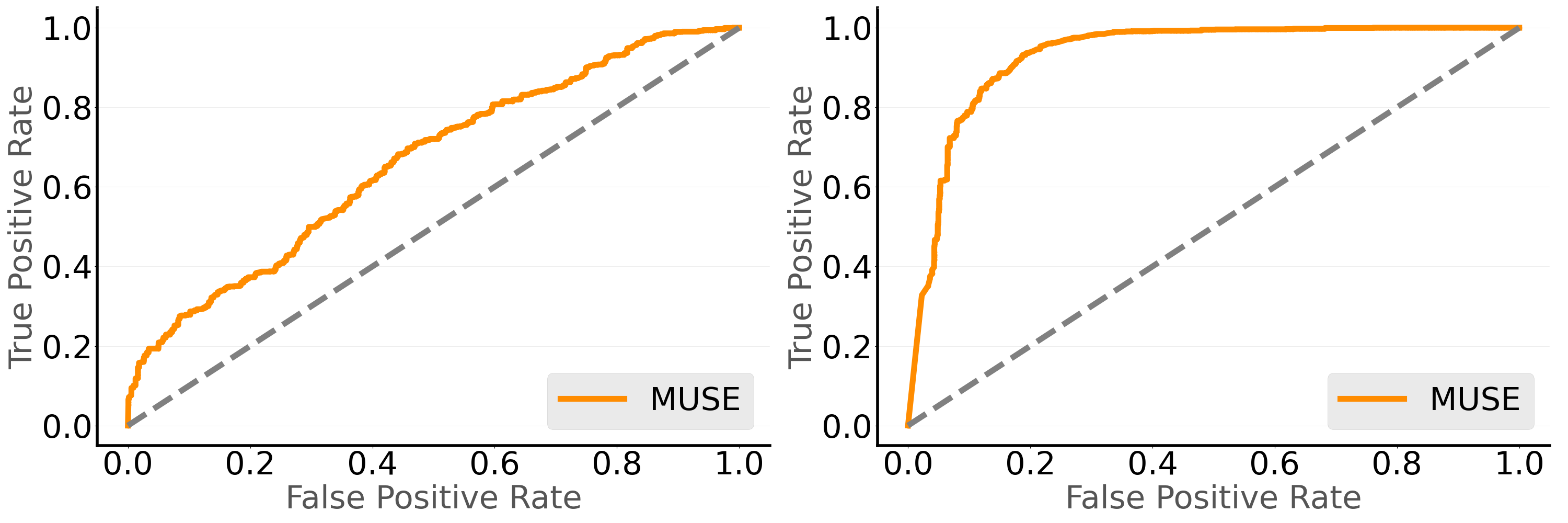
## Chart: Receiver Operating Characteristic (ROC) Curves
### Overview
The image presents two Receiver Operating Characteristic (ROC) curves, likely representing the performance of a classification model (labeled "MUSE") across different threshold settings. Each ROC curve plots the True Positive Rate (TPR) against the False Positive Rate (FPR). A diagonal dashed gray line represents a random classifier (TPR = FPR). The curves visually demonstrate the trade-off between sensitivity and specificity.
### Components/Axes
* **X-axis:** False Positive Rate (ranging from 0.0 to 1.0)
* **Y-axis:** True Positive Rate (ranging from 0.0 to 1.0)
* **Data Series:** "MUSE" (represented by an orange solid line) - appears twice.
* **Reference Line:** A dashed gray line representing a random classifier (TPR = FPR).
* **Legend:** Located in the bottom-right corner of each plot, labeling the orange line as "MUSE".
### Detailed Analysis or Content Details
**Plot 1 (Left):**
The orange "MUSE" line starts at approximately (0.0, 0.0). It initially slopes upward relatively steeply, reaching a TPR of around 0.2 at an FPR of approximately 0.1. The curve continues to rise, but the slope decreases. At an FPR of 0.4, the TPR is around 0.5. At an FPR of 0.6, the TPR is approximately 0.7. The curve plateaus around a TPR of 0.9, with an FPR of approximately 0.95.
**Plot 2 (Right):**
The orange "MUSE" line starts at approximately (0.0, 0.0). It rises very steeply initially, reaching a TPR of around 0.8 at an FPR of approximately 0.2. The curve continues to rise, but the slope decreases. At an FPR of 0.4, the TPR is around 0.9. At an FPR of 0.6, the TPR is approximately 0.95. The curve plateaus around a TPR of 0.98, with an FPR of approximately 0.98.
### Key Observations
* Both ROC curves demonstrate that the "MUSE" model performs significantly better than random chance (the diagonal line).
* The second plot (right) shows a substantially better performance than the first plot (left). The curve is closer to the top-left corner, indicating a higher TPR for a given FPR.
* The area under the curve (AUC) is visually larger in the second plot, suggesting a better ability to discriminate between positive and negative cases.
* Both curves exhibit a trade-off between TPR and FPR. Increasing the threshold to improve specificity (reduce FPR) results in a decrease in sensitivity (TPR), and vice versa.
### Interpretation
The ROC curves suggest that the "MUSE" model is capable of distinguishing between positive and negative cases. The difference in performance between the two plots indicates that there may be different datasets, different model configurations, or different threshold settings being evaluated. The second plot demonstrates a much stronger ability to correctly identify positive cases while minimizing false positives.
The curves are useful for evaluating the model's performance and selecting an appropriate operating point (threshold) based on the specific application's requirements. For example, if minimizing false positives is critical, a lower threshold would be chosen, even if it means missing some true positives. Conversely, if maximizing true positives is paramount, a higher threshold would be selected, accepting a higher rate of false positives.
The fact that both curves are above the diagonal line indicates that the model is consistently performing better than random guessing. The steepness of the initial rise in the curves suggests that the model is particularly good at identifying true positives with a low rate of false positives.