## ROC Curves: MUSE Model Performance Comparison
### Overview
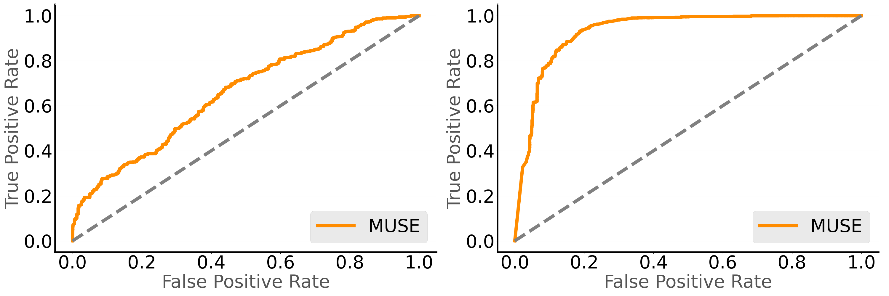
The image displays two side-by-side Receiver Operating Characteristic (ROC) curves comparing the performance of the MUSE model under different conditions. Each curve is plotted against a diagonal dashed baseline representing random guessing (50% accuracy). The left graph shows a gradual improvement in true positive rate (TPR) with increasing false positive rate (FPR), while the right graph demonstrates rapid early gains followed by plateauing performance.
### Components/Axes
- **X-axis (False Positive Rate)**: Labeled "False Positive Rate" with ticks at 0.0, 0.2, 0.4, 0.6, 0.8, 1.0
- **Y-axis (True Positive Rate)**: Labeled "True Positive Rate" with ticks at 0.0, 0.2, 0.4, 0.6, 0.8, 1.0
- **Legend**: Positioned at bottom-right of each graph, labeled "MUSE" with orange line indicator
- **Baseline**: Diagonal dashed gray line from (0,0) to (1,1) in both graphs
- **Data Lines**: Orange solid lines representing MUSE model performance
### Detailed Analysis
**Left Graph (Gradual Improvement):**
- Starts at (0,0)
- Reaches approximately (0.2, 0.4)
- Passes through (0.4, 0.7)
- Ends near (0.8, 0.95)
- Final point approaches (1,1) with FPR=0.95 and TPR=0.98
**Right Graph (Rapid Early Gains):**
- Starts at (0,0)
- Reaches (0.1, 0.9) within first 10% FPR
- Plateaus at TPR=0.95 between FPR=0.1 and 0.3
- Final point at (1,1) with FPR=0.98 and TPR=1.0
### Key Observations
1. **Performance Trade-off**: Left graph shows balanced TPR/FPR trade-off, while right graph prioritizes early detection at higher false positives
2. **Saturation Point**: Right graph's plateau at TPR=0.95 suggests diminishing returns after initial gains
3. **Baseline Comparison**: Both curves significantly outperform the random guessing baseline (dashed line)
4. **Final Performance**: Right graph achieves perfect TPR=1.0 at FPR=0.98 vs left graph's TPR=0.98 at FPR=0.95
### Interpretation
The contrasting curves suggest two distinct model behaviors:
1. **Left Graph**: Indicates a model with consistent learning across all thresholds, potentially suitable for balanced decision-making where false positives are costly
2. **Right Graph**: Represents a model optimized for early detection, possibly at the expense of precision. The plateau suggests limited capacity to distinguish between classes beyond initial thresholds.
The divergence in performance patterns could reflect differences in:
- Training data distribution
- Model architecture choices
- Threshold selection strategies
- Class imbalance handling
The right graph's perfect TPR at high FPR might indicate overfitting or data saturation, while the left graph's gradual curve suggests more generalizable performance characteristics.