## Chart Compilation: Super GNN Training & Prediction Analysis
### Overview
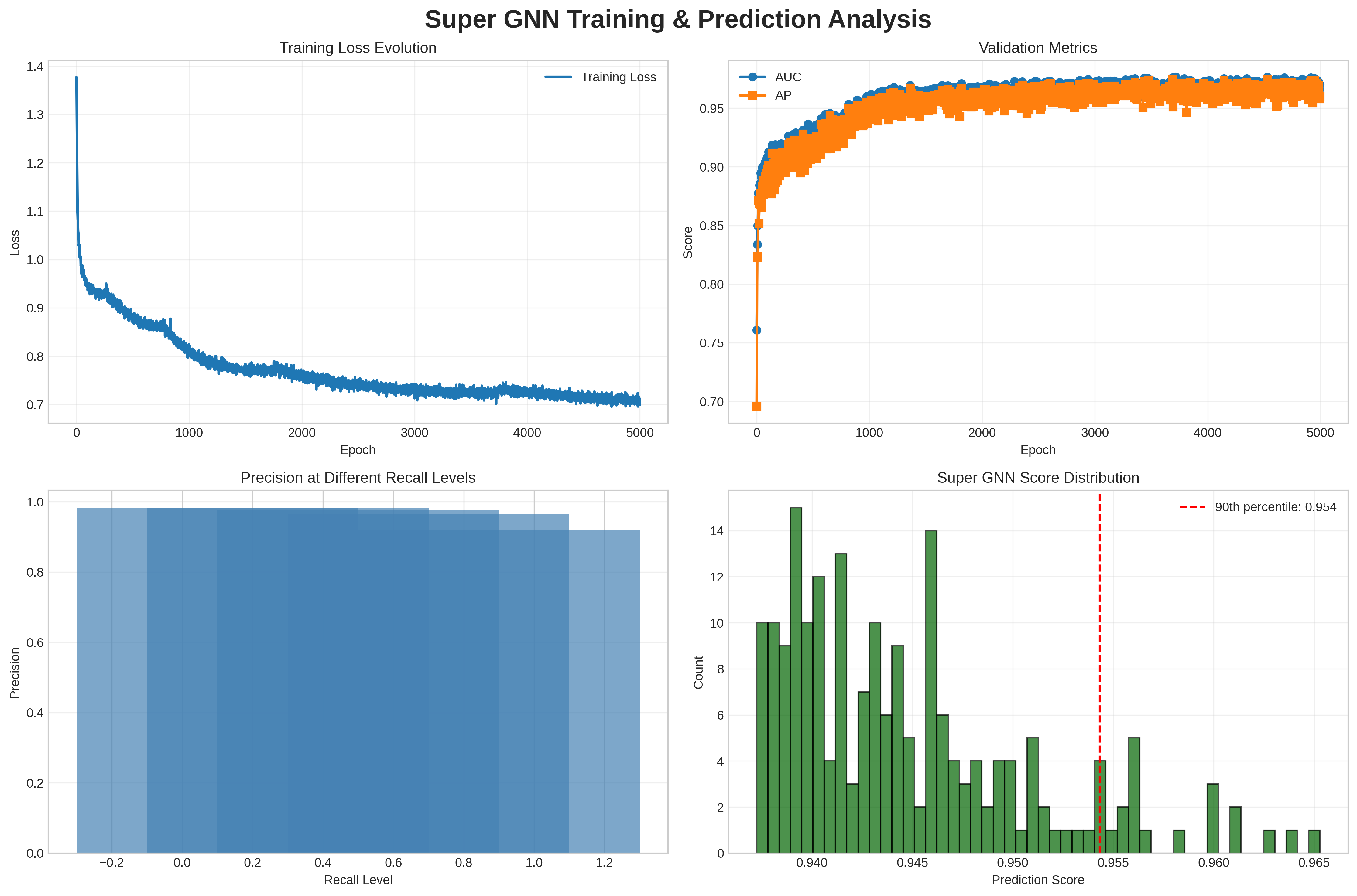
The image presents a compilation of four charts analyzing the training and prediction performance of a Super GNN model. The charts depict training loss evolution, validation metrics (AUC and AP), precision at different recall levels, and the distribution of Super GNN scores.
### Components/Axes
**Top-Left Chart: Training Loss Evolution**
* **Title:** Training Loss Evolution
* **X-axis:** Epoch (ranging from 0 to 5000)
* **Y-axis:** Loss (ranging from 0.7 to 1.4)
* **Legend:** Training Loss (blue line)
**Top-Right Chart: Validation Metrics**
* **Title:** Validation Metrics
* **X-axis:** Epoch (ranging from 0 to 5000)
* **Y-axis:** Score (ranging from 0.7 to 0.95)
* **Legend:**
* AUC (blue line with circle markers)
* AP (orange line with square markers)
**Bottom-Left Chart: Precision at Different Recall Levels**
* **Title:** Precision at Different Recall Levels
* **X-axis:** Recall Level (ranging from approximately -0.2 to 1.2)
* **Y-axis:** Precision (ranging from 0.0 to 1.0)
* **Data:** A series of overlapping blue bars, each representing precision at a specific recall level.
**Bottom-Right Chart: Super GNN Score Distribution**
* **Title:** Super GNN Score Distribution
* **X-axis:** Prediction Score (ranging from 0.940 to 0.965)
* **Y-axis:** Count (ranging from 0 to 14)
* **Data:** A green histogram showing the distribution of prediction scores.
* **Additional Element:** A vertical dashed red line indicating the 90th percentile at a score of 0.954.
### Detailed Analysis
**Training Loss Evolution**
* The blue "Training Loss" line starts at approximately 1.38 and rapidly decreases until around epoch 1000, where it reaches approximately 0.8. From epoch 1000 to 5000, the loss continues to decrease gradually, fluctuating around 0.75.
* Trend: Decreasing loss over epochs, indicating learning.
**Validation Metrics**
* The blue "AUC" line starts at approximately 0.76 and increases rapidly until around epoch 1000, where it reaches approximately 0.93. From epoch 1000 to 5000, the AUC continues to increase slightly, fluctuating around 0.97.
* The orange "AP" line starts at approximately 0.70 and increases rapidly until around epoch 1000, where it reaches approximately 0.94. From epoch 1000 to 5000, the AP fluctuates around 0.96.
* Trend: Both AUC and AP increase rapidly initially and then plateau, indicating model convergence.
**Precision at Different Recall Levels**
* The blue bars show the precision at different recall levels. The precision is high (close to 1.0) for lower recall levels and gradually decreases as the recall level increases.
* Trend: Decreasing precision with increasing recall.
**Super GNN Score Distribution**
* The green histogram shows the distribution of prediction scores. The distribution appears to be somewhat normal, with a peak around 0.940-0.945.
* The red dashed line indicates the 90th percentile at a score of 0.954.
* Trend: The distribution is centered around 0.945, with a long tail towards higher scores.
### Key Observations
* The training loss decreases over time, indicating that the model is learning.
* The validation metrics (AUC and AP) increase rapidly initially and then plateau, indicating model convergence.
* Precision decreases as recall increases, which is a common trade-off in machine learning.
* The distribution of Super GNN scores is somewhat normal, with a peak around 0.940-0.945.
### Interpretation
The charts provide a comprehensive analysis of the Super GNN model's performance. The decreasing training loss and increasing validation metrics indicate that the model is learning effectively. The precision-recall curve shows the trade-off between precision and recall. The distribution of Super GNN scores provides insights into the model's prediction behavior. The 90th percentile score can be used to identify high-confidence predictions. Overall, the charts suggest that the Super GNN model is performing well.