## Diagram Type: Causal Diagrams
### Overview
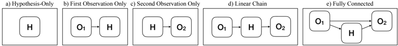
The image presents five different causal diagrams, each illustrating a different relationship between a hypothesis (H) and observations (O1, O2). The diagrams are labeled a) through e), and each is contained within a rectangular box. The nodes in the diagrams are represented by rounded rectangles, and the causal relationships are represented by arrows.
### Components/Axes
* **Nodes:**
* H: Hypothesis
* O1: First Observation
* O2: Second Observation
* **Edges:** Arrows indicating causal relationships.
* **Diagram Titles:**
* a) Hypothesis-Only
* b) First Observation Only
* c) Second Observation Only
* d) Linear Chain
* e) Fully Connected
### Detailed Analysis
* **a) Hypothesis-Only:** A single node labeled "H" is present within the box. There are no observations and no causal relationships.
* **b) First Observation Only:** Two nodes are present: "O1" and "H". An arrow points from "O1" to "H", indicating that the first observation influences the hypothesis.
* **c) Second Observation Only:** Two nodes are present: "H" and "O2". An arrow points from "H" to "O2", indicating that the hypothesis influences the second observation.
* **d) Linear Chain:** Three nodes are present: "O1", "H", and "O2". An arrow points from "O1" to "H", and another arrow points from "H" to "O2". This indicates a sequential causal relationship: O1 -> H -> O2.
* **e) Fully Connected:** Three nodes are present: "O1", "H", and "O2". Arrows point from "O1" to "H", from "O1" to "O2", and from "H" to "O2". This indicates that O1 influences both H and O2, and H also influences O2.
### Key Observations
* The diagrams illustrate different ways in which observations can influence a hypothesis and vice versa.
* The "Hypothesis-Only" diagram represents a scenario where the hypothesis is considered in isolation, without any observational data.
* The "Linear Chain" diagram represents a simple causal chain, where one observation influences the hypothesis, which in turn influences another observation.
* The "Fully Connected" diagram represents a more complex scenario, where the observations and hypothesis are all interconnected.
### Interpretation
The diagrams provide a visual representation of different causal models. They can be used to illustrate how observations can be used to test a hypothesis, or how a hypothesis can be used to predict future observations. The choice of which diagram is most appropriate depends on the specific context and the relationships between the variables being considered. The diagrams are useful for understanding the flow of influence between hypotheses and observations in various scenarios.