## NMSE vs. Iterations Chart
### Overview
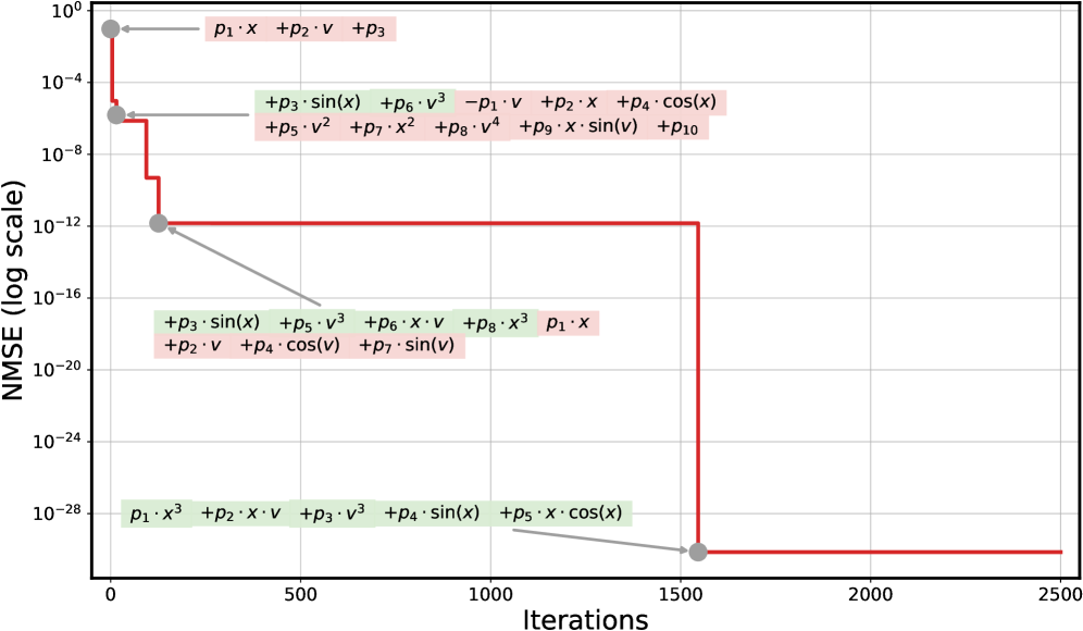
The image is a line chart showing the Normalized Mean Squared Error (NMSE) on a logarithmic scale versus the number of iterations. The chart displays a red line that represents the NMSE, which decreases in steps as the number of iterations increases. Several text annotations are placed near the line, indicating different mathematical expressions.
### Components/Axes
* **X-axis:** Iterations, ranging from 0 to 2500, with tick marks at intervals of 500.
* **Y-axis:** NMSE (log scale), ranging from 10^0 to 10^-28. Tick marks are present at each order of magnitude.
* **Data Series:** A single red line representing the NMSE.
* **Annotations:** Several text boxes containing mathematical expressions, positioned near the red line. These boxes have either a light green or light pink background.
### Detailed Analysis
* **Red Line (NMSE):** The red line starts at approximately 10^0 and decreases in a step-wise fashion.
* From 0 to approximately 100 iterations, the NMSE drops from 10^0 to approximately 10^-6.
* From 100 to approximately 300 iterations, the NMSE drops from 10^-6 to approximately 10^-12.
* From 300 to approximately 1500 iterations, the NMSE remains constant at approximately 10^-12.
* At approximately 1500 iterations, the NMSE drops sharply to approximately 10^-28, where it remains constant until 2500 iterations.
* **Annotations:**
* Near the top-left (around 0 iterations, 10^0 NMSE): "p1 * x + p2 * v + p3" (light pink background)
* Around 100 iterations, 10^-6 NMSE: "+p3 * sin(x) + p6 * v^3 - p1 * v + p2 * x + p4 * cos(x) + p5 * v^2 + p7 * x^2 + p8 * v^4 + p9 * x * sin(v) + p10" (light pink background)
* Around 300 iterations, 10^-12 NMSE: "+p3 * sin(x) + p5 * v^3 + p6 * x * v + p8 * x^3 p1 * x + p2 * v + p4 * cos(v) + p7 * sin(v)" (light green background)
* Around 1500 iterations, 10^-12 NMSE: "p1 * x^3 + p2 * x * v + p3 * v^3 + p4 * sin(x) + p5 * x * cos(x)" (light green background)
### Key Observations
* The NMSE decreases significantly in the first 1500 iterations, after which it stabilizes.
* The annotations suggest that different mathematical expressions or models are being applied at different stages of the iterative process.
* The step-wise decrease in NMSE indicates that the model is being refined or adjusted at specific iteration points.
### Interpretation
The chart illustrates the convergence of an iterative process, likely an optimization or machine learning algorithm, as measured by the NMSE. The annotations provide insight into the potential changes in the model or algorithm being used during the iterations. The initial rapid decrease in NMSE suggests that the model quickly improves, while the later stabilization indicates that the model has reached a point of diminishing returns. The different mathematical expressions likely represent different terms or features being added or adjusted in the model to improve its performance. The sudden drop at 1500 iterations could indicate a significant change in the model or algorithm that leads to a substantial reduction in error.