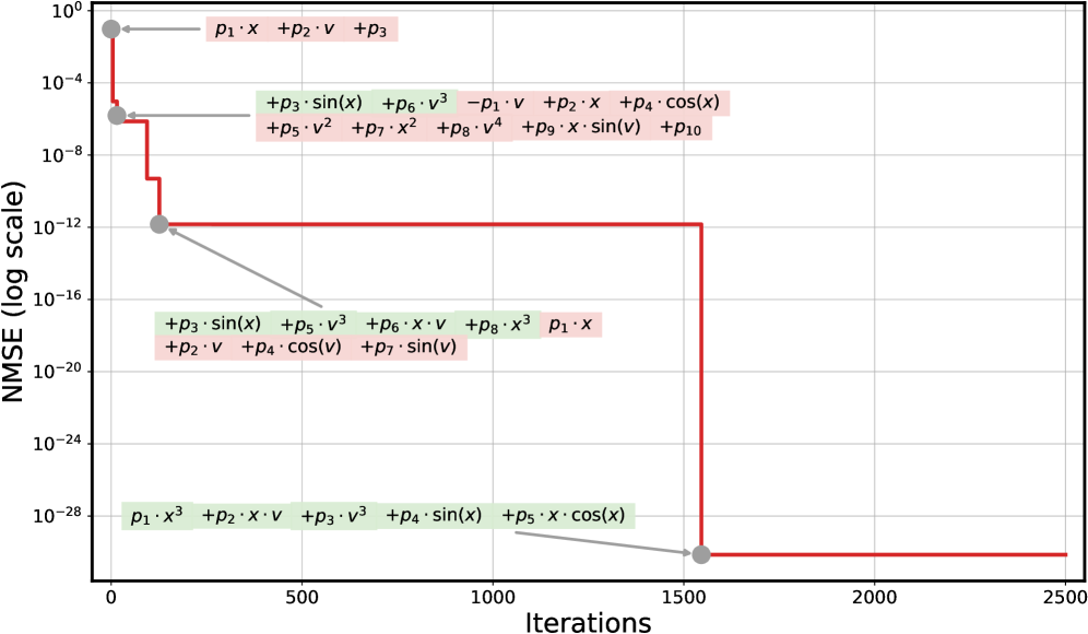
## Line Graph: NMSE vs. Iterations
### Overview
The image is a line graph depicting the relationship between the Normalized Mean Squared Error (NMSE) and the number of iterations. The y-axis is logarithmic (ranging from 10⁻²⁸ to 10⁰), and the x-axis represents iterations (0 to 2500). Multiple data series are plotted, each associated with distinct mathematical expressions involving variables like `p1`, `p2`, `x`, `v`, and trigonometric functions (e.g., `sin(x)`, `cos(x)`). The graph shows exponential decay in NMSE as iterations increase, with distinct trends for different series.
---
### Components/Axes
- **Y-axis**: "NMSE (log scale)" with values from 10⁻²⁸ to 10⁰ (logarithmic scale).
- **X-axis**: "Iterations" with values from 0 to 2500.
- **Legend**: Located on the right side of the graph, with color-coded labels for each data series. Colors include red, gray, and green, each corresponding to specific mathematical expressions.
- **Data Series**:
- **Red Line**: `p1·x + p2·v + p3` (initial NMSE ~10⁰, drops to ~10⁻⁴).
- **Gray Lines**:
- `+p3·sin(x) + p6·v³ - p1·v + p2·x + p4·cos(x)` (NMSE ~10⁻⁴ to ~10⁻⁸).
- `+p5·v² + p7·x² + p8·v⁴ + p9·x·sin(v) + p10` (NMSE ~10⁻⁸ to ~10⁻¹²).
- `+p3·sin(x) + p5·v³ + p6·x·v + p8·x³ + p1·x` (NMSE ~10⁻¹² to ~10⁻¹⁶).
- `+p2·v + p4·cos(v) + p7·sin(v)` (NMSE ~10⁻¹⁶ to ~10⁻²⁰).
- **Green Lines**:
- `+p1·x³ + p2·x·v + p3·v³ + p4·sin(x) + p5·x·cos(x)` (NMSE ~10⁻²⁰ to ~10⁻²⁸).
---
### Detailed Analysis
1. **Red Line (`p1·x + p2·v + p3`)**:
- Starts at 10⁰ (iteration 0) and drops sharply to 10⁻⁴ by iteration 500.
- Remains flat at 10⁻⁴ until iteration 1500, then continues to decline slightly.
2. **Gray Lines**:
- **First Gray Line**:
- Starts at 10⁻⁴ (iteration 500) and drops to 10⁻⁸ by iteration 1000.
- Remains flat at 10⁻⁸ until iteration 1500.
- **Second Gray Line**:
- Starts at 10⁻⁸ (iteration 1000) and drops to 10⁻¹² by iteration 1500.
- **Third Gray Line**:
- Starts at 10⁻¹² (iteration 1500) and drops to 10⁻¹⁶ by iteration 2000.
- **Fourth Gray Line**:
- Starts at 10⁻¹⁶ (iteration 2000) and drops to 10⁻²⁰ by iteration 2500.
3. **Green Lines**:
- **First Green Line**:
- Starts at 10⁻²⁰ (iteration 2000) and drops to 10⁻²⁸ by iteration 2500.
---
### Key Observations
- **Exponential Decay**: All data series show a logarithmic decrease in NMSE as iterations increase, indicating rapid convergence.
- **Complexity vs. Performance**: Series with higher-order terms (e.g., `x³`, `v⁴`, `sin(x)`) achieve lower NMSE values, suggesting that more complex models improve accuracy faster.
- **Color Consistency**: The legend matches the colors of the data series (red, gray, green) accurately.
- **Flat Plateaus**: Some series exhibit flat regions (e.g., red line at 10⁻⁴), indicating periods of minimal improvement.
---
### Interpretation
The graph demonstrates that increasing the number of iterations significantly reduces NMSE, reflecting improved model performance. The use of complex mathematical expressions (e.g., trigonometric functions, higher powers) correlates with faster convergence, as these terms likely capture more nuanced patterns in the data. The red line (simplest model) shows the slowest improvement, while green lines (most complex) achieve the lowest NMSE. This suggests that model complexity and iteration count are critical factors in optimizing accuracy. The flat plateaus may indicate saturation points where further iterations yield diminishing returns.