## Scatter Plots: Visualization of Grid Points on Different Grid Sizes
### Overview
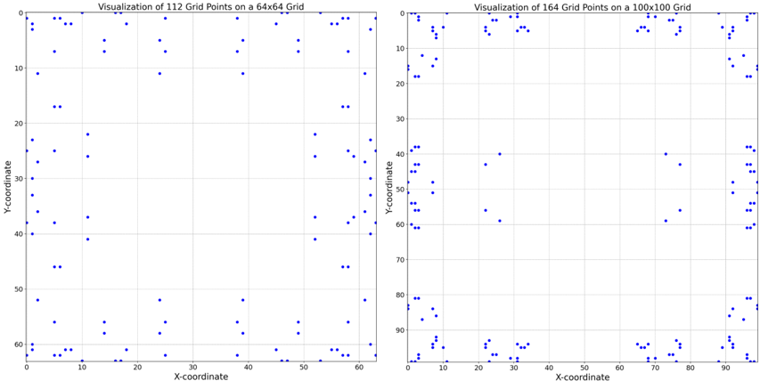
The image contains two side-by-side scatter plots comparing the distribution of grid points on two different grid sizes: a 64x64 grid (left) and a 100x100 grid (right). Both plots use blue dots to represent grid points, with axes labeled "X-coordinate" and "Y-coordinate."
### Components/Axes
- **Left Plot (64x64 Grid)**:
- **Title**: "Visualization of 112 Grid Points on a 64x64 Grid"
- **X-axis**: Labeled "X-coordinate," ranging from 0 to 64.
- **Y-axis**: Labeled "Y-coordinate," ranging from 0 to 64.
- **Grid Points**: 112 blue dots distributed across the grid.
- **Right Plot (100x100 Grid)**:
- **Title**: "Visualization of 164 Grid Points on a 100x100 Grid"
- **X-axis**: Labeled "X-coordinate," ranging from 0 to 100.
- **Y-axis**: Labeled "Y-coordinate," ranging from 0 to 100.
- **Grid Points**: 164 blue dots distributed across the grid.
### Detailed Analysis
- **Left Plot (64x64)**:
- Points are sparsely distributed, with no clear clustering.
- Notable concentrations near the edges (e.g., X ≈ 0–10, Y ≈ 0–10 and X ≈ 50–64, Y ≈ 50–64).
- Approximately 112 points, with a density of ~0.027 points per unit area (112 / (64×64)).
- **Right Plot (100x100)**:
- Points are denser overall, with clusters near the edges (e.g., X ≈ 0–20, Y ≈ 0–20 and X ≈ 80–100, Y ≈ 80–100).
- Approximately 164 points, with a density of ~0.0164 points per unit area (164 / (100×100)).
- Higher density near the edges compared to the center (e.g., X ≈ 40–60, Y ≈ 40–60 has fewer points).
### Key Observations
1. **Grid Size vs. Point Density**:
- The 100x100 grid has more points (164 vs. 112) but a lower density per unit area due to its larger size.
- Edge regions in both plots show higher concentrations of points.
2. **Distribution Patterns**:
- Left plot: Points are more evenly spread but sparse.
- Right plot: Points cluster near edges, suggesting a bias in sampling or distribution.
3. **Outliers/Anomalies**:
- No extreme outliers in either plot.
- Right plot has a noticeable gap in the central region (X ≈ 40–60, Y ≈ 40–60).
### Interpretation
The visualizations highlight how grid points are distributed across grids of different sizes. The 100x100 grid, despite its larger size, has a higher total number of points but lower density, indicating a potential trade-off between grid resolution and point distribution efficiency. The clustering near edges in both plots suggests a possible bias in the sampling method or a focus on boundary regions in the underlying data generation process. The central gaps in the right plot may reflect intentional exclusion or lower relevance of central areas in the context of the data being visualized.