\n
## Array Visualization: Choice Preference
### Overview
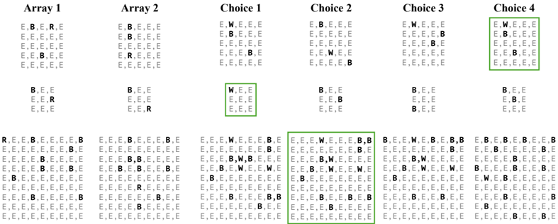
The image presents a visualization of choices made across multiple arrays. Each array represents a set of options, and the choices are indicated by letters: 'E', 'B', 'R', and 'W'. The visualization appears to be a grid-based representation of these choices, with each cell representing a selection. The arrays are labeled "Array 1", "Array 2", "Choice 1", "Choice 2", "Choice 3", and "Choice 4". Certain cells are highlighted with green boxes.
### Components/Axes
The image consists of six arrays arranged horizontally. Each array is a grid of letters. There are no explicit axes or scales. The letters represent the choices made. The green boxes highlight specific cells within the arrays.
### Detailed Analysis or Content Details
Let's analyze each array and the highlighted cells:
**Array 1:**
The array is filled predominantly with 'E's, with scattered 'B's and 'R's. There is one highlighted cell in the top-left corner containing 'E', 'B', 'R', 'E'.
**Array 2:**
Similar to Array 1, this array is mostly 'E's with some 'B's and 'R's. There is one highlighted cell in the bottom-left corner containing 'E', 'E', 'R'.
**Choice 1:**
This array is predominantly 'E's, with some 'W's. There is one highlighted cell in the center containing 'W', 'E', 'E'.
**Choice 2:**
This array is mostly 'E's and 'B's. There is one highlighted cell in the bottom-center containing 'E', 'E', 'W', 'E', 'E', 'B'.
**Choice 3:**
This array is a mix of 'E's, 'W's, and 'B's. There is one highlighted cell in the bottom-right corner containing 'W', 'E', 'E', 'B'.
**Choice 4:**
This array is a mix of 'E's, 'W's, and 'B's. There is one highlighted cell in the top-right corner containing 'W', 'E', 'E', 'B'.
**Letter Counts (Approximate):**
* 'E': Dominant in all arrays.
* 'B': Present in all arrays, but less frequent than 'E'.
* 'R': Relatively rare, mostly in Array 1 and Array 2.
* 'W': More prominent in Choice 1, Choice 3, and Choice 4.
### Key Observations
* The arrays are not uniform in their letter distribution.
* The highlighted cells do not appear to follow a clear pattern across the arrays.
* 'E' is the most frequent choice in all arrays.
* 'R' is the least frequent choice.
* 'W' appears to be more prevalent in the "Choice" arrays than in the "Array" arrays.
### Interpretation
The data suggests a preference for 'E' as the most common choice across all arrays. The presence of 'B', 'R', and 'W' indicates some degree of variability in the choices. The highlighted cells might represent specific instances of interest or selections made under certain conditions. The shift in letter distribution from "Array" to "Choice" arrays could indicate a change in the decision-making process or the introduction of new options. The visualization doesn't provide enough context to determine the meaning of the arrays or the choices, but it does reveal a clear preference for 'E' and a varying distribution of other options. The green highlighting suggests a focus on specific instances of these choices, potentially for further analysis or comparison. Without additional information, it's difficult to determine the underlying process generating these choices. It could represent user selections, experimental results, or a simulation of a decision-making process.