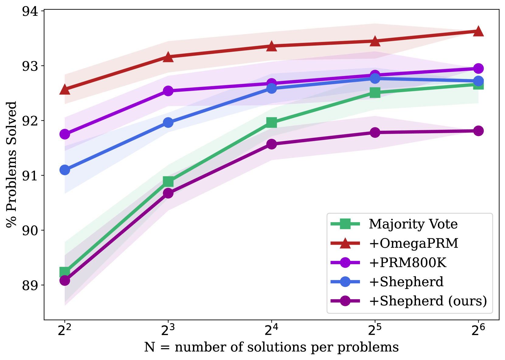
## Line Chart: Performance Scaling with Increased Solution Sampling
### Overview
The image is a line chart comparing the performance of five different methods for solving problems, measured as the percentage of problems solved, as a function of the number of solutions sampled per problem (N). The chart demonstrates how each method's effectiveness scales with increased computational effort (more solutions). All methods show improvement as N increases, but with different starting points and rates of gain.
### Components/Axes
* **Y-Axis:** Labeled "% Problems Solved". The scale runs from 89 to 94, with major tick marks at every integer value (89, 90, 91, 92, 93, 94).
* **X-Axis:** Labeled "N = number of solutions per problems". The scale is logarithmic base 2, with tick marks at N = 2² (4), 2³ (8), 2⁴ (16), 2⁵ (32), and 2⁶ (64).
* **Legend:** Located in the bottom-right quadrant of the chart area. It contains five entries, each with a unique color and marker symbol:
1. **Majority Vote:** Green line with square markers (■).
2. **+OmegaPRM:** Red line with upward-pointing triangle markers (▲).
3. **+PRM800K:** Purple line with circle markers (●).
4. **+Shepherd:** Blue line with circle markers (●).
5. **+Shepherd (ours):** Dark purple/magenta line with circle markers (●).
* **Data Series:** Each method is represented by a solid line connecting data points at each N value. A semi-transparent shaded band of the corresponding color surrounds each line, likely indicating confidence intervals or standard deviation across multiple runs.
### Detailed Analysis
**Trend Verification & Data Points (Approximate Values):**
1. **+OmegaPRM (Red, ▲):**
* **Trend:** Consistently the top-performing method. Shows a steady, slightly decelerating upward slope.
* **Points:**
* N=4: ~92.5%
* N=8: ~93.1%
* N=16: ~93.3%
* N=32: ~93.4%
* N=64: ~93.6%
2. **+PRM800K (Purple, ●):**
* **Trend:** Second-best performance. Slopes upward, with a noticeable increase between N=4 and N=8, then a more gradual rise.
* **Points:**
* N=4: ~91.7%
* N=8: ~92.5%
* N=16: ~92.7%
* N=32: ~92.8%
* N=64: ~92.9%
3. **+Shepherd (Blue, ●):**
* **Trend:** Starts lower but shows strong improvement, nearly catching up to +PRM800K at higher N. The slope is steepest between N=4 and N=16.
* **Points:**
* N=4: ~91.1%
* N=8: ~91.9%
* N=16: ~92.6%
* N=32: ~92.7%
* N=64: ~92.7% (appears to plateau)
4. **Majority Vote (Green, ■):**
* **Trend:** Starts as the lowest-performing method at N=4 but exhibits the most dramatic relative improvement, surpassing the "+Shepherd (ours)" method.
* **Points:**
* N=4: ~89.2%
* N=8: ~90.9%
* N=16: ~91.9%
* N=32: ~92.5%
* N=64: ~92.6%
5. **+Shepherd (ours) (Dark Purple, ●):**
* **Trend:** Starts very close to Majority Vote. Improves but at a slower rate than the other methods, resulting in it being overtaken. It shows the most pronounced plateau after N=16.
* **Points:**
* N=4: ~89.1%
* N=8: ~90.7%
* N=16: ~91.6%
* N=32: ~91.8%
* N=64: ~91.8%
### Key Observations
1. **Performance Hierarchy:** A clear and consistent ranking is maintained across all N values: +OmegaPRM > +PRM800K > +Shepherd > Majority Vote ≈ +Shepherd (ours). The gap between the top method (+OmegaPRM) and the others remains significant.
2. **Diminishing Returns:** All curves show diminishing marginal returns. The performance gain from doubling N is much larger when moving from N=4 to N=8 than from N=32 to N=64.
3. **Convergence:** The performance of "+Shepherd" and "+PRM800K" converges at higher N (32, 64), becoming nearly indistinguishable within the shaded uncertainty bands.
4. **Anomaly:** The method labeled "+Shepherd (ours)" underperforms the standard "+Shepherd" method and is eventually surpassed by the simpler "Majority Vote" baseline. This suggests the "(ours)" variant may be less effective or optimized for a different objective.
5. **Uncertainty:** The shaded bands are widest at lower N values (especially for Majority Vote and +Shepherd (ours) at N=4), indicating higher variance in results when fewer solutions are sampled. The bands narrow as N increases.
### Interpretation
This chart likely comes from a research paper in machine learning or automated reasoning, comparing different methods for generating and verifying solutions to problems (e.g., mathematical reasoning, code generation). The key takeaway is that the **+OmegaPRM method is superior**, achieving the highest solve rate at every level of computational budget (N). Its advantage is established early (at N=4) and maintained.
The data demonstrates a fundamental trade-off: **more sampling (higher N) improves performance for all methods, but at a decreasing rate.** This suggests that simply throwing more computation at the problem has limits, and algorithmic improvements (like those in +OmegaPRM) are crucial for significant gains.
The underperformance of "+Shepherd (ours)" is a critical finding. It implies that the authors' specific modification or implementation of the Shepherd method was not successful compared to the baseline Shepherd approach or other techniques. This could be due to factors like overfitting, a misaligned objective function, or an architectural choice that doesn't scale well. The fact that it is eventually beaten by a simple "Majority Vote" baseline underscores this point.
The convergence of +Shepherd and +PRM800K at high N suggests that with enough sampling, the differences between these two advanced methods become negligible, and they hit a similar performance ceiling below that of +OmegaPRM.