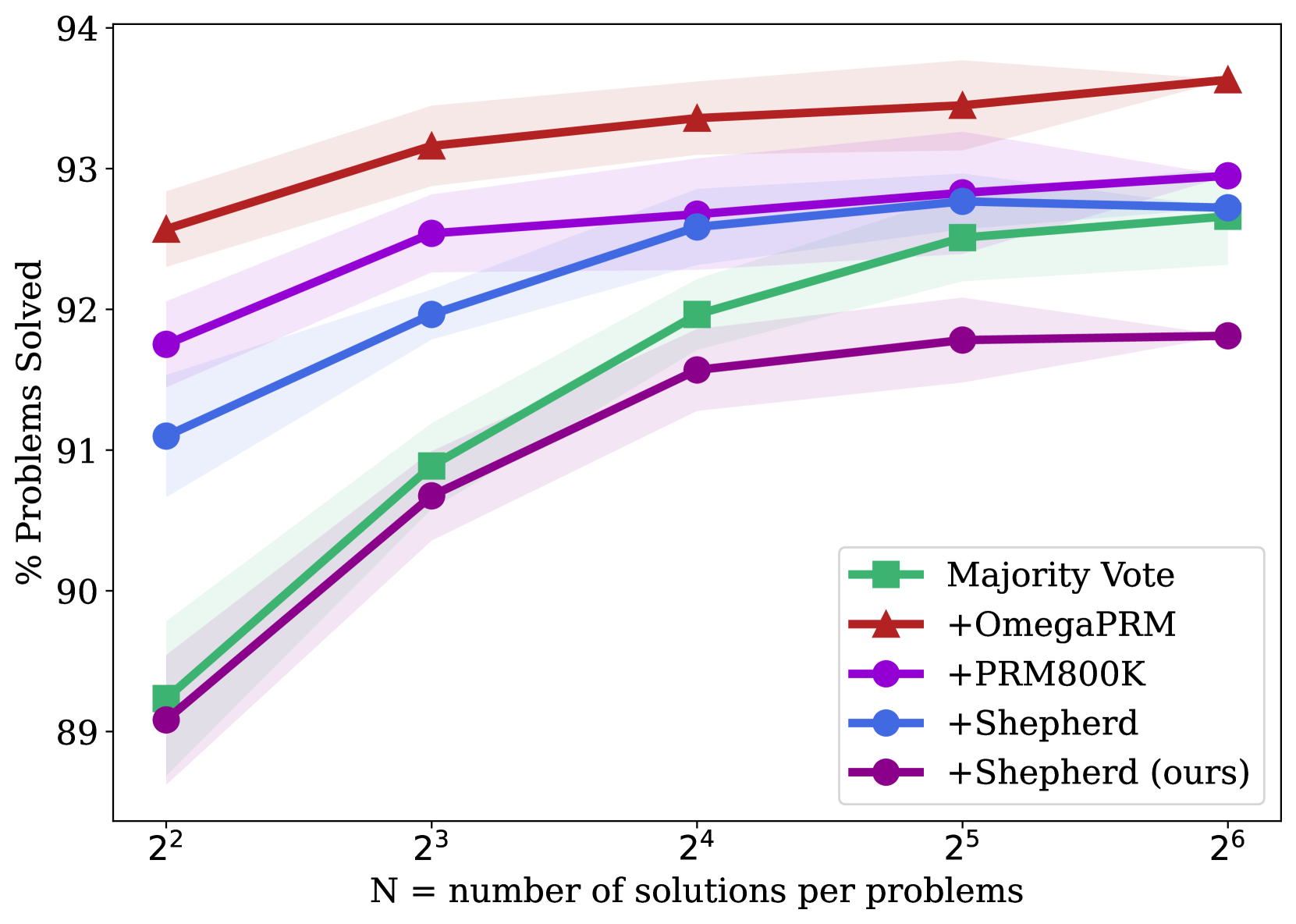
## Line Chart: Percentage of Problems Solved vs. Number of Solutions
### Overview
The image is a line chart comparing the performance of different problem-solving methods based on the percentage of problems solved, plotted against the number of solutions per problem. The chart includes five different methods, each represented by a distinct colored line with corresponding markers. Shaded regions around each line indicate the uncertainty or variance in the data.
### Components/Axes
* **Y-axis:** "% Problems Solved". The scale ranges from 89 to 94, with tick marks at each integer value.
* **X-axis:** "N = number of solutions per problems". The scale is logarithmic, with values 2<sup>2</sup>, 2<sup>3</sup>, 2<sup>4</sup>, 2<sup>5</sup>, and 2<sup>6</sup>.
* **Legend:** Located in the bottom-right corner, the legend identifies each method by color and name:
* Green: Majority Vote (square markers)
* Red: +OmegaPRM (triangle markers)
* Purple: +PRM800K (circle markers)
* Blue: +Shepherd (circle markers)
* Dark Purple: +Shepherd (ours) (circle markers)
### Detailed Analysis
**1. Majority Vote (Green Line):**
* Trend: Generally increasing, with a steeper initial slope.
* Data Points:
* 2<sup>2</sup>: Approximately 89%
* 2<sup>3</sup>: Approximately 91%
* 2<sup>4</sup>: Approximately 92%
* 2<sup>5</sup>: Approximately 92.5%
* 2<sup>6</sup>: Approximately 92.7%
**2. +OmegaPRM (Red Line):**
* Trend: Relatively flat, with a slight upward slope.
* Data Points:
* 2<sup>2</sup>: Approximately 92.6%
* 2<sup>3</sup>: Approximately 93%
* 2<sup>4</sup>: Approximately 93.3%
* 2<sup>5</sup>: Approximately 93.4%
* 2<sup>6</sup>: Approximately 93.7%
**3. +PRM800K (Purple Line):**
* Trend: Increasing, then flattening out.
* Data Points:
* 2<sup>2</sup>: Approximately 91.8%
* 2<sup>3</sup>: Approximately 92.5%
* 2<sup>4</sup>: Approximately 92.7%
* 2<sup>5</sup>: Approximately 92.8%
* 2<sup>6</sup>: Approximately 92.8%
**4. +Shepherd (Blue Line):**
* Trend: Increasing, then slightly decreasing.
* Data Points:
* 2<sup>2</sup>: Approximately 91.2%
* 2<sup>3</sup>: Approximately 92%
* 2<sup>4</sup>: Approximately 92.6%
* 2<sup>5</sup>: Approximately 92.9%
* 2<sup>6</sup>: Approximately 92.7%
**5. +Shepherd (ours) (Dark Purple Line):**
* Trend: Increasing, then flattening out.
* Data Points:
* 2<sup>2</sup>: Approximately 89%
* 2<sup>3</sup>: Approximately 90.7%
* 2<sup>4</sup>: Approximately 91.6%
* 2<sup>5</sup>: Approximately 91.8%
* 2<sup>6</sup>: Approximately 91.8%
### Key Observations
* +OmegaPRM consistently achieves the highest percentage of problems solved across all solution counts.
* +Shepherd (ours) starts with the lowest performance but shows a significant initial increase.
* The performance of all methods tends to plateau as the number of solutions increases, suggesting diminishing returns.
* The shaded regions indicate the variability in performance for each method, with some methods showing more consistent results than others.
### Interpretation
The chart illustrates the trade-off between the number of solutions considered and the percentage of problems successfully solved by different methods. +OmegaPRM appears to be the most effective method overall, achieving the highest success rate. The other methods show varying degrees of improvement as the number of solutions increases, but their performance eventually plateaus. This suggests that there is a limit to the benefits of simply increasing the number of solutions, and that the effectiveness of the problem-solving method itself plays a crucial role. The uncertainty regions highlight the robustness of each method, with narrower regions indicating more consistent performance.