## Bar Chart: Number of Files per Category
### Overview
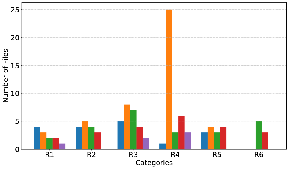
The image presents a bar chart illustrating the number of files associated with different categories, labeled R1 through R6. The chart uses multiple colored bars for each category, suggesting multiple data series are being compared. The y-axis represents the "Number of Files," while the x-axis represents "Categories."
### Components/Axes
* **X-axis:** "Categories" with markers R1, R2, R3, R4, R5, and R6.
* **Y-axis:** "Number of Files" ranging from 0 to 25, with increments of 5.
* **Data Series:** Six distinct colored bar series are present:
* Blue
* Orange
* Green
* Red
* Purple
* Teal
* **Legend:** There is no explicit legend, but the colors are consistently used for each series across all categories.
### Detailed Analysis
Let's analyze each category and the values for each data series. I will describe the trend of each series within a category before providing approximate values.
* **R1:**
* Blue: Flat, approximately 3.5 files.
* Orange: Flat, approximately 1.5 files.
* Green: Flat, approximately 2.5 files.
* Red: Flat, approximately 2 files.
* Purple: Flat, approximately 1 file.
* Teal: Flat, approximately 3 files.
* **R2:**
* Blue: Flat, approximately 4.5 files.
* Orange: Flat, approximately 4 files.
* Green: Flat, approximately 3.5 files.
* Red: Flat, approximately 2.5 files.
* Purple: Flat, approximately 1.5 files.
* Teal: Flat, approximately 4 files.
* **R3:**
* Blue: Flat, approximately 4 files.
* Orange: Flat, approximately 1 file.
* Green: Increasing, approximately 9 files.
* Red: Flat, approximately 5 files.
* Purple: Flat, approximately 2 files.
* Teal: Flat, approximately 4 files.
* **R4:**
* Blue: Flat, approximately 2 files.
* Orange: Spiking upwards, approximately 25 files.
* Green: Flat, approximately 1 file.
* Red: Flat, approximately 6 files.
* Purple: Flat, approximately 3 files.
* Teal: Flat, approximately 2 files.
* **R5:**
* Blue: Flat, approximately 3.5 files.
* Orange: Flat, approximately 2 files.
* Green: Flat, approximately 4 files.
* Red: Flat, approximately 2.5 files.
* Purple: Flat, approximately 3 files.
* Teal: Flat, approximately 4 files.
* **R6:**
* Blue: Flat, approximately 3 files.
* Orange: Flat, approximately 1 file.
* Green: Increasing, approximately 5 files.
* Red: Flat, approximately 3 files.
* Purple: Flat, approximately 1 file.
* Teal: Flat, approximately 4 files.
### Key Observations
* Category R4 exhibits a significantly higher number of files for the orange data series compared to all other categories and data series. This is a clear outlier.
* The green data series shows a noticeable increase in R3 and R6 compared to other categories.
* The purple data series consistently has the lowest number of files across all categories.
* The blue, teal, and red data series generally remain within a similar range of file counts across all categories.
### Interpretation
The chart demonstrates the distribution of files across six categories (R1-R6), broken down by six different data series (represented by color). The stark difference in the orange series for category R4 suggests a unique characteristic or event associated with that category. It could indicate a specific type of file, a particular process, or an anomaly within that category. The increasing trend of the green series in R3 and R6 might indicate a growing trend or a specific activity related to those categories. The consistently low values for the purple series suggest it represents a less frequent or less significant type of file. Without knowing what the categories and data series *represent*, it's difficult to draw definitive conclusions, but the chart clearly highlights areas of concentration and potential investigation. The chart is a comparative analysis of file distribution, and the significant outlier in R4 warrants further examination.