## Grouped Bar Chart: File Counts by Category and Sub-Category
### Overview
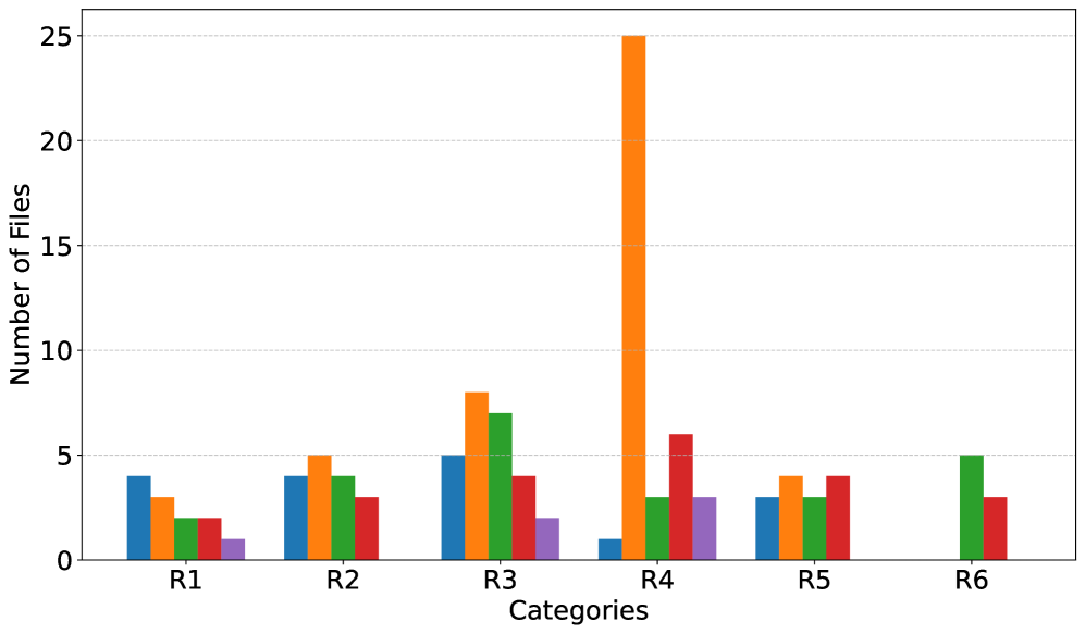
The image displays a grouped bar chart comparing the "Number of Files" across six primary categories (R1 through R6). Each primary category contains up to five sub-categories, represented by bars of different colors (blue, orange, green, red, purple). The chart has a white background with light grey horizontal grid lines.
### Components/Axes
* **Chart Type:** Grouped (clustered) bar chart.
* **X-Axis (Horizontal):**
* **Label:** "Categories"
* **Categories (Ticks):** R1, R2, R3, R4, R5, R6.
* **Y-Axis (Vertical):**
* **Label:** "Number of Files"
* **Scale:** Linear, from 0 to 25.
* **Major Ticks/Gridlines:** 0, 5, 10, 15, 20, 25.
* **Legend:** **Not present in the image.** The sub-categories are only distinguishable by bar color (blue, orange, green, red, purple). Their specific meanings are unknown.
* **Data Series (by color):** Five distinct color series are plotted within each category group.
### Detailed Analysis
Data values are approximate, read from the chart's scale.
**Category R1:**
* Blue: ~4
* Orange: ~3
* Green: ~2
* Red: ~2
* Purple: ~1
**Category R2:**
* Blue: ~4
* Orange: ~5
* Green: ~4
* Red: ~3
* Purple: Not present (value of 0).
**Category R3:**
* Blue: ~5
* Orange: ~8
* Green: ~7
* Red: ~4
* Purple: ~2
**Category R4:**
* Blue: ~1
* Orange: ~25 **(Significant outlier, maximum value in the chart)**
* Green: ~3
* Red: ~6
* Purple: ~3
**Category R5:**
* Blue: ~3
* Orange: ~4
* Green: ~3
* Red: ~4
* Purple: Not present (value of 0).
**Category R6:**
* Blue: Not present (value of 0).
* Orange: Not present (value of 0).
* Green: ~5
* Red: ~3
* Purple: Not present (value of 0).
### Key Observations
1. **Dominant Outlier:** The orange bar in category R4 is the most prominent feature, reaching the maximum y-axis value of 25. This is 3-5 times higher than any other bar in the chart.
2. **Variable Presence:** Not all sub-categories (colors) are present in every primary category. Purple is absent in R2, R5, and R6. Blue and Orange are absent in R6.
3. **General Scale:** With the exception of the R4 orange outlier, all other data points fall between 0 and 8 files.
4. **Highest Non-Outlier:** The next highest values are the orange (~8) and green (~7) bars in category R3.
5. **Lowest Values:** The lowest non-zero values are the purple bar in R1 (~1) and the blue bar in R4 (~1).
### Interpretation
This chart visualizes the distribution of files across a two-level classification system: six main categories (R1-R6) and five unnamed sub-categories (colors). The data suggests a highly uneven distribution.
* **The R4/Orange Anomaly:** The extreme value for the orange sub-category within R4 indicates a massive concentration of files in this specific segment. This could represent a primary focus area, a data collection bias, or a significant event or process that generated a large number of files for that particular sub-category in R4. Without the legend, the meaning of "orange" is critical to understanding this spike.
* **Category Composition:** Categories R1, R2, and R5 show a relatively balanced, low-volume distribution across their present sub-categories. R3 shows moderate activity, particularly in orange and green. R6 is the most sparse, containing only green and red sub-categories.
* **Missing Data Implications:** The absence of certain color bars likely indicates a count of zero files for that sub-category within the given main category, not missing data. This highlights that some sub-category types are not relevant or do not exist within certain main categories.
* **Overall Purpose:** The chart is designed to compare not only the total file count per main category (by summing the bars) but, more importantly, the composition of those totals by sub-category. The stark outlier in R4/Orange would be the primary subject of any investigation or report based on this data. The lack of a legend is a major limitation for full interpretation.