\n
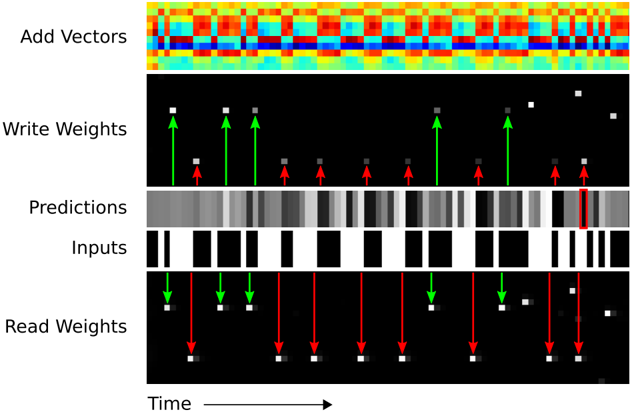
## Diagram: Neural Network Weight Update Visualization
### Overview
The image is a diagram illustrating the process of updating weights in a neural network over time. It depicts five horizontal layers representing "Add Vectors", "Write Weights", "Predictions", "Inputs", and "Real Weights", with time progressing from left to right. The diagram uses color gradients, arrows, and rectangular blocks to visualize the flow of information and weight adjustments.
### Components/Axes
The diagram consists of the following components:
* **Time Axis:** A horizontal arrow at the bottom labeled "Time" indicates the progression of the process.
* **Add Vectors:** The top layer displays a heatmap-like visualization with a color gradient ranging from blue to red.
* **Write Weights:** This layer shows white squares on a black background, with green upward arrows and red downward arrows indicating weight adjustments.
* **Predictions:** A layer with varying shades of gray rectangles, representing the network's predictions. A red rectangle highlights a specific prediction.
* **Inputs:** A layer with black and white rectangles, representing the input data.
* **Real Weights:** This layer mirrors the "Write Weights" layer, showing white squares on a black background with green upward and red downward arrows.
### Detailed Analysis or Content Details
The diagram shows a sequence of operations occurring over time.
* **Add Vectors:** The top layer shows a dynamic color pattern, suggesting a continuous change in vector values. The colors range from deep blue (approximately -1) to bright red (approximately +1).
* **Write Weights:** This layer shows a series of weight updates. At each time step, there are both green upward arrows (positive weight adjustments) and red downward arrows (negative weight adjustments). The magnitude of the adjustments appears to vary. There are approximately 10 time steps shown.
* **Predictions:** The "Predictions" layer displays a series of gray rectangles, with one rectangle highlighted in red. The intensity of the gray rectangles varies, indicating different prediction values. The red rectangle appears to indicate a specific prediction that is being focused on.
* **Inputs:** The "Inputs" layer shows a sequence of black and white rectangles, representing the input data. The pattern of black and white rectangles changes over time.
* **Real Weights:** This layer mirrors the "Write Weights" layer, showing the actual weights being adjusted. The green and red arrows indicate the direction and magnitude of the weight changes.
The arrows in the "Write Weights" and "Real Weights" layers are aligned vertically, suggesting a direct relationship between the predicted weight changes and the actual weight updates.
### Key Observations
* The diagram illustrates a feedback loop where predictions are made, compared to real weights, and then used to adjust the weights.
* The "Add Vectors" layer suggests that the weight updates are based on a combination of multiple vectors.
* The red rectangle in the "Predictions" layer highlights a specific prediction that is being used for weight adjustment.
* The diagram does not provide specific numerical values for the weights or predictions, but it visually represents the process of weight updates.
### Interpretation
The diagram demonstrates the core mechanism of learning in a neural network – iterative weight adjustment based on the difference between predictions and actual values. The "Add Vectors" layer likely represents the gradient calculation, which determines the direction and magnitude of the weight updates. The "Write Weights" and "Real Weights" layers show the application of these updates to the network's weights. The "Predictions" and "Inputs" layers represent the data flowing through the network.
The diagram suggests that the network is continuously learning by adjusting its weights to minimize the difference between its predictions and the real values. The highlighted red rectangle in the "Predictions" layer indicates that the network is focusing on a specific prediction to improve its accuracy. The dynamic color pattern in the "Add Vectors" layer suggests that the gradient is constantly changing as the network learns.
The diagram is a simplified representation of a complex process, but it effectively conveys the fundamental principles of neural network learning. It is a conceptual visualization rather than a precise data representation. The diagram does not provide quantitative data, but it illustrates the qualitative relationships between the different components of the network.