## Charts: Parameter Dependence of Quantities
### Overview
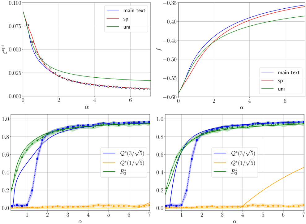
The image contains four separate charts, arranged in a 2x2 grid, depicting the relationship between a parameter α (on the x-axis) and various quantities (on the y-axis). Each chart displays multiple curves, each representing a different model or condition ("main text", "sp", "uni", Q*(3/√5), Q*(1/√5), R₂*). The charts appear to be exploring the behavior of these quantities as α varies.
### Components/Axes
All four charts share the same x-axis label: "α". The y-axis labels differ for each chart:
* Top-Left: "ω_0"
* Top-Right: "f"
* Bottom-Left: (No explicit label, but values range from 0 to 1)
* Bottom-Right: (No explicit label, but values range from 0 to 1)
The legend is positioned in the top-right corner of each chart and contains the following labels with corresponding colors:
* "main text" - Blue
* "sp" - Red
* "uni" - Green
* Q*(3/√5) - Dark Blue
* Q*(1/√5) - Orange
* R₂* - Green
### Detailed Analysis or Content Details
**Top-Left Chart (ω_0 vs. α):**
* The blue line ("main text") starts at approximately ω_0 = 0.075 at α = 0 and decreases rapidly, approaching 0 as α increases.
* The red line ("sp") starts at approximately ω_0 = 0.065 at α = 0 and decreases more slowly than the blue line, also approaching 0 as α increases.
* The green line ("uni") starts at approximately ω_0 = 0.03 at α = 0 and decreases even more slowly than the red line, approaching 0 as α increases.
* All three lines exhibit a decreasing trend.
**Top-Right Chart (f vs. α):**
* The blue line ("main text") starts at approximately f = -0.55 at α = 0 and increases rapidly, approaching approximately f = -0.35 as α increases.
* The red line ("sp") starts at approximately f = -0.50 at α = 0 and increases more slowly than the blue line, approaching approximately f = -0.40 as α increases.
* The green line ("uni") starts at approximately f = -0.45 at α = 0 and increases at a constant rate, approaching approximately f = -0.35 as α increases.
* All three lines exhibit an increasing trend.
**Bottom-Left Chart (Unlabeled vs. α):**
* The dark blue line (Q*(3/√5)) starts at approximately 0 at α = 0 and increases rapidly, reaching approximately 0.8 at α = 2, and then plateaus around 0.95.
* The orange line (Q*(1/√5)) remains close to 0 for α values up to approximately 3, then increases slowly to around 0.2.
* The green line (R₂*) starts at approximately 0 at α = 0 and increases rapidly, reaching approximately 0.8 at α = 2, and then plateaus around 0.95.
* The dark blue and green lines show a similar trend, while the orange line remains significantly lower.
**Bottom-Right Chart (Unlabeled vs. α):**
* The dark blue line (Q*(3/√5)) starts at approximately 0 at α = 0 and increases rapidly, reaching approximately 0.8 at α = 2, and then plateaus around 0.95.
* The orange line (Q*(1/√5)) remains close to 0 for α values up to approximately 3, then increases slowly to around 0.2.
* The green line (R₂*) starts at approximately 0 at α = 0 and increases rapidly, reaching approximately 0.8 at α = 2, and then plateaus around 0.95.
* The dark blue and green lines show a similar trend, while the orange line remains significantly lower.
### Key Observations
* The bottom-left and bottom-right charts are identical.
* The quantities ω_0 and f exhibit opposite trends with respect to α.
* The quantities Q*(3/√5) and R₂* behave similarly, while Q*(1/√5) remains significantly lower.
* The "main text" model generally shows the most pronounced changes in ω_0 and f.
### Interpretation
The charts likely represent the results of a theoretical model or simulation, exploring the dependence of various physical quantities on a parameter α. The different curves ("main text", "sp", "uni") may correspond to different approximations or assumptions within the model.
The decreasing trend of ω_0 suggests that the system's natural frequency decreases as α increases. The increasing trend of f suggests that some form of driving force or feedback increases as α increases.
The behavior of Q*(3/√5), Q*(1/√5), and R₂* suggests that these quantities represent probabilities or normalized values, with Q*(1/√5) being a less significant contribution. The rapid increase and plateauing of these quantities indicate a transition or saturation effect as α increases.
The identical nature of the bottom-left and bottom-right charts suggests that they represent the same underlying quantity, possibly viewed from different perspectives or with different normalization. The fact that the "main text" model shows the most pronounced changes suggests that it is the most accurate or complete representation of the system.