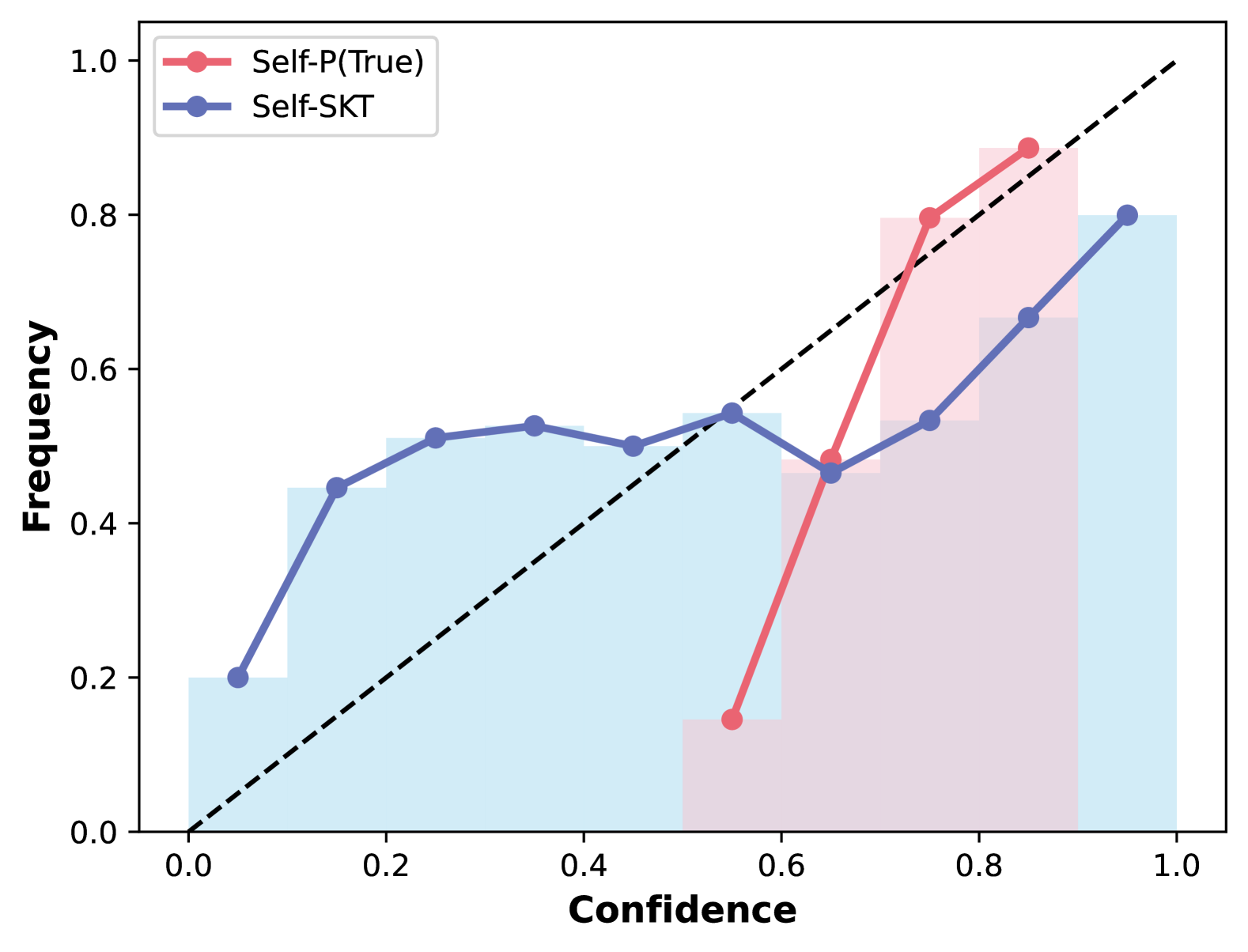
## Calibration Plot: Self-P(True) vs. Self-SKT
### Overview
The image is a calibration plot comparing the performance of two models, "Self-P(True)" and "Self-SKT". The plot shows the relationship between the confidence of the models' predictions and the actual frequency of correct predictions. A diagonal dashed line represents perfect calibration. The plot includes two lines representing the calibration of each model, along with histograms indicating the distribution of confidence scores.
### Components/Axes
* **X-axis:** Confidence, ranging from 0.0 to 1.0 in increments of 0.2.
* **Y-axis:** Frequency, ranging from 0.0 to 1.0 in increments of 0.2.
* **Legend (Top-left):**
* Red line: Self-P(True)
* Blue line: Self-SKT
* **Diagonal dashed line:** Represents perfect calibration.
* **Histograms:** Light red/pink bars behind the Self-P(True) line and light blue bars behind the Self-SKT line, showing the distribution of confidence scores.
### Detailed Analysis
**Self-P(True) (Red Line):**
* **Trend:** The line starts low, rises sharply, and then continues to rise, but at a slower rate.
* **Data Points:**
* (0.55, 0.14)
* (0.75, 0.84)
* (0.90, 0.90)
**Self-SKT (Blue Line):**
* **Trend:** The line starts low, rises, plateaus, and then rises again.
* **Data Points:**
* (0.10, 0.20)
* (0.17, 0.45)
* (0.25, 0.51)
* (0.37, 0.50)
* (0.50, 0.53)
* (0.62, 0.47)
* (0.75, 0.52)
* (0.87, 0.67)
* (0.97, 0.80)
**Histograms:**
* **Self-P(True) (Light Red/Pink):** The histogram shows a higher concentration of confidence scores in the 0.7 to 1.0 range.
* **Self-SKT (Light Blue):** The histogram shows a more even distribution of confidence scores across the range, with a peak in the 0.2 to 0.5 range and another peak near 1.0.
### Key Observations
* Self-P(True) is poorly calibrated for lower confidence scores, as the frequency of correct predictions is much higher than the confidence.
* Self-SKT is better calibrated than Self-P(True) for lower confidence scores, but it is still not perfectly calibrated.
* Both models tend to be overconfident in their predictions, as the calibration curves are below the diagonal line for most of the range.
* Self-P(True) shows a sharp increase in frequency as confidence increases, suggesting that when it is confident, it is usually correct.
* Self-SKT has a more gradual increase in frequency as confidence increases, suggesting that its confidence is less reliable.
### Interpretation
The calibration plot provides insights into the reliability of the confidence scores produced by the two models. Self-P(True) appears to be more overconfident than Self-SKT, especially for lower confidence scores. This means that when Self-P(True) predicts a low confidence score, the actual frequency of correct predictions is higher than the predicted confidence. Self-SKT is better calibrated for lower confidence scores, but it is still not perfectly calibrated.
The histograms provide additional information about the distribution of confidence scores. Self-P(True) tends to produce higher confidence scores, while Self-SKT produces a more even distribution of confidence scores. This suggests that Self-P(True) is more likely to make confident predictions, while Self-SKT is more likely to make uncertain predictions.
Overall, the calibration plot suggests that Self-SKT is a more reliable model than Self-P(True), as its confidence scores are better calibrated. However, both models could benefit from calibration techniques to improve the reliability of their confidence scores.