## Chart: Cumulative Distribution Function Comparison
### Overview
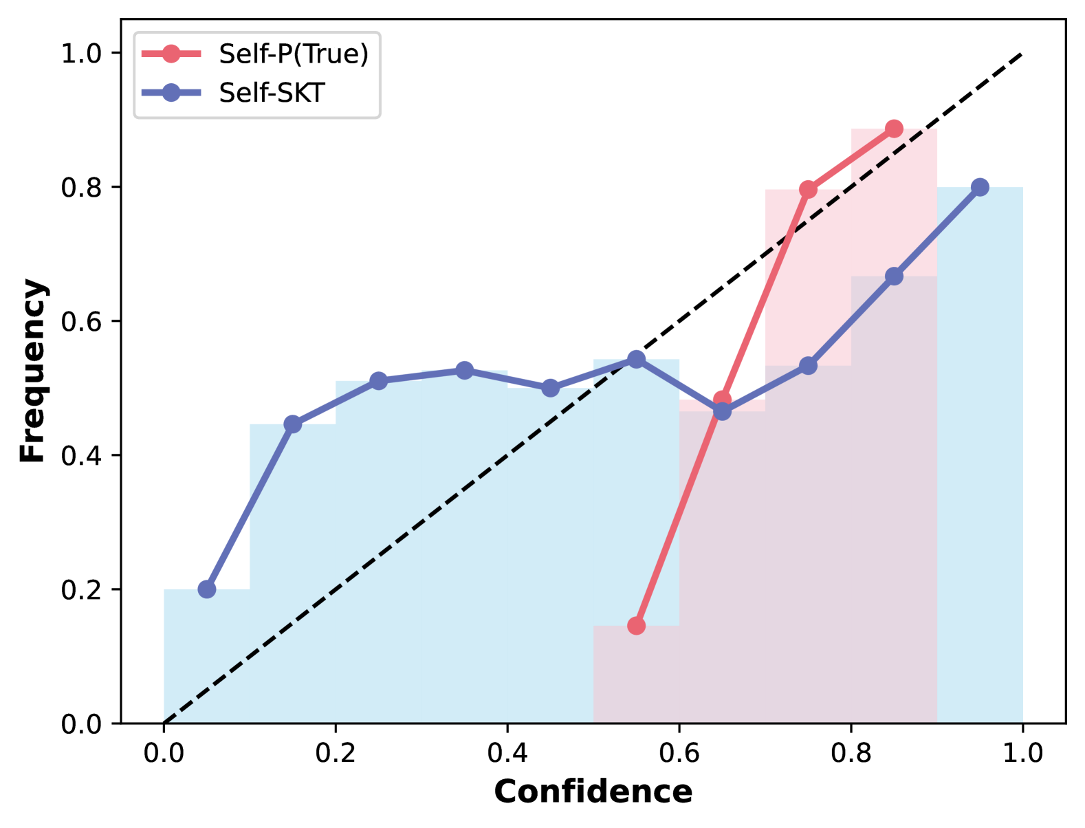
The image presents a chart comparing the cumulative distribution functions (CDFs) of two metrics: "Self-P(True)" and "Self-SKT". The chart visualizes the frequency of each metric as a function of confidence, ranging from 0.0 to 1.0. The "Self-P(True)" is represented by a red line with circular markers, while "Self-SKT" is represented by a blue line with circular markers. Shaded areas indicate the confidence intervals around each CDF. A diagonal dashed black line represents a baseline of equal frequency and confidence.
### Components/Axes
* **X-axis:** "Confidence" ranging from 0.0 to 1.0, with markers at 0.0, 0.2, 0.4, 0.6, 0.8, and 1.0.
* **Y-axis:** "Frequency" ranging from 0.0 to 1.0, with markers at 0.0, 0.2, 0.4, 0.6, 0.8, and 1.0.
* **Legend:** Located in the top-left corner.
* "Self-P(True)" - Red line with circular markers.
* "Self-SKT" - Blue line with circular markers.
* **Baseline:** A dashed black diagonal line representing the identity function (Frequency = Confidence).
* **Shaded Areas:** Light blue shading around the "Self-SKT" line, and light red shading around the "Self-P(True)" line, representing confidence intervals.
### Detailed Analysis
**Self-P(True) (Red Line):**
The red line representing "Self-P(True)" starts at approximately 0.16 at a confidence of 0.0. It increases to approximately 0.44 at a confidence of 0.2, then continues to rise to approximately 0.52 at a confidence of 0.4. It peaks at approximately 0.53 at a confidence of 0.5, then sharply decreases to approximately 0.22 at a confidence of 0.6. Finally, it rises again to approximately 0.78 at a confidence of 1.0.
**Self-SKT (Blue Line):**
The blue line representing "Self-SKT" starts at approximately 0.18 at a confidence of 0.0. It increases steadily to approximately 0.46 at a confidence of 0.2, then continues to rise to approximately 0.53 at a confidence of 0.4. It reaches a peak of approximately 0.55 at a confidence of 0.5, then decreases slightly to approximately 0.50 at a confidence of 0.6. Finally, it rises to approximately 0.82 at a confidence of 1.0.
**Baseline (Black Dashed Line):**
The black dashed line starts at 0.0 and increases linearly to 1.0, representing the case where frequency equals confidence.
### Key Observations
* Both "Self-P(True)" and "Self-SKT" start with similar frequencies at low confidence levels.
* "Self-P(True)" exhibits a more pronounced dip in frequency around a confidence of 0.6, while "Self-SKT" remains relatively stable.
* Both curves converge towards a frequency of approximately 0.8 at a confidence of 1.0.
* "Self-SKT" generally has a higher frequency than "Self-P(True)" across most confidence levels, especially at higher confidence values.
* The confidence intervals (shaded areas) suggest a degree of uncertainty in the CDF estimates.
### Interpretation
The chart compares the distributions of confidence scores for two different methods, "Self-P(True)" and "Self-SKT". The fact that both CDFs are above the diagonal baseline indicates that, on average, the frequency of these metrics is higher than their corresponding confidence levels. This suggests that the methods are generally conservative in their confidence estimates.
The dip in "Self-P(True)" around a confidence of 0.6 could indicate a region where the method is less reliable or produces lower confidence scores for certain cases. The higher frequency of "Self-SKT" at higher confidence levels suggests that it may be a more reliable or accurate method overall.
The convergence of both curves at a confidence of 1.0 suggests that both methods eventually achieve high confidence for a significant portion of the data. The shaded areas indicate that there is some variability in the confidence estimates, and further analysis may be needed to determine the statistical significance of the differences between the two methods.