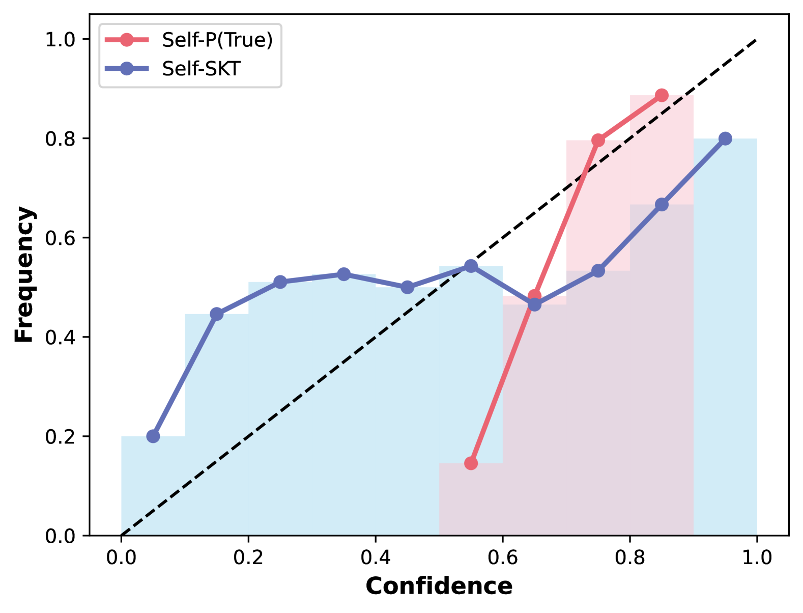
## Calibration Plot: Self-P(True) vs. Self-SKT Confidence-Frequency Relationship
### Overview
This is a calibration plot (a type of line + bar chart) that compares the alignment between predicted confidence scores (x-axis) and observed frequency of correct predictions (y-axis) for two models: *Self-P(True)* and *Self-SKT*. A dashed black diagonal line represents perfect calibration, where predicted confidence exactly matches observed frequency.
### Components/Axes
- **X-axis**: Labeled *Confidence*, with a linear scale from 0.0 to 1.0, marked at intervals of 0.2 (0.0, 0.2, 0.4, 0.6, 0.8, 1.0).
- **Y-axis**: Labeled *Frequency*, with a linear scale from 0.0 to 1.0, marked at intervals of 0.2 (0.0, 0.2, 0.4, 0.6, 0.8, 1.0).
- **Legend**: Positioned top-left, with two entries:
1. Red line with circular markers: *Self-P(True)*
2. Blue line with circular markers: *Self-SKT*
- **Reference Line**: Dashed black diagonal line from (0.0, 0.0) to (1.0, 1.0), representing ideal perfect calibration.
- **Bar Elements**: Light blue bars (for *Self-SKT*) and light pink bars (for *Self-P(True)*) behind the lines, showing the distribution of confidence scores for each model.
### Detailed Analysis
#### Self-SKT (Blue Line, Light Blue Bars)
- **Trend**: The line starts at low confidence, rises to a plateau in the 0.2-0.4 confidence range, dips slightly at 0.6 confidence, then rises again to 1.0 confidence. It remains below the perfect calibration line for all confidence values.
- **Approximate Data Points**:
- Confidence 0.0: Frequency ~0.2
- Confidence 0.2: Frequency ~0.45
- Confidence 0.3: Frequency ~0.5
- Confidence 0.4: Frequency ~0.5
- Confidence 0.5: Frequency ~0.5
- Confidence 0.6: Frequency ~0.45
- Confidence 0.8: Frequency ~0.55
- Confidence 1.0: Frequency 0.8
- **Bar Distribution**: Light blue bars are tallest at confidence 0.0-0.2, decrease in height through mid-confidence, have a small bar at 0.6, and a tall bar at 1.0.
#### Self-P(True) (Red Line, Light Pink Bars)
- **Trend**: The line starts at 0.6 confidence, rises steeply to 0.7 confidence, then continues rising to 0.9 confidence. It is above the perfect calibration line for confidence values 0.7-0.9, and below it at 0.6 confidence.
- **Approximate Data Points**:
- Confidence 0.6: Frequency ~0.15
- Confidence 0.7: Frequency ~0.8
- Confidence 0.8: Frequency ~0.9
- Confidence 0.9: Frequency ~0.9
- **Bar Distribution**: Light pink bars are only present at confidence 0.6-0.9, with the tallest bars at 0.8-0.9.
### Key Observations
1. **Confidence Range**: *Self-SKT* uses confidence scores across the full 0.0-1.0 range, while *Self-P(True)* only uses scores in the 0.6-0.9 range.
2. **Calibration Alignment**:
- *Self-SKT* is consistently underconfident (observed frequency < predicted confidence) across all confidence levels.
- *Self-P(True)* is underconfident at 0.6 confidence, and overconfident (observed frequency > predicted confidence) at 0.7-0.9 confidence.
3. **Distribution**: *Self-SKT* frequently assigns low confidence scores, while *Self-P(True)* only assigns mid-to-high confidence scores.
### Interpretation
This plot evaluates how well each model's confidence scores reflect actual prediction accuracy:
- *Self-SKT* has poor calibration: its confidence scores do not reliably predict correctness, with observed accuracy consistently lower than predicted confidence. The model frequently uses low confidence scores, but these scores do not align with actual performance.
- *Self-P(True)* has a narrow confidence range, suggesting it only assigns confidence scores when it is more certain. It overestimates its accuracy at high confidence levels, meaning when it is confident, it is actually more correct than it predicts, but underperforms at its lowest confidence level (0.6).
- The perfect calibration line serves as a benchmark: neither model aligns with it, indicating both have calibration issues, but in opposite directions at different confidence ranges.