## Line Chart with Histogram Overlay: Confidence vs. Frequency
### Overview
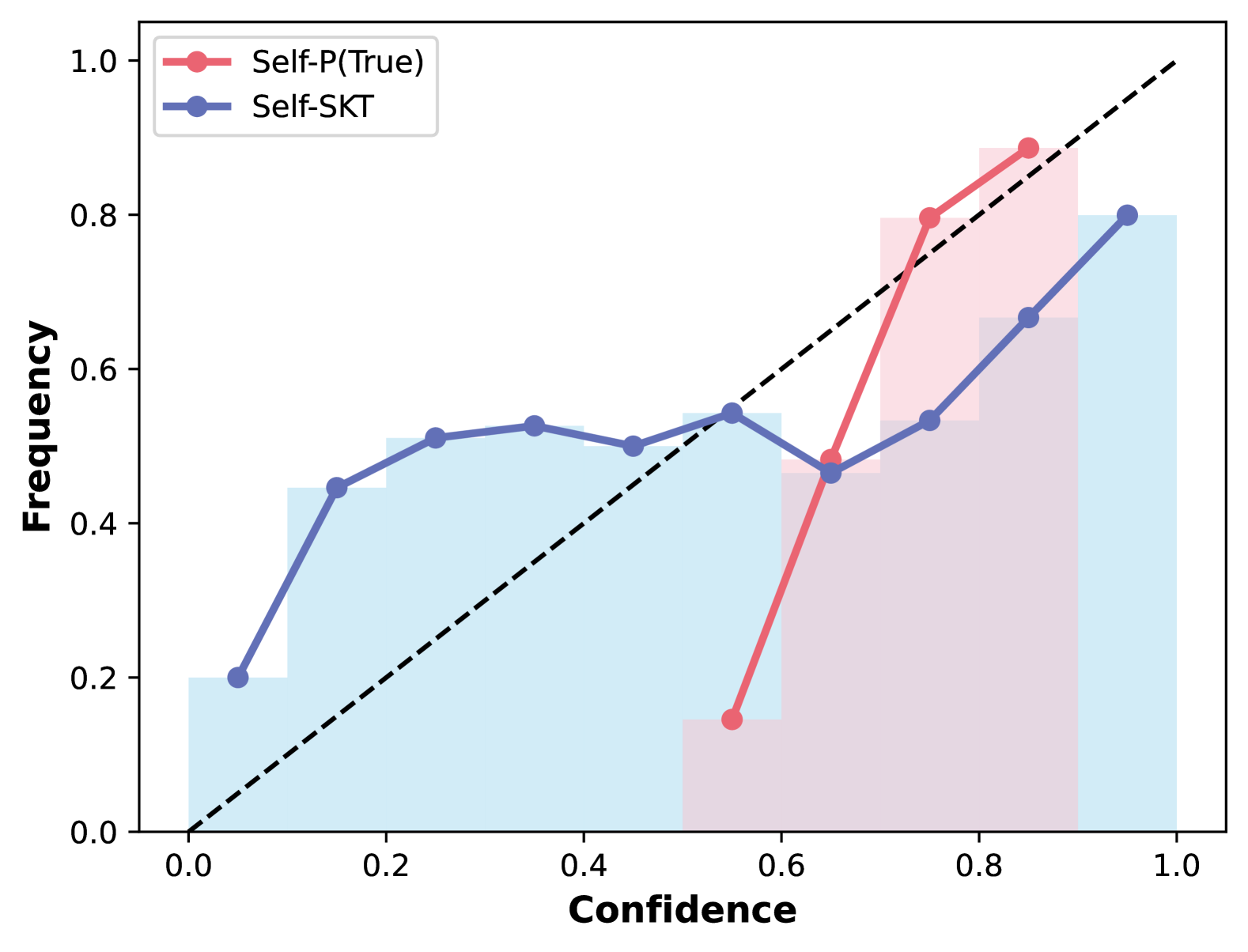
The image displays a line chart comparing two confidence-frequency distributions: "Self-P(True)" (red) and "Self-SKT" (blue). A dashed diagonal reference line (y=x) is included for comparison. The chart combines line plots with shaded histogram-like areas, suggesting distributions of confidence scores.
### Components/Axes
- **X-axis (Confidence)**: Ranges from 0.0 to 1.0 in increments of 0.1.
- **Y-axis (Frequency)**: Ranges from 0.0 to 1.0 in increments of 0.2.
- **Legend**: Located in the top-left corner, with:
- Red circles: "Self-P(True)"
- Blue circles: "Self-SKT"
- **Dashed Reference Line**: Diagonal line from (0,0) to (1,1), representing perfect correlation between confidence and frequency.
### Detailed Analysis
#### Self-P(True) (Red)
- **Data Points**:
- (0.6, 0.15)
- (0.7, 0.8)
- (0.8, 0.9)
- **Trend**: Starts at low confidence (0.6) with minimal frequency, then sharply increases to dominate higher confidence ranges (0.7–0.9). The shaded red area under the line indicates a concentration of confidence scores in the 0.7–0.9 range.
#### Self-SKT (Blue)
- **Data Points**:
- (0.1, 0.2)
- (0.3, 0.5)
- (0.5, 0.5)
- (0.7, 0.6)
- (0.9, 0.8)
- **Trend**: Gradual increase from low confidence (0.1–0.3) to moderate confidence (0.5–0.7), with a secondary rise at 0.9. The shaded blue area shows a broader distribution across confidence levels compared to Self-P(True).
#### Key Observations
1. **Intersection at Confidence 0.7**: Both lines cross the dashed reference line (y=x) near confidence 0.7, suggesting this is a threshold where observed frequency matches confidence.
2. **Self-P(True) Dominance**: After confidence 0.6, Self-P(True) consistently exceeds Self-SKT in frequency, indicating higher reliability in high-confidence predictions.
3. **Self-SKT Spread**: Self-SKT shows a more uniform distribution, with notable frequency at lower confidence (0.1–0.3) but fewer high-confidence predictions (0.7–0.9).
### Interpretation
- **Self-P(True) Behavior**: The sharp rise in frequency for high-confidence predictions (0.7–0.9) suggests this method is optimized for scenarios requiring high confidence, such as critical decision-making systems. Its shaded area indicates a "long tail" of low-confidence predictions, which may represent uncertainty or edge cases.
- **Self-SKT Behavior**: The broader distribution implies this method balances confidence across a wider range, potentially useful for exploratory analysis but less reliable for high-stakes predictions. The secondary rise at 0.9 suggests some capability in high-confidence scenarios but not as pronounced as Self-P(True).
- **Dashed Line Significance**: The reference line (y=x) acts as a benchmark. Deviations above/below indicate over/underconfidence. Self-P(True) aligns more closely with this line in the high-confidence range, while Self-SKT shows more divergence at lower confidence levels.
- **Anomalies**: The abrupt jump in Self-P(True) at 0.7 (from 0.15 to 0.8) may indicate a threshold effect or a design choice to prioritize high-confidence outputs. Self-SKT’s plateau at 0.5 (confidence 0.3–0.5) could reflect a saturation point or data limitation.
### Critical Insights
- **Performance Tradeoff**: Self-P(True) sacrifices coverage of lower-confidence predictions to excel in high-confidence scenarios, while Self-SKT offers broader coverage at the cost of precision.
- **Practical Implications**:
- Use Self-P(True) when high-confidence predictions are critical (e.g., medical diagnosis, autonomous systems).
- Use Self-SKT for tasks requiring balanced confidence distribution (e.g., exploratory data analysis, uncertainty quantification).
- **Uncertainty**: The exact confidence-frequency mapping for Self-SKT between 0.5–0.7 is ambiguous due to overlapping shaded areas. Further granular data points would clarify this region.