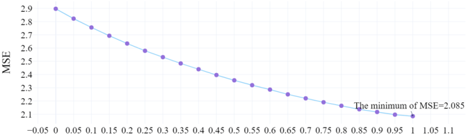
## Line Chart: MSE vs. X-Variable
### Overview
The image displays a 2D line chart plotting Mean Squared Error (MSE) against an unlabeled independent variable (x-axis). The chart shows a clear, monotonic decreasing trend. A text annotation identifies the minimum MSE value achieved within the plotted range.
### Components/Axes
* **Chart Type:** Line chart with circular data point markers.
* **Y-Axis:**
* **Label:** "MSE" (Mean Squared Error).
* **Scale:** Linear.
* **Range:** Approximately 2.1 to 2.9.
* **Major Tick Marks:** Every 0.1 units (2.1, 2.2, 2.3, ..., 2.9).
* **X-Axis:**
* **Label:** Not explicitly stated. Represents an independent variable or parameter.
* **Scale:** Linear.
* **Range:** Approximately -0.05 to 1.1.
* **Major Tick Marks:** Every 0.05 units (-0.05, 0, 0.05, 0.1, ..., 1.1).
* **Data Series:** A single series represented by a solid blue line connecting circular blue markers.
* **Annotation:** A text label located in the bottom-right quadrant of the chart area, near the final data points. It reads: "The minimum of MSE=2.085".
### Detailed Analysis
**Data Point Extraction (Approximate Values):**
The following table lists the approximate (x, MSE) coordinates for each visible data point, read from left to right. Values are estimated based on the grid lines.
| Approx. X Value | Approx. MSE Value | Visual Trend Note |
| :--- | :--- | :--- |
| 0.00 | 2.90 | Starting point, highest MSE. |
| 0.05 | 2.85 | |
| 0.10 | 2.80 | |
| 0.15 | 2.75 | |
| 0.20 | 2.70 | |
| 0.25 | 2.65 | |
| 0.30 | 2.60 | |
| 0.35 | 2.55 | |
| 0.40 | 2.50 | |
| 0.45 | 2.45 | |
| 0.50 | 2.40 | |
| 0.55 | 2.35 | |
| 0.60 | 2.30 | |
| 0.65 | 2.25 | |
| 0.70 | 2.20 | |
| 0.75 | 2.18 | Slope begins to shallow slightly. |
| 0.80 | 2.15 | |
| 0.85 | 2.12 | |
| 0.90 | 2.10 | |
| 0.95 | 2.09 | |
| 1.00 | 2.085 | **Minimum point**, as per annotation. |
**Trend Verification:** The blue line exhibits a consistent, near-linear downward slope from the top-left (x=0, MSE=2.9) to the bottom-right (x=1.0, MSE=2.085). The rate of decrease appears to slow marginally after x=0.7.
### Key Observations
1. **Monotonic Decrease:** The MSE decreases continuously as the x-variable increases from 0 to 1. There are no local minima or maxima within this range.
2. **Highlighted Minimum:** The chart explicitly calls out the minimum MSE value of 2.085, which occurs at the far right of the plotted data (x ≈ 1.0).
3. **Linear Relationship:** The relationship between the x-variable and MSE appears approximately linear for most of the range, suggesting a strong negative correlation.
4. **Data Density:** Data points are plotted at regular intervals of 0.05 along the x-axis, providing a smooth representation of the trend.
### Interpretation
This chart demonstrates the performance (measured by MSE) of a model or system as a single parameter (x) is varied. The clear downward trend indicates that increasing the value of this parameter from 0 to 1 consistently improves performance by reducing error.
The annotation of the minimum value (2.085 at x=1.0) is the key takeaway, suggesting that within the tested range, the optimal setting for the parameter is at its maximum value of 1.0. The near-linear relationship implies a predictable and stable response to parameter changes. For a technical document, this chart would be used to justify the selection of x=1.0 as the optimal operating point and to illustrate the sensitivity of the model's error to this specific parameter. The absence of a rise in MSE at higher x-values suggests that the optimal point may lie at or beyond x=1.0, warranting further investigation outside the plotted range.