\n
## Heatmap: Sequential vs. Spatial Color Schemes
### Overview
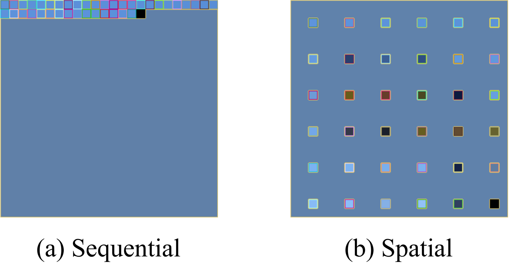
The image presents two heatmaps, labeled "(a) Sequential" and "(b) Spatial", illustrating different color scheme approaches. Both heatmaps are displayed against a blue background. The "Sequential" heatmap shows a gradient of colors along a single row at the top, while the "Spatial" heatmap displays a grid of colored squares. The image does not contain numerical data, but rather demonstrates visual representations of data distribution.
### Components/Axes
* **Labels:** "(a) Sequential", "(b) Spatial"
* **Color Scheme (Sequential):** A gradient of colors, starting with light blue, transitioning through shades of purple and pink, and ending with black.
* **Color Scheme (Spatial):** A grid of squares filled with various colors including light blue, blue, purple, pink, orange, brown, and black.
* **Background:** Uniform blue for both heatmaps.
* **Grid (Spatial):** A 6x6 grid of squares.
### Detailed Analysis or Content Details
**Sequential Heatmap:**
The color gradient is positioned along the top edge of the heatmap. The colors transition from light blue to dark blue, then to purple, pink, and finally black. The gradient appears to be continuous, with smooth transitions between colors.
**Spatial Heatmap:**
The heatmap consists of a 6x6 grid of colored squares. The colors are distributed seemingly randomly across the grid. The colors present include:
* Light Blue (several shades)
* Blue (several shades)
* Purple (several shades)
* Pink (several shades)
* Orange (several shades)
* Brown (several shades)
* Black (a few squares)
The distribution of colors does not appear to follow any obvious pattern.
### Key Observations
* The "Sequential" heatmap demonstrates a linear progression of color intensity, suitable for representing a single variable with a continuous range.
* The "Spatial" heatmap uses a variety of colors distributed across a grid, potentially representing multiple variables or a complex relationship between data points.
* The "Spatial" heatmap lacks a clear visual trend or pattern. The colors appear to be randomly assigned to the grid cells.
### Interpretation
The image illustrates two different approaches to visualizing data using color. The "Sequential" scheme is appropriate for representing data that varies along a single dimension, such as time or magnitude. The "Spatial" scheme is more suitable for representing data with multiple dimensions or complex relationships, where color can be used to encode different variables or categories.
The lack of a clear pattern in the "Spatial" heatmap suggests that the underlying data may be complex or noisy. Alternatively, the color scheme may not be optimized for revealing the underlying structure of the data. The image serves as a visual comparison of these two common heatmap approaches, highlighting their strengths and weaknesses. The image is a demonstration of color scheme choices, not a presentation of specific data.