\n
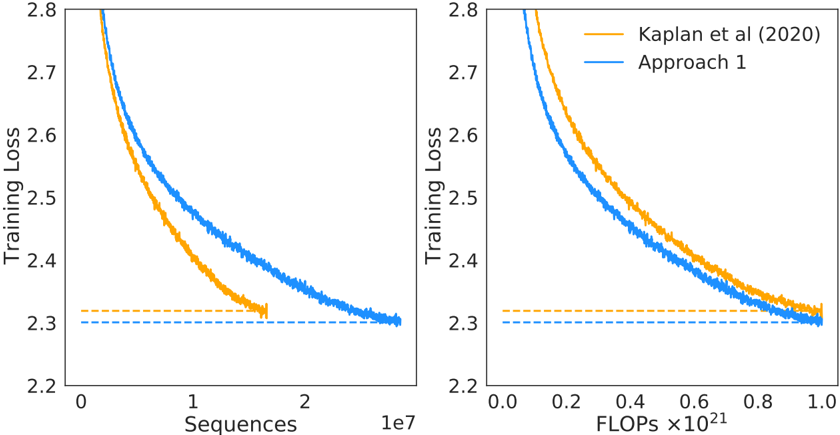
## Chart: Training Loss vs. Sequences/FLOPs
### Overview
The image presents two line charts comparing the training loss of a model ("Approach 1") against a baseline ("Kaplan et al (2020)"). The left chart plots training loss against the number of sequences processed, while the right chart plots training loss against the number of FLOPs (Floating Point Operations) performed. Both charts share the same y-axis scale (Training Loss) but differ in their x-axis representation.
### Components/Axes
* **Y-axis (Both Charts):** "Training Loss", ranging from approximately 2.2 to 2.8.
* **Left Chart X-axis:** "Sequences", ranging from 0 to approximately 2.1 x 10<sup>7</sup>.
* **Right Chart X-axis:** "FLOPs x10<sup>21</sup>", ranging from 0.0 to 1.0.
* **Legend (Top-Right):**
* Yellow Line: "Kaplan et al (2020)"
* Blue Line: "Approach 1"
* **Horizontal Dashed Line (Both Charts):** A horizontal dashed line at approximately 2.32 on the Training Loss axis.
### Detailed Analysis or Content Details
**Left Chart (Loss vs. Sequences):**
* **Kaplan et al (2020) - Yellow Line:** The line starts at approximately 2.75 at 0 sequences, rapidly decreases to around 2.35 at approximately 5 x 10<sup>6</sup> sequences, and then plateaus around 2.32.
* **Approach 1 - Blue Line:** The line begins at approximately 2.75 at 0 sequences, decreases more gradually than the yellow line, reaching approximately 2.32 at approximately 1.5 x 10<sup>7</sup> sequences, and then plateaus.
**Right Chart (Loss vs. FLOPs):**
* **Kaplan et al (2020) - Yellow Line:** The line starts at approximately 2.75 at 0 FLOPs, rapidly decreases to around 2.35 at approximately 0.4 x 10<sup>21</sup> FLOPs, and then plateaus around 2.32.
* **Approach 1 - Blue Line:** The line begins at approximately 2.75 at 0 FLOPs, decreases more gradually than the yellow line, reaching approximately 2.32 at approximately 0.8 x 10<sup>21</sup> FLOPs, and then plateaus.
### Key Observations
* Both approaches demonstrate a decreasing training loss as the number of sequences or FLOPs increases.
* "Kaplan et al (2020)" achieves a lower loss for a given amount of computational effort (sequences or FLOPs) initially, but both approaches converge to approximately the same loss value.
* The horizontal dashed line represents a potential lower bound or target loss value.
* The rate of loss reduction slows down for both approaches as they approach the plateau.
### Interpretation
The charts suggest that both "Approach 1" and the method described by "Kaplan et al (2020)" are effective in reducing training loss. However, "Kaplan et al (2020)" appears to be more efficient in the early stages of training, achieving a lower loss with fewer sequences or FLOPs. As training progresses, "Approach 1" catches up, eventually reaching a similar loss level. This could indicate that "Approach 1" requires more computational resources to achieve the same level of performance as "Kaplan et al (2020)", but it is still capable of reaching a comparable result. The plateauing of both curves suggests diminishing returns – further increasing sequences or FLOPs beyond a certain point yields minimal improvement in training loss. The horizontal dashed line could represent a practical limit to the achievable loss, or a point where further optimization becomes less impactful. The comparison highlights a trade-off between computational efficiency and overall performance.