## Line Charts: Training Loss Comparison
### Overview
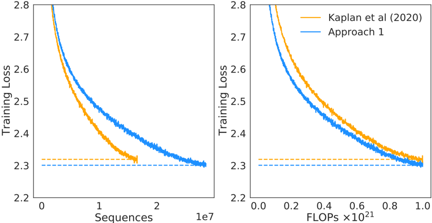
The image displays two side-by-side line charts comparing the training loss of two different approaches over training progress. The left chart plots loss against the number of training sequences processed, while the right chart plots loss against computational cost measured in FLOPs. Both charts show that "Approach 1" achieves a lower final training loss than the baseline "Kaplan et al (2020)" method, but the relationship between the two methods differs depending on whether progress is measured by data seen (sequences) or compute used (FLOPs).
### Components/Axes
**Common Elements:**
* **Y-Axis (Both Charts):** Labeled "Training Loss". The scale ranges from 2.2 to 2.8, with major tick marks at 0.1 intervals (2.2, 2.3, 2.4, 2.5, 2.6, 2.7, 2.8).
* **Data Series (Both Charts):** Two lines are plotted.
* **Orange Line:** Labeled "Kaplan et al (2020)" in the legend.
* **Blue Line:** Labeled "Approach 1" in the legend.
* **Legend:** Located in the top-right corner of the *right chart only*. It contains two entries with colored line samples matching the data series.
* **Horizontal Dashed Lines:** Both charts feature two horizontal dashed lines near the bottom, indicating the approximate final loss values for each series. The orange dashed line is slightly above the blue dashed line.
**Left Chart Specifics:**
* **Title/Context:** Not explicitly titled, but the x-axis indicates it measures progress by data volume.
* **X-Axis:** Labeled "Sequences". The scale is linear, ranging from 0 to approximately 2.5 x 10⁷ (25 million). Major tick marks are at 0, 1, and 2, with a multiplier of "1e7" noted at the far right.
**Right Chart Specifics:**
* **Title/Context:** Not explicitly titled, but the x-axis indicates it measures progress by computational cost.
* **X-Axis:** Labeled "FLOPs ×10²¹". The scale is linear, ranging from 0.0 to 1.0. Major tick marks are at 0.0, 0.2, 0.4, 0.6, 0.8, and 1.0.
### Detailed Analysis
**Left Chart (Loss vs. Sequences):**
* **Trend Verification:** Both lines show a steep, decaying curve, indicating loss decreases rapidly with more training data and then plateaus. The orange line (Kaplan) descends more steeply initially but flattens out earlier. The blue line (Approach 1) starts at a higher loss but continues to decrease for longer, eventually crossing below the orange line.
* **Data Points (Approximate):**
* **Start (Sequences ≈ 0):** Both lines begin near the top of the y-axis, above 2.8. The blue line starts slightly higher than the orange line.
* **Mid-Point (Sequences ≈ 1 x 10⁷):** Orange line ≈ 2.45. Blue line ≈ 2.55.
* **End (Sequences ≈ 2.5 x 10⁷):** The orange line terminates earlier, around 1.7 x 10⁷ sequences, at a loss of ~2.32 (marked by the orange dashed line). The blue line extends further, reaching a final loss of ~2.30 (marked by the blue dashed line) at approximately 2.5 x 10⁷ sequences.
**Right Chart (Loss vs. FLOPs):**
* **Trend Verification:** Both lines again show a decaying curve. However, when plotted against compute, the blue line (Approach 1) is consistently below the orange line (Kaplan) for the entire duration after the very initial phase.
* **Data Points (Approximate):**
* **Start (FLOPs ≈ 0):** Both lines begin above 2.8, with the blue line starting slightly lower.
* **Mid-Point (FLOPs ≈ 0.5 x 10²¹):** Orange line ≈ 2.45. Blue line ≈ 2.40.
* **End (FLOPs ≈ 1.0 x 10²¹):** The orange line ends at a loss of ~2.32 (orange dashed line). The blue line ends at a loss of ~2.30 (blue dashed line). Both series appear to use a similar total amount of compute (~1.0 x 10²¹ FLOPs) to reach their final points.
### Key Observations
1. **Crossover in Data Efficiency:** The left chart reveals a crossover point. "Kaplan et al (2020)" is more data-efficient early in training (lower loss for the same number of sequences), but "Approach 1" becomes more data-efficient later, achieving a lower loss given enough data.
2. **Consistent Compute Efficiency:** The right chart shows that "Approach 1" is consistently more compute-efficient than "Kaplan et al (2020)" throughout training. For any given budget of FLOPs, Approach 1 yields a lower loss.
3. **Final Performance:** Both charts confirm that "Approach 1" converges to a better (lower) final training loss (~2.30) than the baseline (~2.32).
4. **Training Duration:** The left chart suggests "Approach 1" was trained for more sequences (2.5e7 vs. ~1.7e7), while the right chart shows both used roughly the same total compute. This implies "Approach 1" processes sequences with a different computational cost per sequence than the baseline.
### Interpretation
The data demonstrates a trade-off and an improvement in training methodology. The "Kaplan et al (2020)" approach represents a known, efficient baseline in terms of data usage early on. "Approach 1" appears to be a modification that alters the scaling behavior.
The key finding is that **Approach 1 improves computational efficiency without sacrificing final model quality.** While it may require more data sequences to reach its full potential (left chart), it makes better use of each FLOP spent (right chart), consistently achieving lower loss for the same computational investment. This suggests the modification in Approach 1 likely involves an architectural or optimization change that improves the "loss per FLOP" metric, making training more cost-effective in terms of hardware resources, even if it doesn't reduce the amount of data required. The lower final loss indicates this efficiency gain does not come at the cost of model performance; in fact, it enables a slightly better final model.