\n
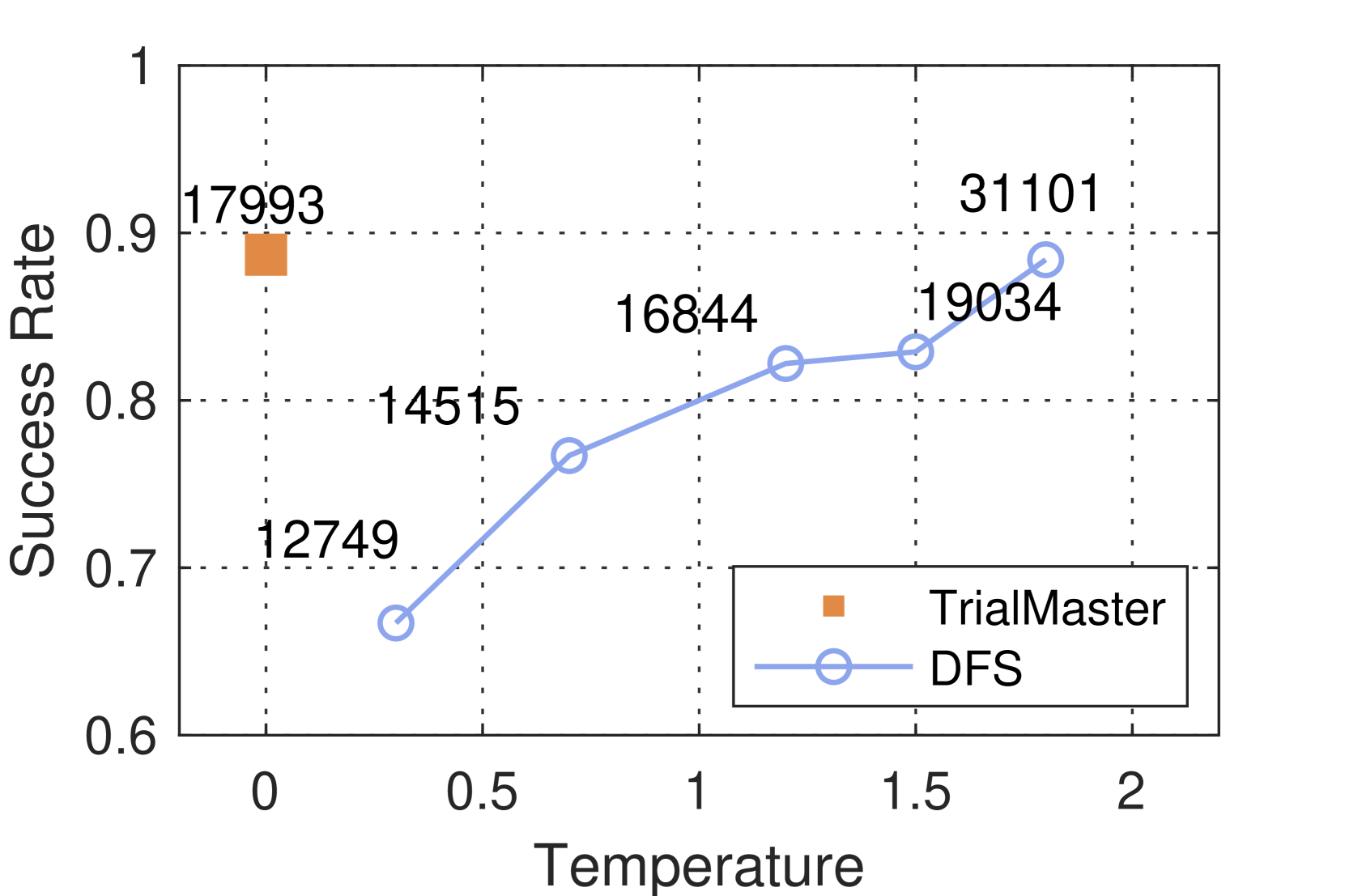
## Line Chart: Success Rate vs. Temperature for Two Methods
### Overview
The image is a 2D line chart comparing the performance of two methods, "TrialMaster" and "DFS," across a range of temperature values. The chart plots "Success Rate" on the vertical axis against "Temperature" on the horizontal axis. A single data point is shown for TrialMaster, while a connected line shows the performance trend for DFS across five temperature points.
### Components/Axes
* **Chart Type:** Line chart with markers.
* **X-Axis (Horizontal):**
* **Label:** "Temperature"
* **Scale:** Linear, ranging from 0 to 2.
* **Major Tick Marks:** 0, 0.5, 1, 1.5, 2.
* **Y-Axis (Vertical):**
* **Label:** "Success Rate"
* **Scale:** Linear, ranging from 0.6 to 1.
* **Major Tick Marks:** 0.6, 0.7, 0.8, 0.9, 1.
* **Legend:**
* **Position:** Bottom-right corner of the plot area.
* **Entry 1:** Orange square marker labeled "TrialMaster".
* **Entry 2:** Light blue line with open circle markers labeled "DFS".
* **Data Point Annotations:** Each data point has a numerical label placed directly above it. These numbers (e.g., 17993, 12749) likely represent sample sizes, identifiers, or another metric associated with that specific experimental condition.
### Detailed Analysis
**1. TrialMaster Data Series:**
* **Visual Trend:** A single, isolated data point. No trend can be inferred.
* **Data Point:**
* **Temperature (X):** 0
* **Success Rate (Y):** ~0.89 (visually estimated between 0.8 and 0.9, closer to 0.9).
* **Annotation:** "17993"
* **Marker:** Solid orange square.
**2. DFS Data Series:**
* **Visual Trend:** The line shows a clear, consistent upward slope from left to right, indicating that the Success Rate for the DFS method increases as Temperature increases.
* **Data Points (from left to right):**
* **Point 1:**
* Temperature (X): ~0.3
* Success Rate (Y): ~0.67 (visually estimated between 0.6 and 0.7).
* Annotation: "12749"
* **Point 2:**
* Temperature (X): ~0.7
* Success Rate (Y): ~0.77 (visually estimated between 0.7 and 0.8).
* Annotation: "14515"
* **Point 3:**
* Temperature (X): ~1.2
* Success Rate (Y): ~0.82 (visually estimated just above the 0.8 grid line).
* Annotation: "16844"
* **Point 4:**
* Temperature (X): ~1.5
* Success Rate (Y): ~0.83 (visually estimated slightly higher than the previous point).
* Annotation: "19034"
* **Point 5:**
* Temperature (X): ~1.8
* Success Rate (Y): ~0.88 (visually estimated just below the 0.9 grid line).
* Annotation: "31101"
### Key Observations
1. **Performance Comparison:** At Temperature = 0, the single TrialMaster point (~0.89) has a higher Success Rate than the first DFS point at Temperature ~0.3 (~0.67).
2. **DFS Improvement:** The DFS method shows a strong positive correlation between Temperature and Success Rate. Its performance improves from ~0.67 to ~0.88 as Temperature increases from ~0.3 to ~1.8.
3. **Convergence:** At the highest plotted temperature (~1.8), the DFS method's Success Rate (~0.88) approaches the performance level of the TrialMaster method at Temperature 0 (~0.89).
4. **Annotation Pattern:** The numerical annotations for DFS increase monotonically with both Temperature and Success Rate (12749 → 14515 → 16844 → 19034 → 31101). The annotation for TrialMaster (17993) falls within the range of the DFS annotations.
### Interpretation
This chart likely presents results from an experiment or simulation where "Temperature" is a control parameter influencing the performance of two different algorithms or processes ("TrialMaster" and "DFS"). The "Success Rate" is the primary performance metric.
* **What the data suggests:** The DFS method is highly sensitive to the Temperature parameter, exhibiting a clear performance benefit from higher temperatures. In contrast, TrialMaster is only shown at Temperature=0, where it performs very well. This could imply that TrialMaster is a specialized method designed for, or only effective at, zero temperature (perhaps a deterministic or baseline approach), while DFS is a stochastic or adaptive method that thrives with increased randomness or exploration (higher temperature).
* **Relationship between elements:** The chart sets up a direct comparison. It asks the viewer to consider whether the high, single-point performance of TrialMaster at T=0 is preferable to the tunable, improving performance of DFS. The increasing annotations for DFS might correlate with increased computational cost, sample size, or another resource alongside the performance improvement.
* **Unexplained elements:** The numerical annotations (e.g., 17993, 12749) are not defined in the chart; their meaning (e.g., iterations, dataset size, cost) is essential for a full technical understanding of the trade-offs involved. The chart does not provide a legend or axis label for these annotations, leaving their interpretation open.