## Line Graph: Success Rate vs. Temperature
### Overview
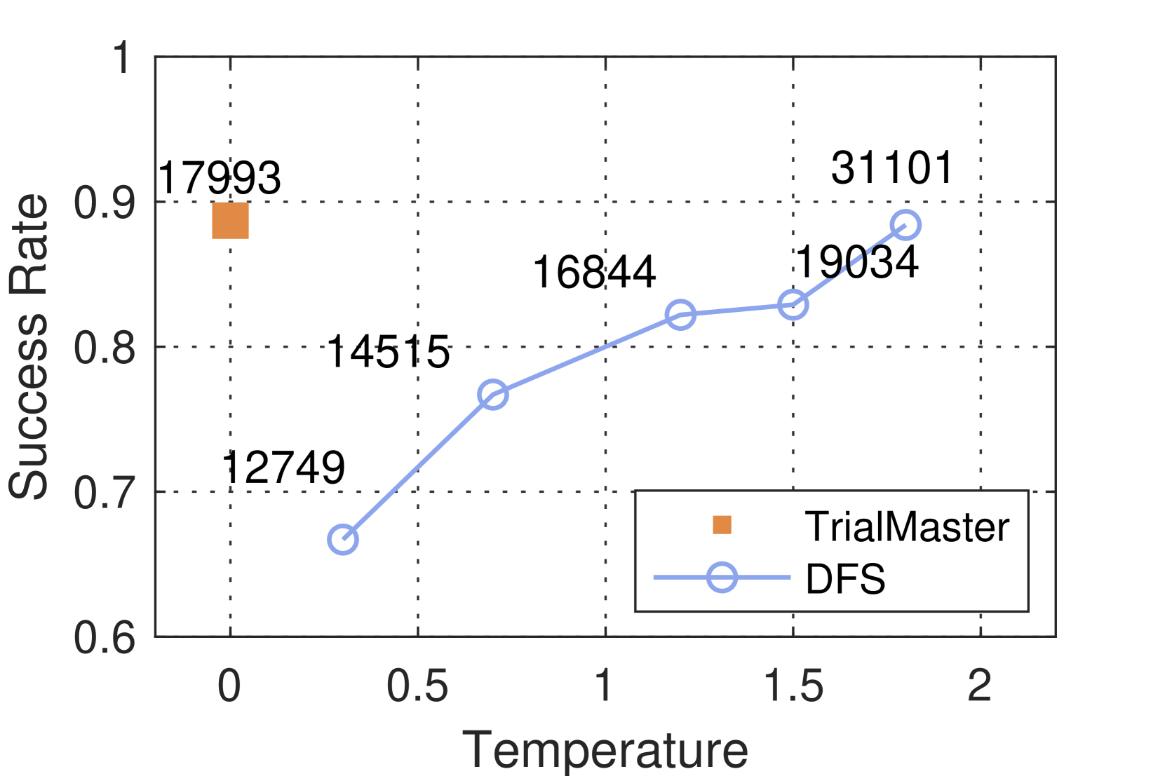
The image is a line graph comparing the **Success Rate** of two methods, **TrialMaster** and **DFS**, across varying **Temperature** values. The graph includes two data series: one represented by an orange square (TrialMaster) and another by a blue line with circular markers (DFS). The x-axis represents **Temperature** (ranging from 0 to 2), and the y-axis represents **Success Rate** (ranging from 0.6 to 1.0). Numerical values are annotated near specific data points.
---
### Components/Axes
- **X-axis (Temperature)**: Labeled "Temperature" with a scale from 0 to 2.0, marked at intervals of 0.5.
- **Y-axis (Success Rate)**: Labeled "Success Rate" with a scale from 0.6 to 1.0, marked at intervals of 0.1.
- **Legend**: Located in the bottom-right corner, with:
- **Orange square**: TrialMaster
- **Blue line with circles**: DFS
- **Data Points**:
- **TrialMaster**: Single orange square at (0, 0.90).
- **DFS**: Blue line with circles at (0.5, 0.75), (1.0, 0.82), (1.5, 0.83), and (2.0, 0.90).
---
### Detailed Analysis
- **TrialMaster**:
- **Data Point**: (0, 0.90) — Success Rate of 0.90 at Temperature 0.
- **Trend**: No additional data points; only one value is plotted.
- **DFS**:
- **Data Points**:
- (0.5, 0.75): Success Rate of 0.75 at Temperature 0.5.
- (1.0, 0.82): Success Rate of 0.82 at Temperature 1.0.
- (1.5, 0.83): Success Rate of 0.83 at Temperature 1.5.
- (2.0, 0.90): Success Rate of 0.90 at Temperature 2.0.
- **Trend**: A steady upward slope from 0.75 to 0.90 as Temperature increases.
---
### Key Observations
1. **TrialMaster** achieves the highest Success Rate (0.90) at Temperature 0, but no data is provided for higher temperatures.
2. **DFS** shows a consistent increase in Success Rate with rising Temperature, reaching 0.90 at Temperature 2.0.
3. The **orange square** (TrialMaster) is positioned at the top-left corner of the graph, while the **blue line** (DFS) spans the entire x-axis range.
---
### Interpretation
- **TrialMaster** appears to perform optimally at **Temperature 0**, but its lack of data at higher temperatures limits conclusions about its behavior under varying conditions.
- **DFS** demonstrates a **positive correlation** between Temperature and Success Rate, suggesting it may be more effective or adaptable at higher temperatures.
- The **orange square** (TrialMaster) is an outlier in terms of data density, as it only has one data point, whereas DFS has multiple points showing a clear trend.
- The graph implies that **DFS** might be preferable in scenarios where higher temperatures are expected, while **TrialMaster** could be optimal at lower temperatures. However, further data for TrialMaster at higher temperatures would be needed to confirm this.