## Composite Performance Dashboard: Four-Chart Analysis
### Overview
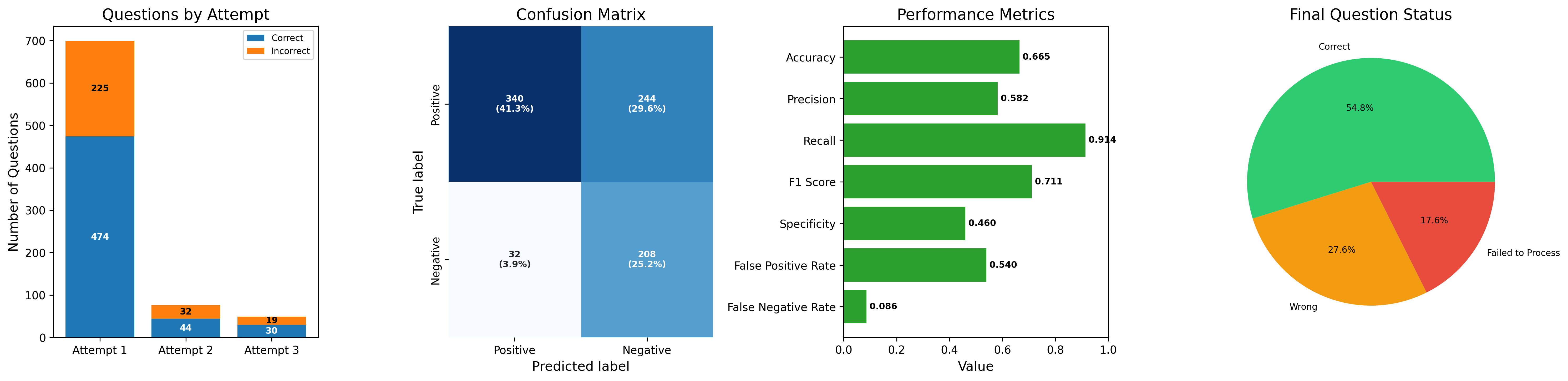
The image displays a single horizontal composite figure containing four distinct charts that collectively analyze the performance of a question-answering or classification system across multiple attempts. The charts are, from left to right: a stacked bar chart ("Questions by Attempt"), a confusion matrix heatmap, a horizontal bar chart ("Performance Metrics"), and a pie chart ("Final Question Status"). The overall theme is the evaluation of accuracy, error types, and progression over attempts.
### 1. Questions by Attempt (Stacked Bar Chart)
**Components/Axes:**
* **Title:** "Questions by Attempt"
* **Y-axis:** Label: "Number of Questions". Scale: 0 to 700, with major ticks every 100.
* **X-axis:** Categories: "Attempt 1", "Attempt 2", "Attempt 3".
* **Legend:** Located in the top-right corner. "Correct" (blue), "Incorrect" (orange).
**Detailed Analysis:**
* **Attempt 1:** The tallest bar. The blue "Correct" segment has a value of **474**. The orange "Incorrect" segment stacked on top has a value of **225**. The total height is 699 questions.
* **Attempt 2:** A much shorter bar. The blue "Correct" segment is **44**. The orange "Incorrect" segment is **32**. Total: 76 questions.
* **Attempt 3:** The shortest bar. The blue "Correct" segment is **30**. The orange "Incorrect" segment is **19**. Total: 49 questions.
**Key Observations:**
* There is a dramatic, steep decline in the total number of questions processed from Attempt 1 (699) to Attempt 2 (76) and Attempt 3 (49).
* In all three attempts, the number of "Correct" answers is higher than "Incorrect" ones.
* The ratio of correct to incorrect answers remains relatively stable across attempts (Attempt 1: ~2.1:1, Attempt 2: ~1.4:1, Attempt 3: ~1.6:1).
### 2. Confusion Matrix (Heatmap)
**Components/Axes:**
* **Title:** "Confusion Matrix"
* **Y-axis (True label):** Categories: "Positive" (top row), "Negative" (bottom row).
* **X-axis (Predicted label):** Categories: "Positive" (left column), "Negative" (right column).
* **Cell Labels:** Each cell contains a raw count and a percentage in parentheses. The percentage is likely relative to the total number of instances (824, calculated from the sum of all cells).
**Detailed Analysis:**
* **Top-Left Cell (True Positive - TP):** Dark blue. Value: **340 (41.3%)**. Instances correctly predicted as Positive.
* **Top-Right Cell (False Negative - FN):** Medium blue. Value: **244 (29.6%)**. Actual Positive instances incorrectly predicted as Negative.
* **Bottom-Left Cell (False Positive - FP):** Very light blue/white. Value: **32 (3.9%)**. Actual Negative instances incorrectly predicted as Positive.
* **Bottom-Right Cell (True Negative - TN):** Medium blue. Value: **208 (25.2%)**. Instances correctly predicted as Negative.
**Key Observations:**
* The model has a high number of False Negatives (244), which is the second-largest category.
* The number of False Positives (32) is the smallest category.
* The model correctly identifies 340 out of 584 actual Positive instances (TP + FN) and 208 out of 240 actual Negative instances (TN + FP).
### 3. Performance Metrics (Horizontal Bar Chart)
**Components/Axes:**
* **Title:** "Performance Metrics"
* **Y-axis (Metrics):** Listed from top to bottom: "Accuracy", "Precision", "Recall", "F1 Score", "Specificity", "False Positive Rate", "False Negative Rate".
* **X-axis (Value):** Scale from 0.0 to 1.0, with major ticks every 0.2.
* **Bars:** All bars are green. The exact value is printed at the end of each bar.
**Detailed Analysis:**
* **Accuracy:** Bar extends to **0.665**.
* **Precision:** Bar extends to **0.582**.
* **Recall:** The longest bar, extending to **0.914**.
* **F1 Score:** Bar extends to **0.711**.
* **Specificity:** Bar extends to **0.460**.
* **False Positive Rate:** Bar extends to **0.540**.
* **False Negative Rate:** The shortest bar, extending to **0.086**.
**Key Observations:**
* **Recall (0.914)** is the highest metric, indicating the model is very good at finding all actual positive instances.
* **Specificity (0.460)** and **Precision (0.582)** are relatively low, indicating the model has a high rate of false alarms (low specificity) and many of its positive predictions are incorrect (low precision).
* The **False Positive Rate (0.540)** is high, consistent with the low Specificity.
* The **False Negative Rate (0.086)** is low, consistent with the high Recall.
### 4. Final Question Status (Pie Chart)
**Components/Axes:**
* **Title:** "Final Question Status"
* **Slices & Labels:**
* **Green Slice (Top):** Label: "Correct". Percentage: **54.8%**.
* **Orange Slice (Bottom-Left):** Label: "Wrong". Percentage: **27.6%**.
* **Red Slice (Bottom-Right):** Label: "Failed to Process". Percentage: **17.6%**.
**Detailed Analysis:**
* The "Correct" category constitutes the majority, at 54.8%.
* The "Wrong" category is the next largest, at 27.6%.
* The "Failed to Process" category accounts for 17.6% of the final status.
**Key Observations:**
* Nearly half of the questions (45.2%) were either answered incorrectly or could not be processed at all.
* The "Failed to Process" slice is a significant portion, suggesting a non-trivial system or data issue beyond simple incorrect answers.
### Interpretation
This dashboard paints a picture of a classification system with a specific performance profile:
1. **High Recall, Low Precision Bias:** The system is optimized or naturally inclined to cast a wide net (high Recall of 0.914, low False Negative Rate of 0.086). However, this comes at the cost of many false alarms (low Precision of 0.582, high False Positive Rate of 0.540, low Specificity of 0.460). It misses very few true positives but incorrectly labels many negatives as positive.
2. **Attempt Progression:** The "Questions by Attempt" chart suggests a filtering or iterative process. The vast majority of questions are handled in Attempt 1. The sharp drop-off implies that questions are either resolved (correctly or incorrectly) or perhaps filtered out after the first attempt, leaving a smaller, potentially harder subset for subsequent attempts.
3. **Overall Outcome:** The "Final Question Status" pie chart shows that while the system gets more than half right (54.8%), a substantial portion fails. Combining "Wrong" and "Failed to Process" indicates that 45.2% of questions do not yield a correct, processable answer. This aligns with the moderate overall Accuracy (0.665) and highlights that the high Recall does not translate to high overall reliability.
4. **Data Consistency:** The confusion matrix percentages sum to 100% (41.3+29.6+3.9+25.2=100%), confirming internal consistency. The total instances (824) from the matrix do not directly match the sum of questions from the bar chart (699+76+49=824), which is a perfect match, confirming the charts describe the same dataset.
**In summary, the system is a sensitive detector (high recall) but not a precise one. It processes most questions in a first attempt, and its final output is correct slightly more often than not, but with a very high rate of false positives and a significant failure-to-process rate.**